
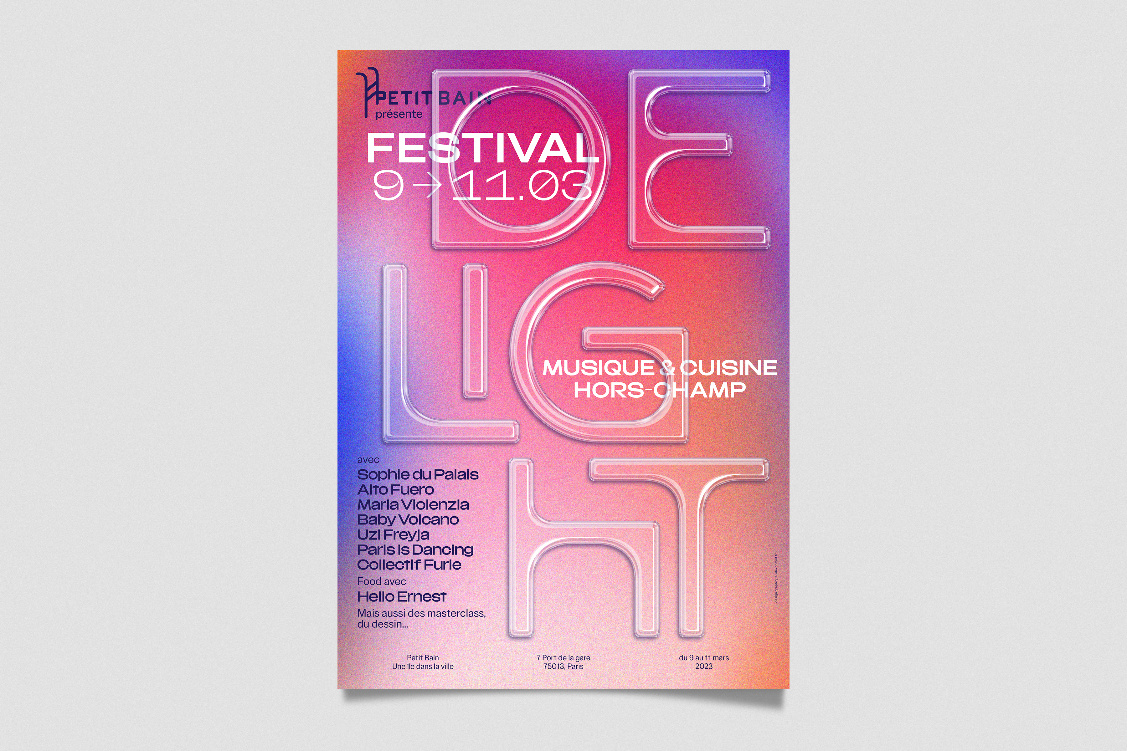
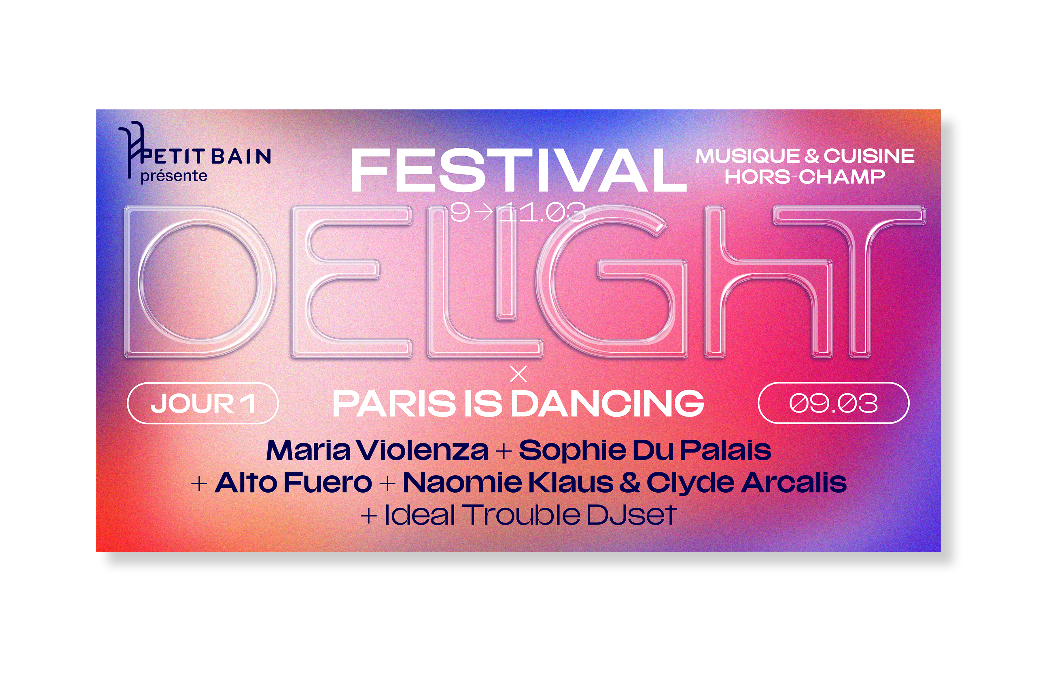
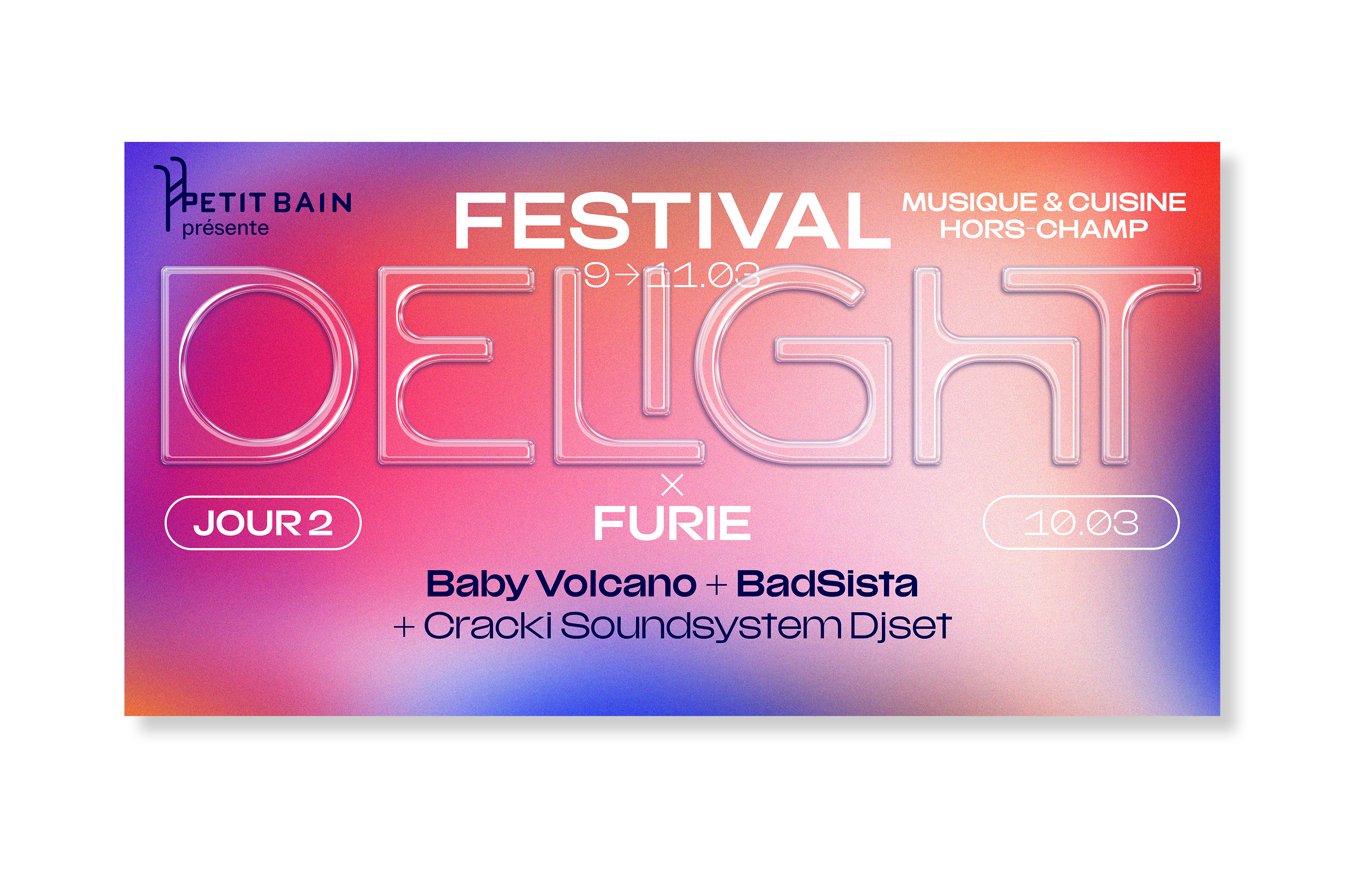
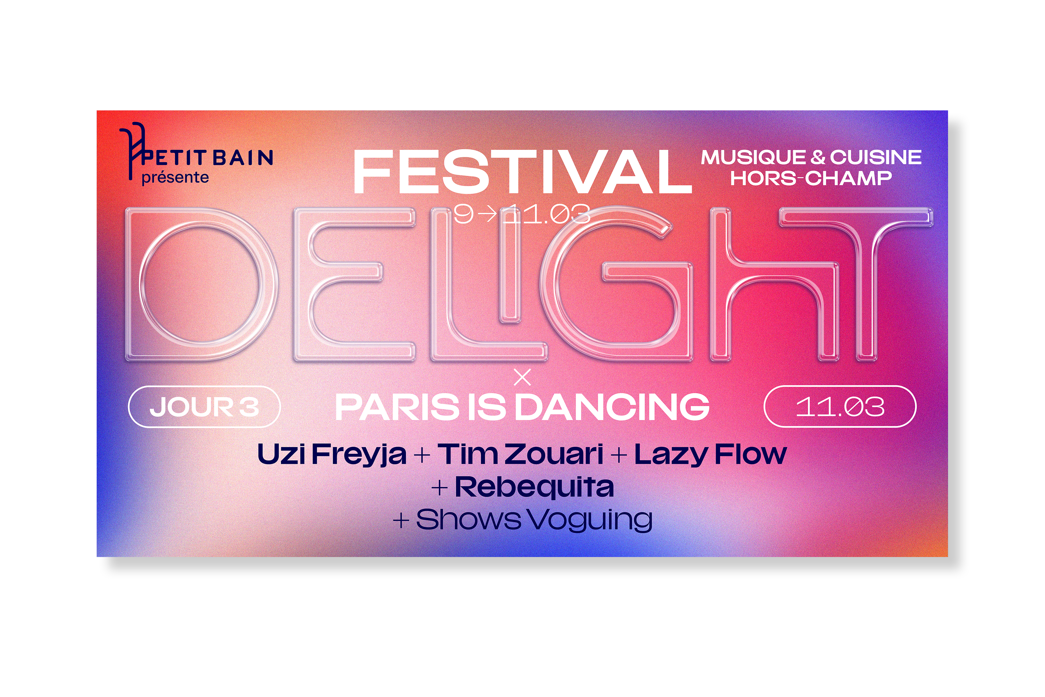
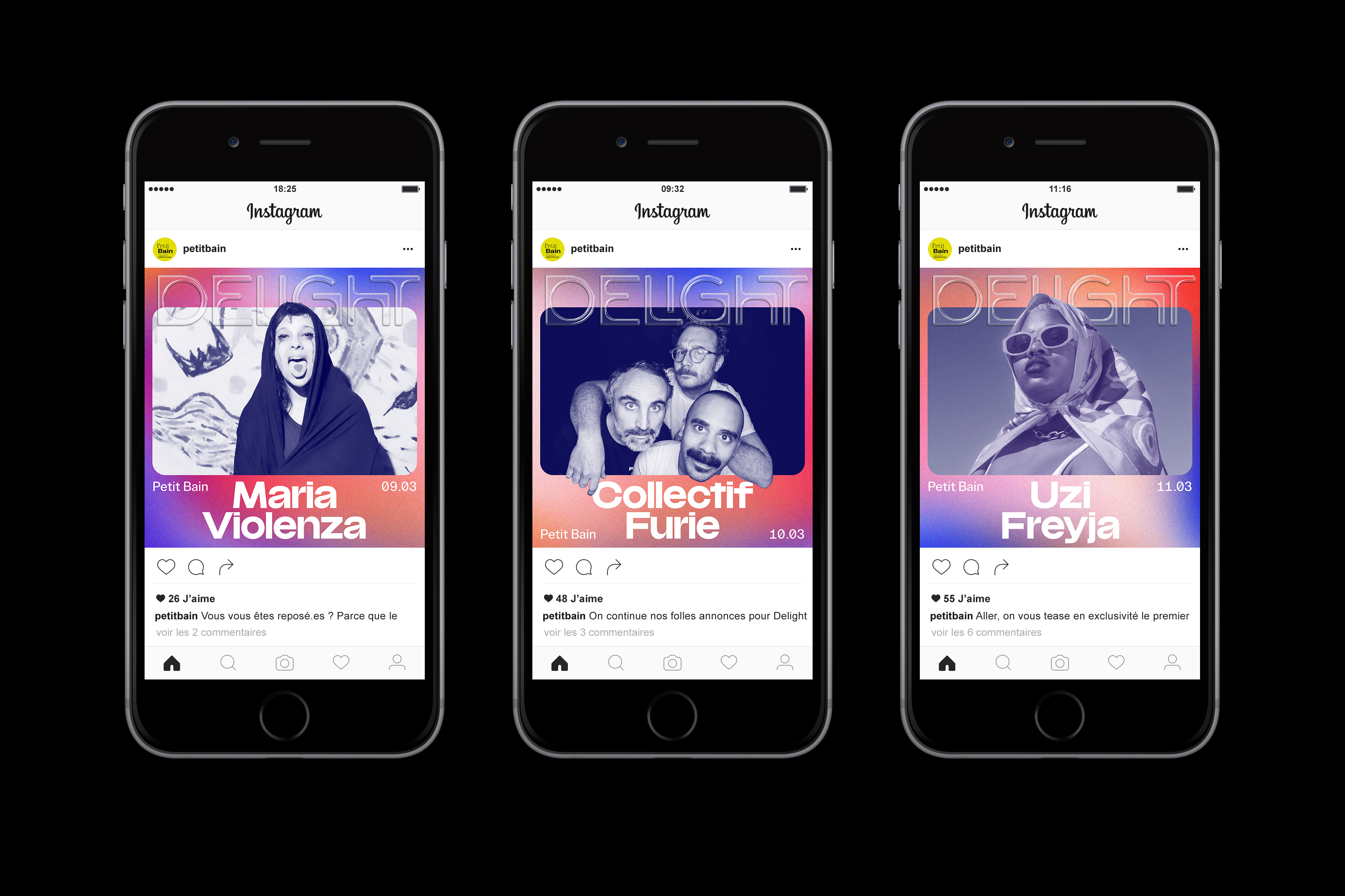
Petit Bain – Delight
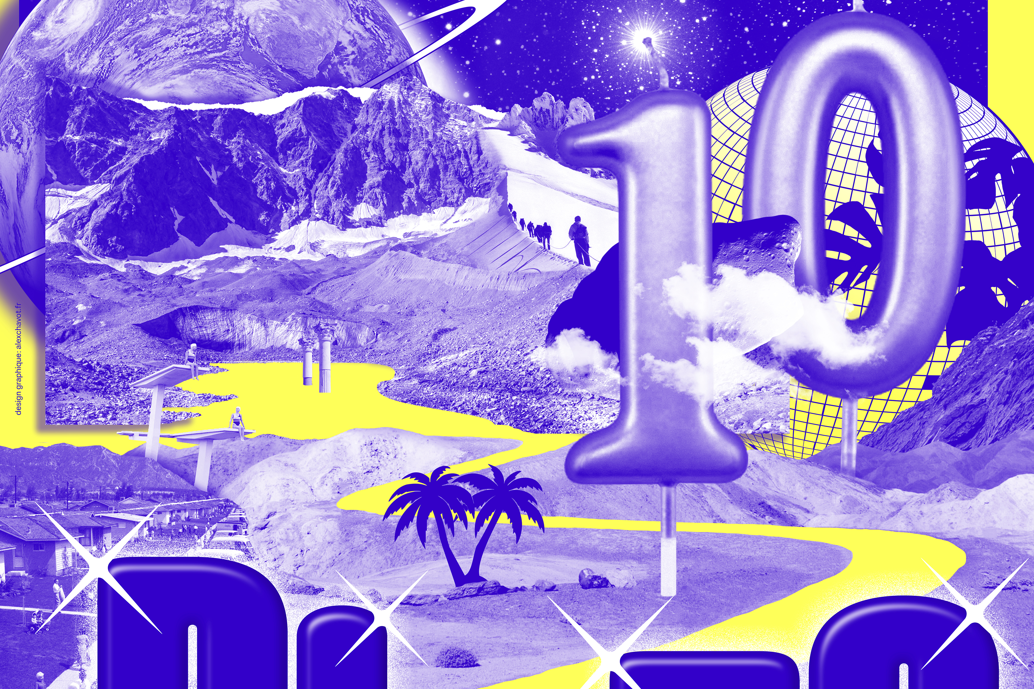
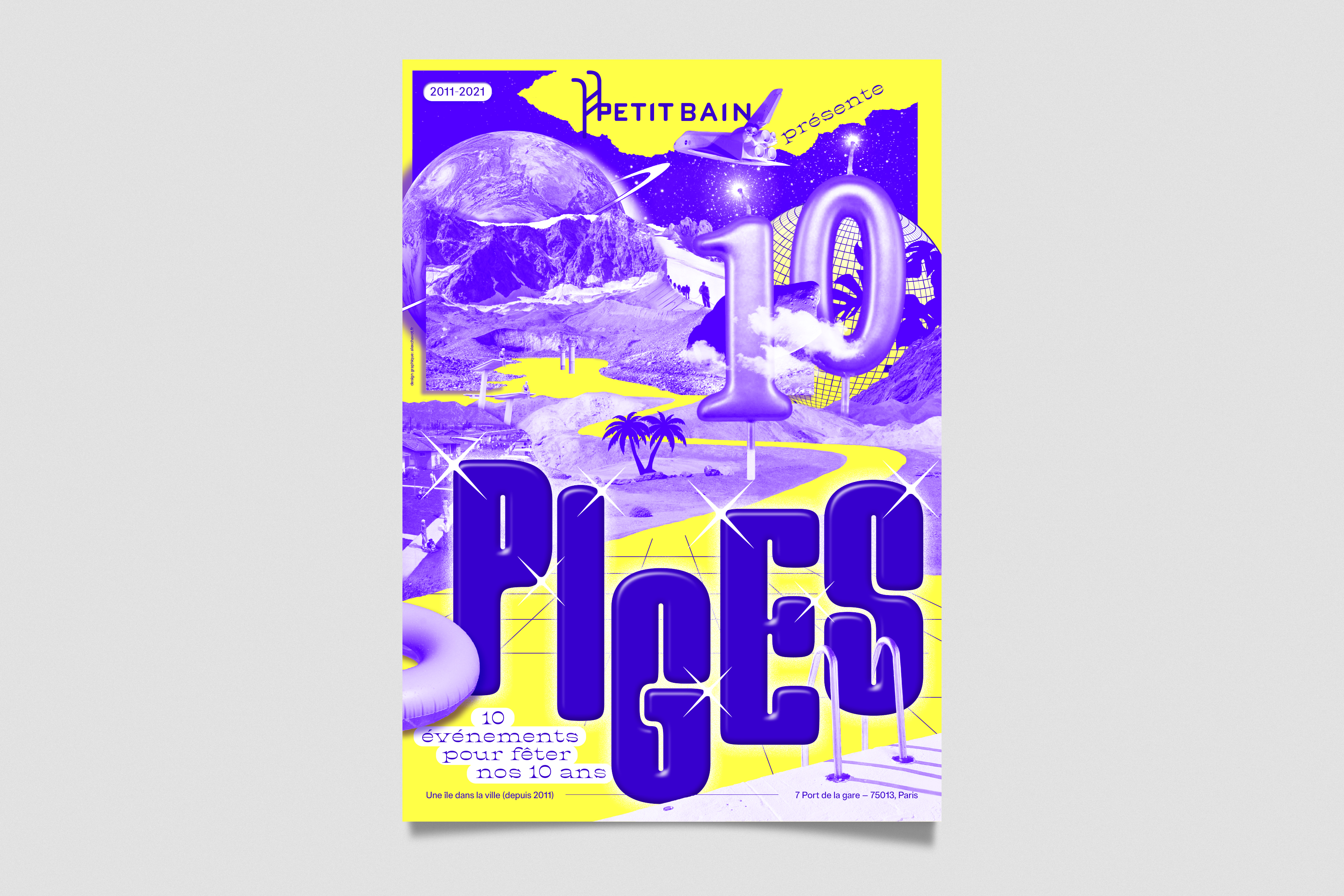
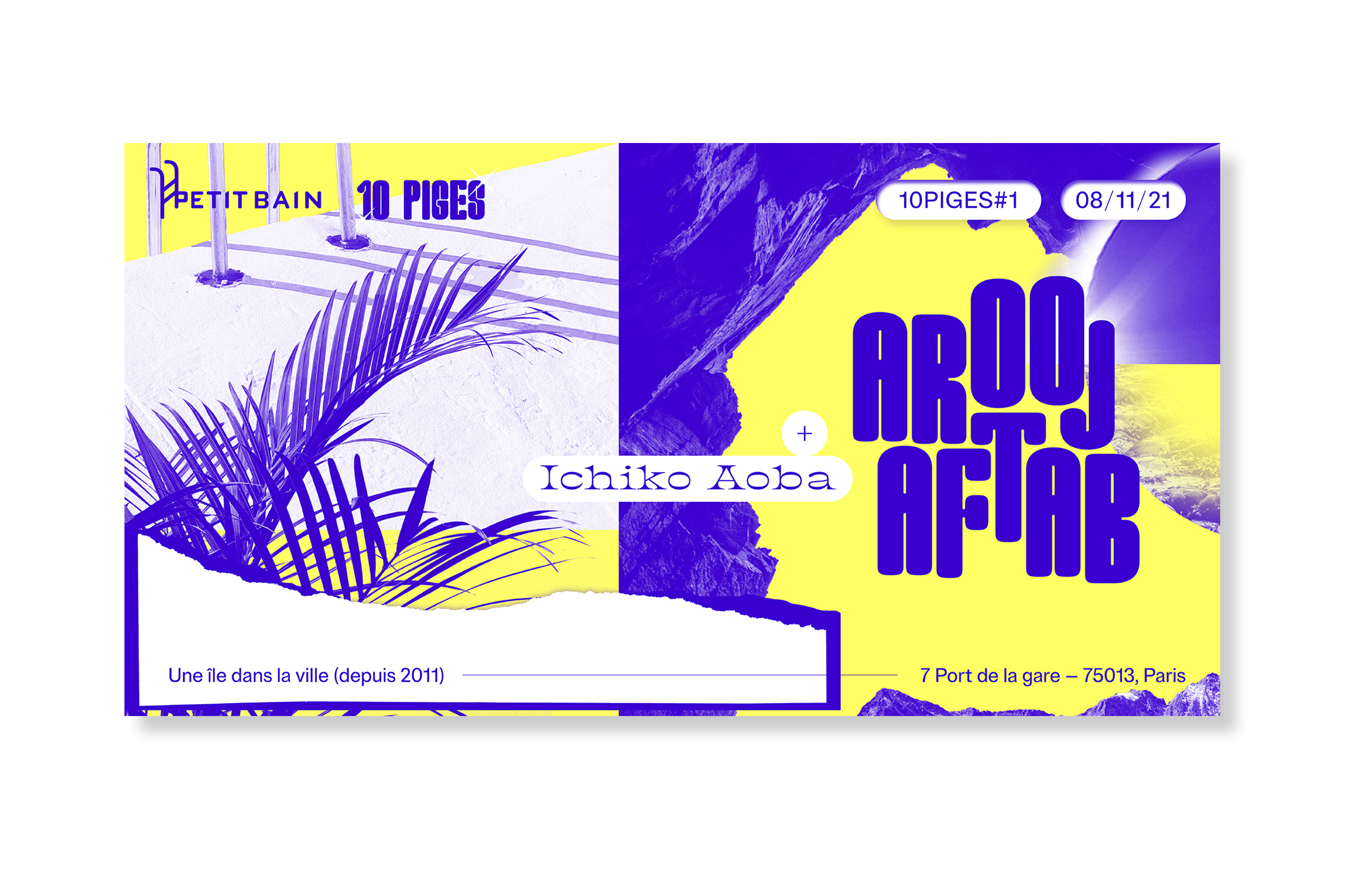
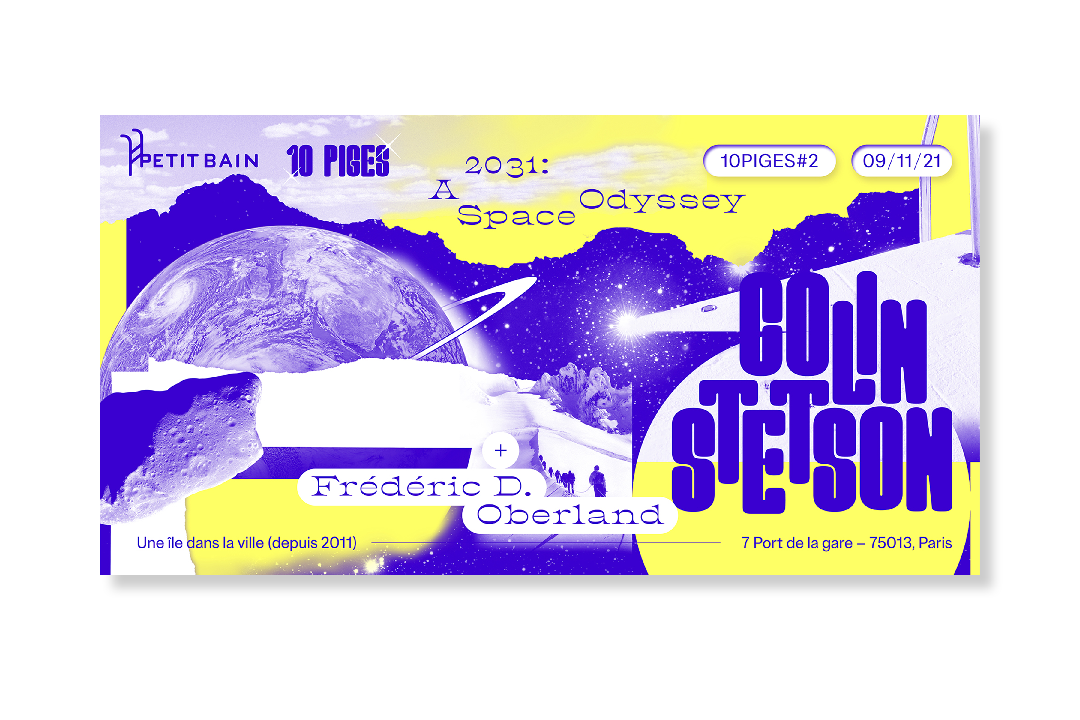
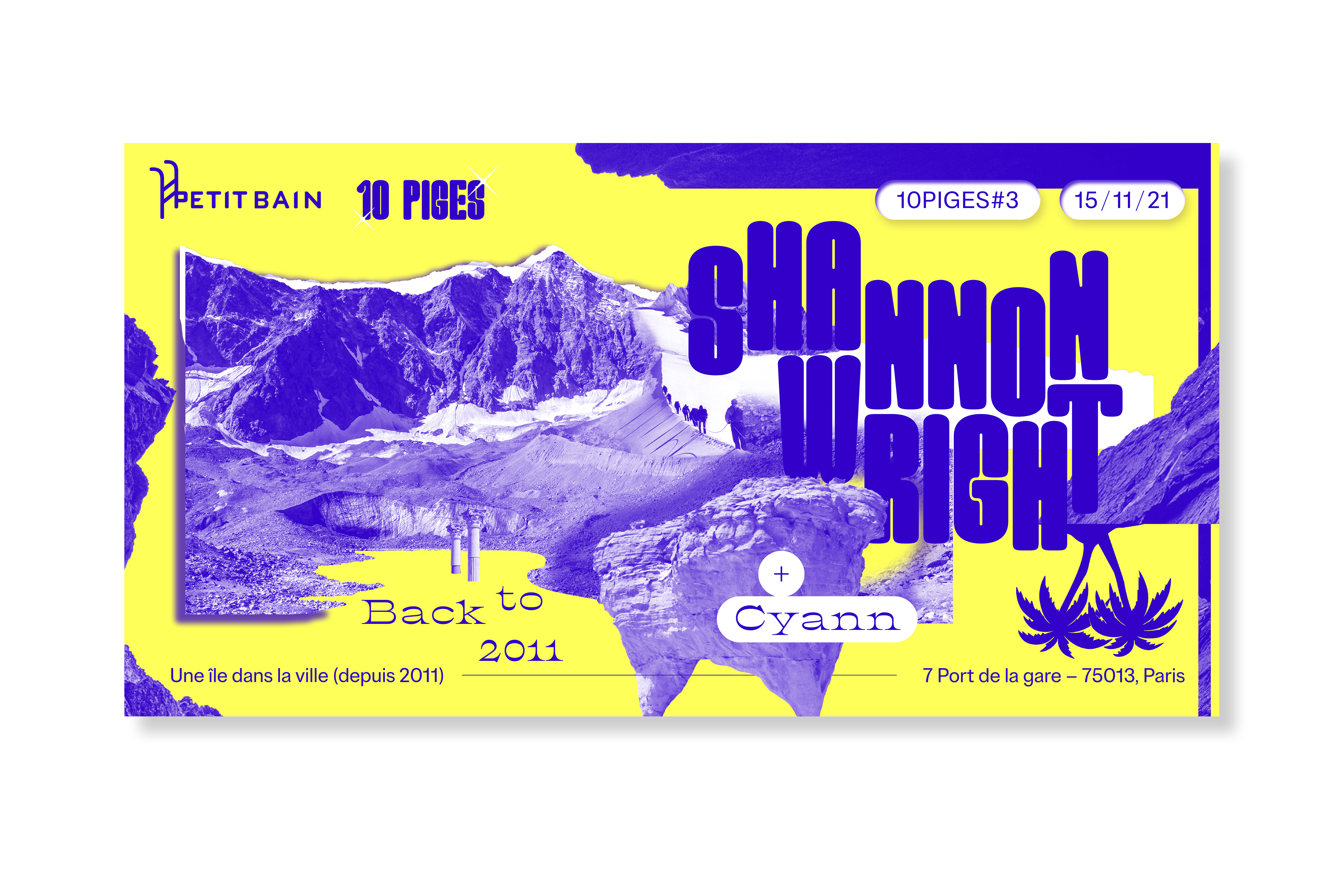
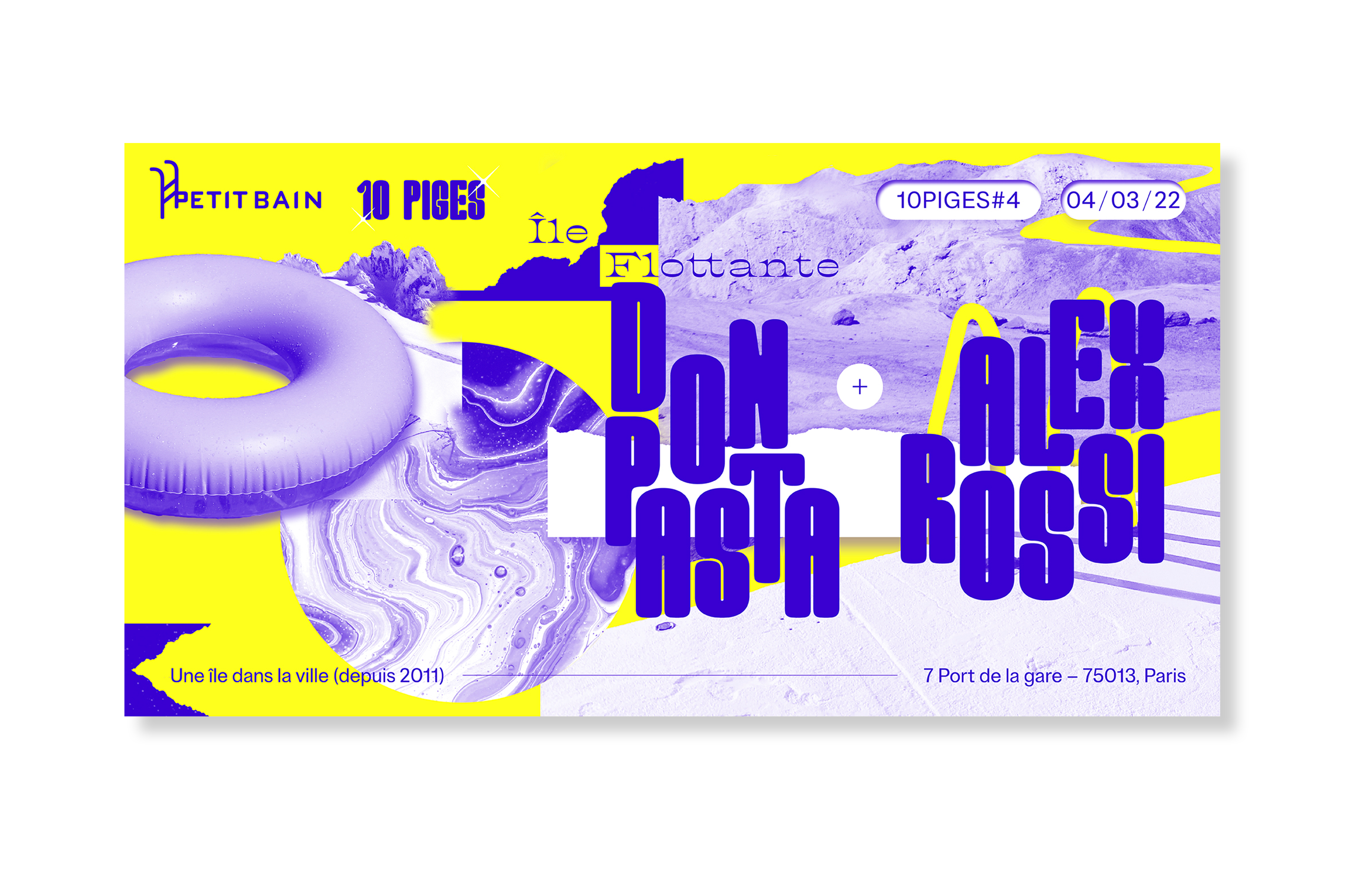
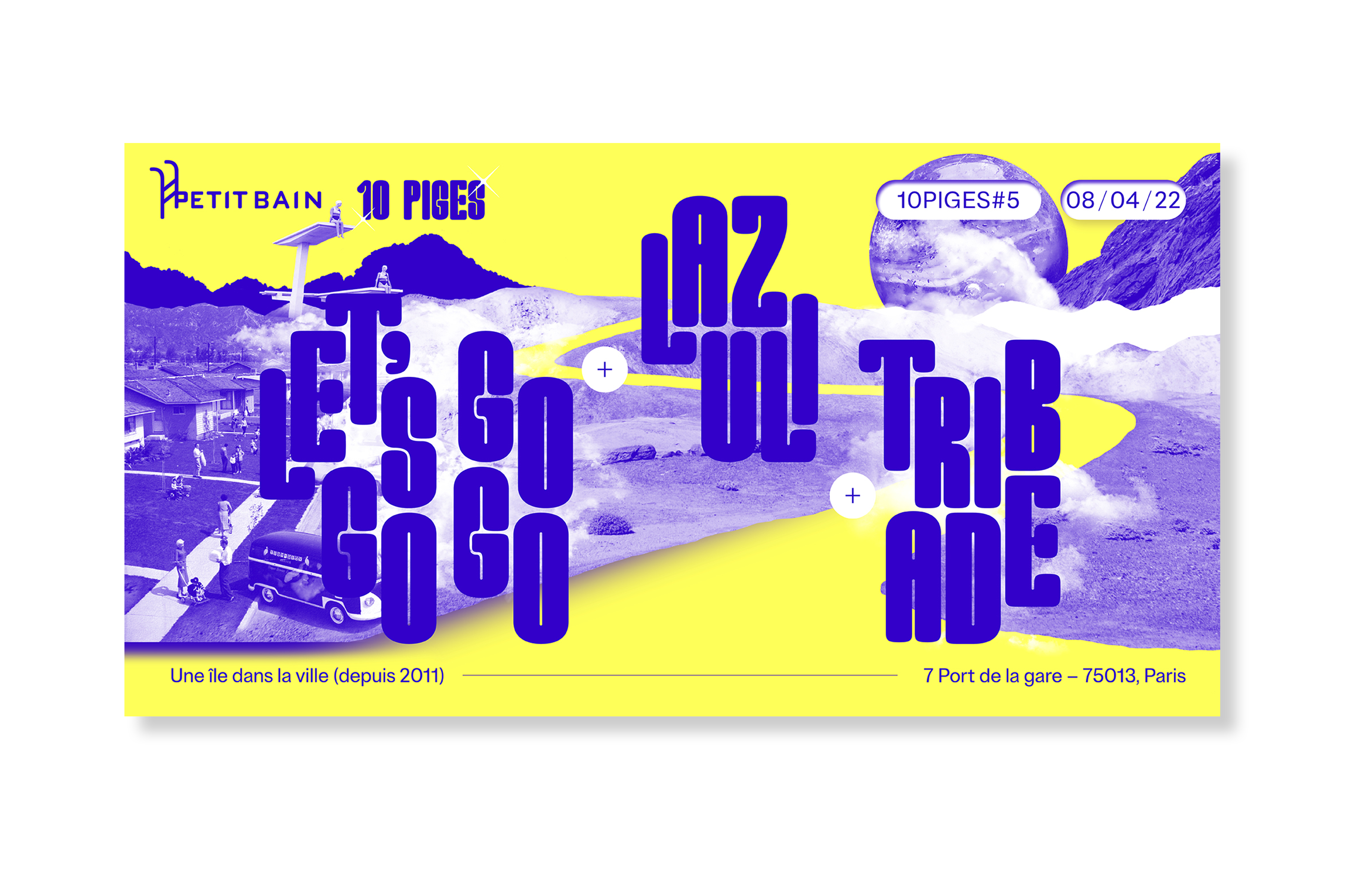
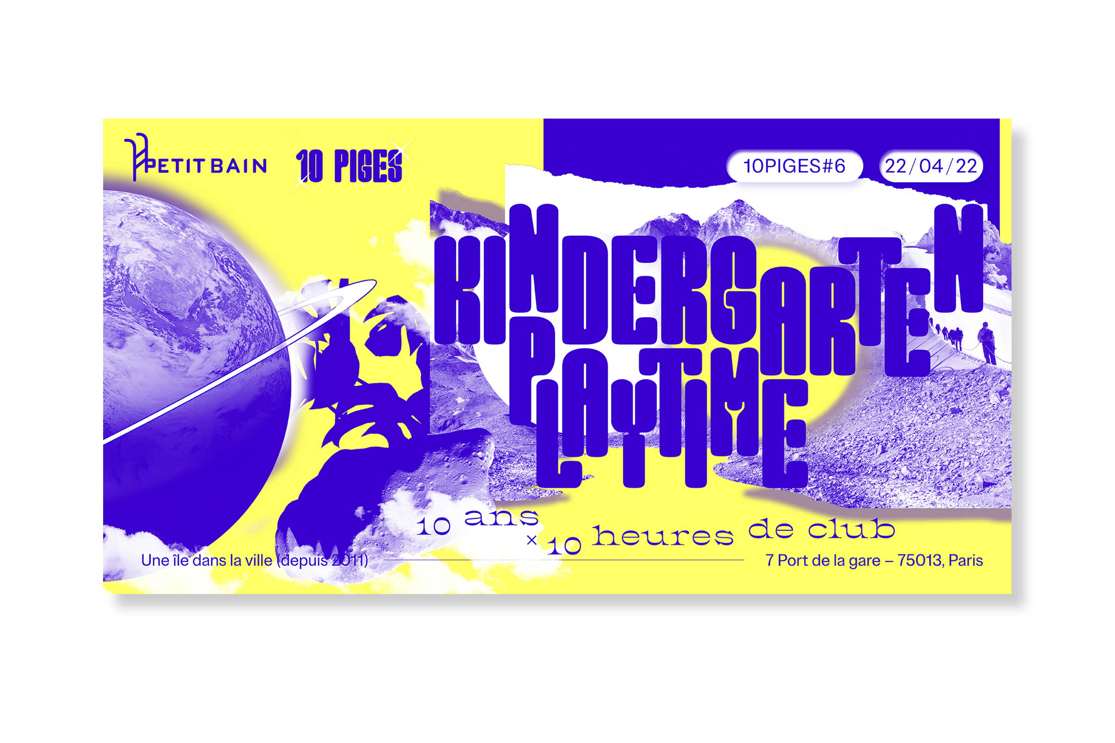
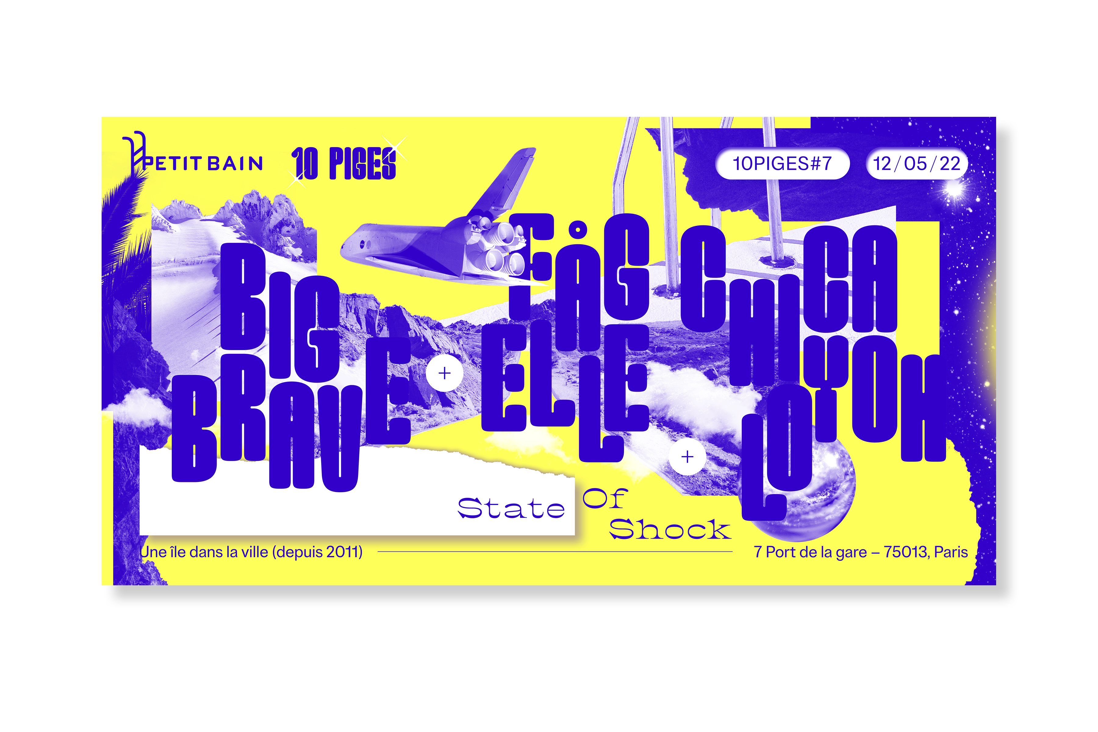
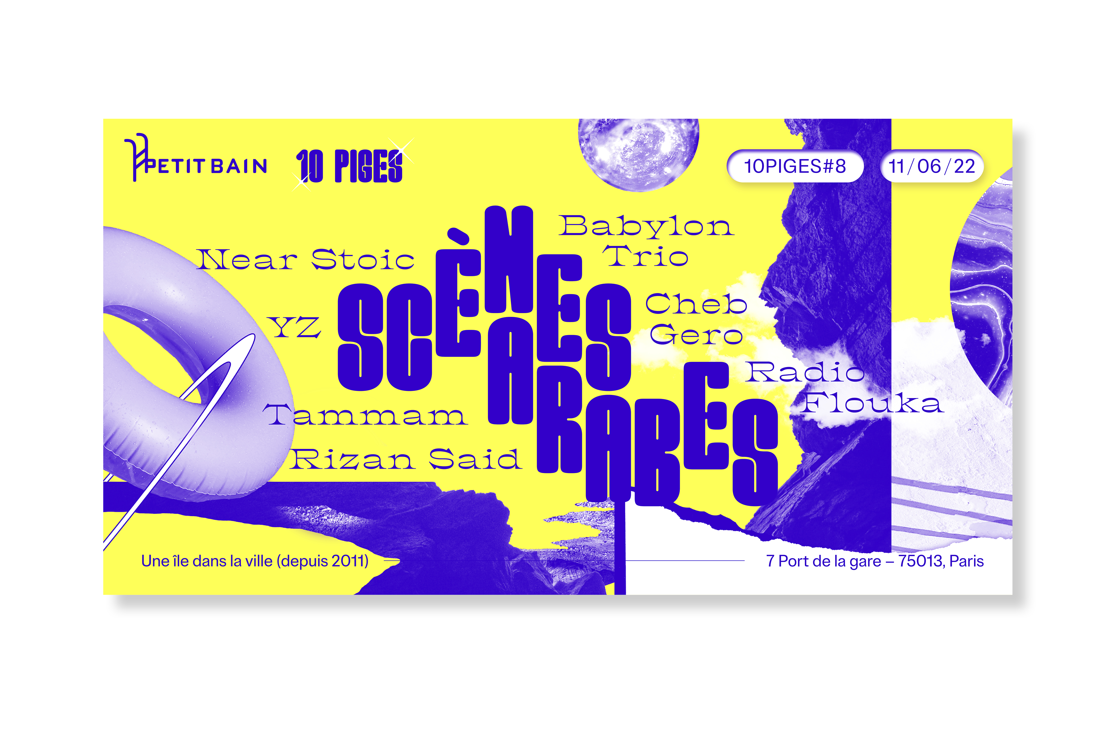
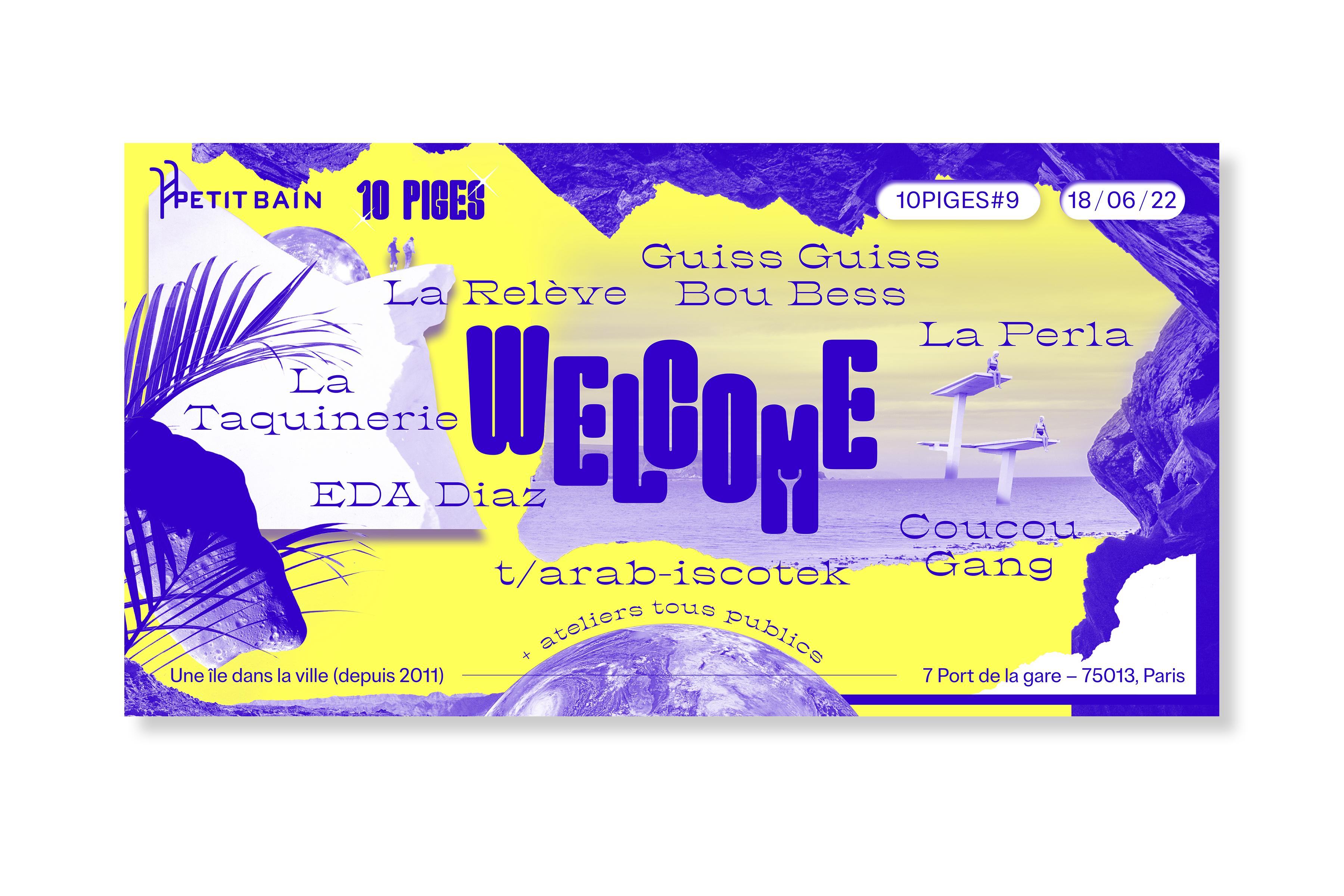
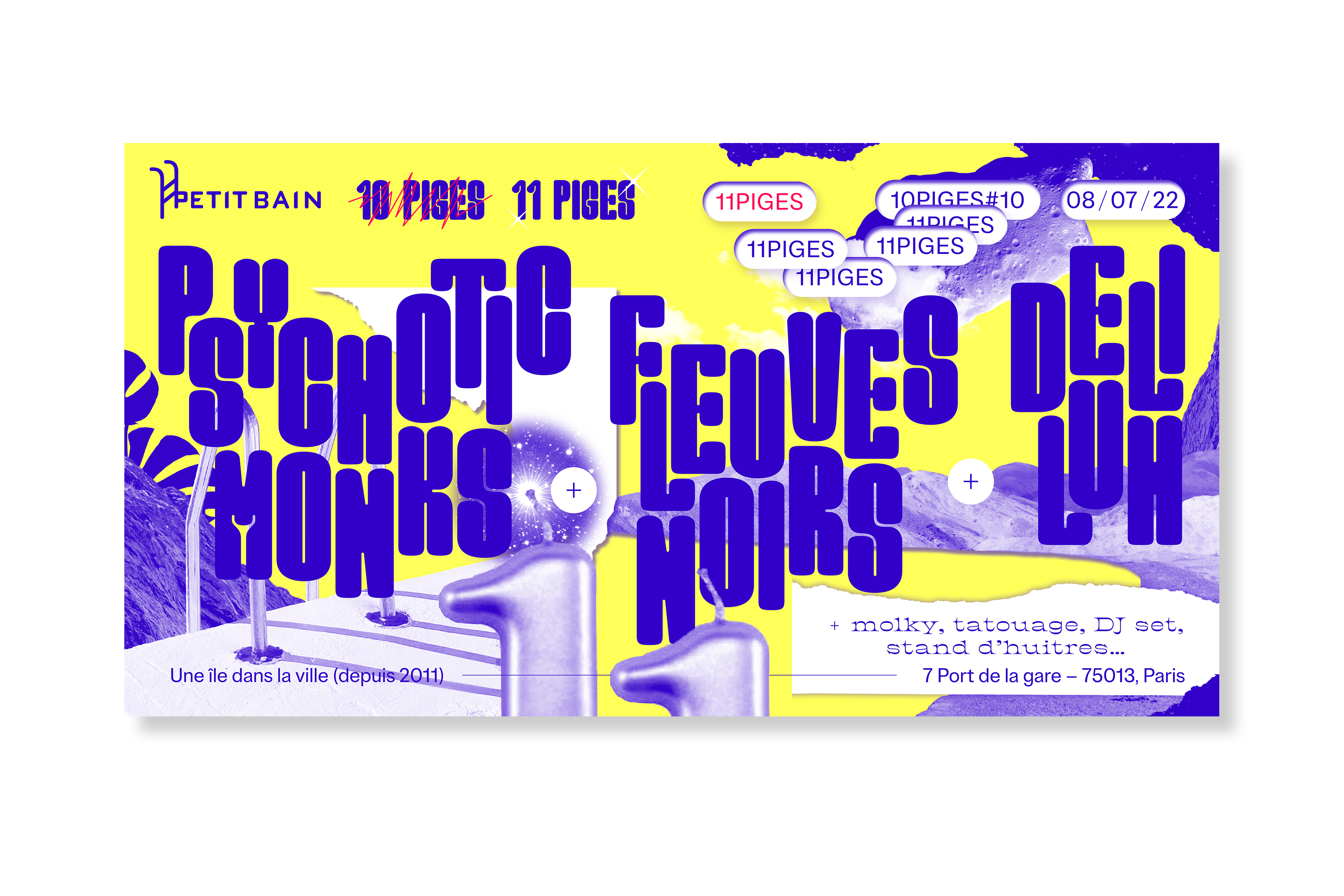
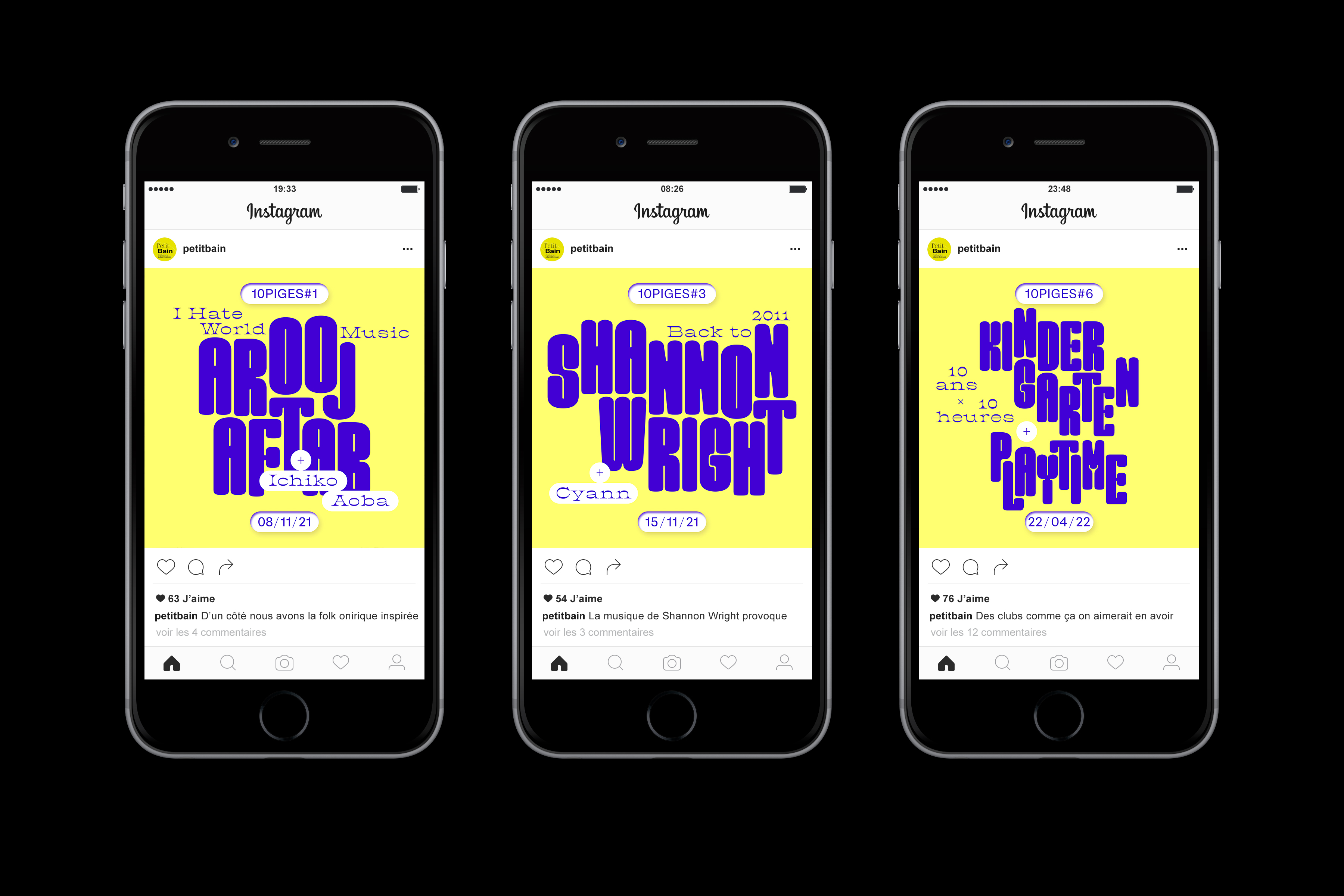
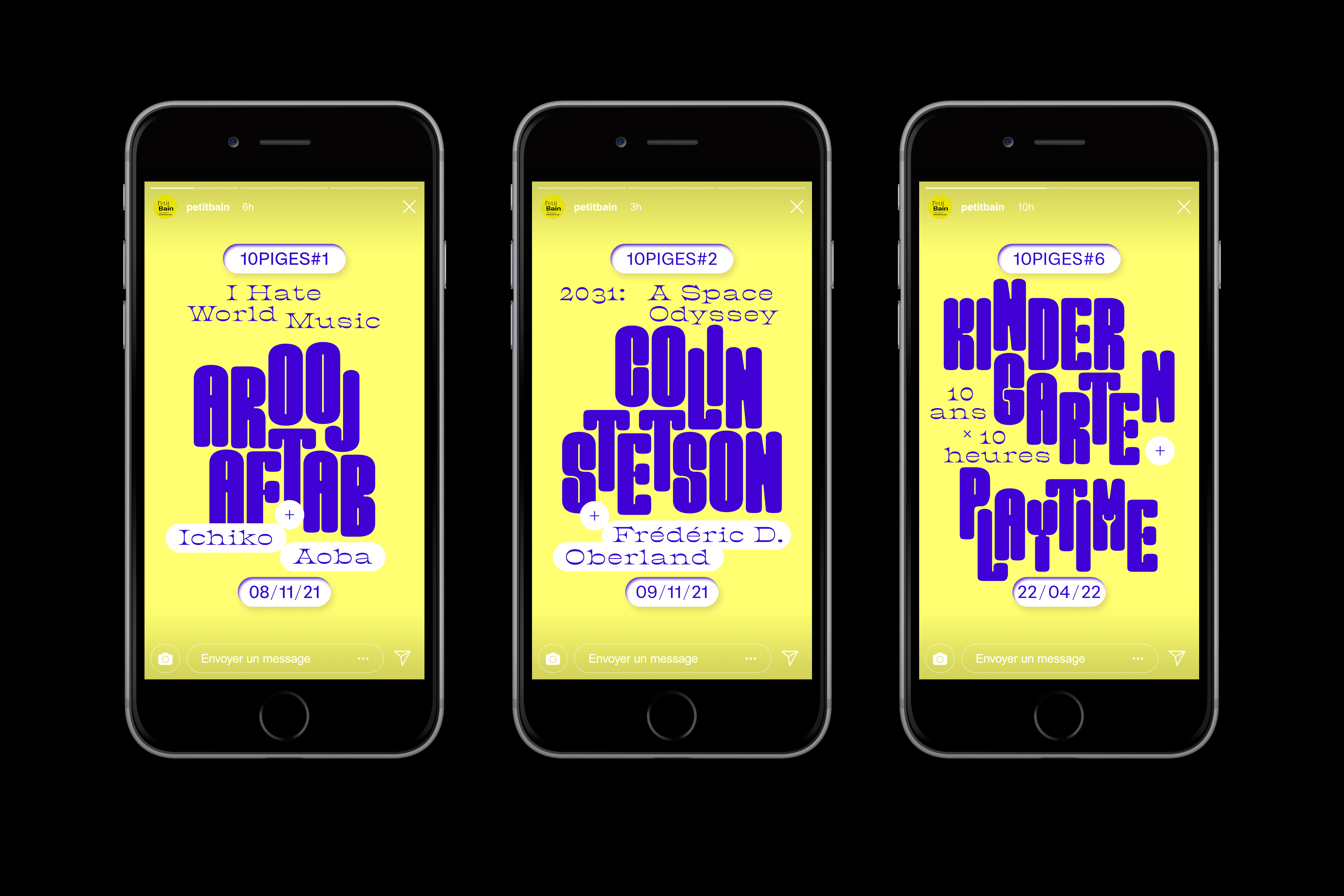
Petit Bain – 10 Piges
Client: Petit Bain | Year: 2021-2022 | identity, poster, social medias
Global visual identity designed for the 10th anniversary of the concert venue Petit Bain in Paris. The identity is built around a key visual from which the 10 concert events – taking place all year round – are declined.
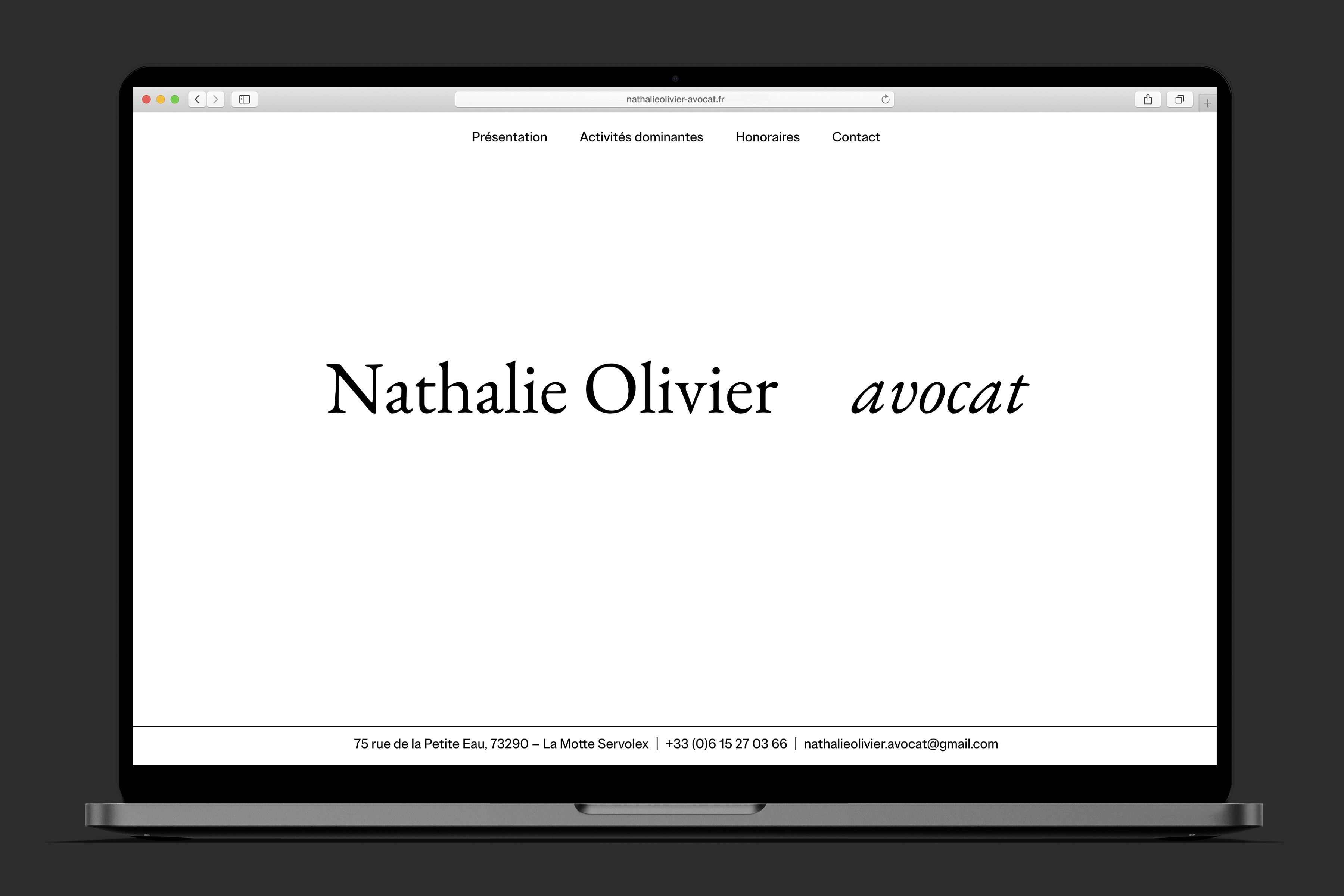
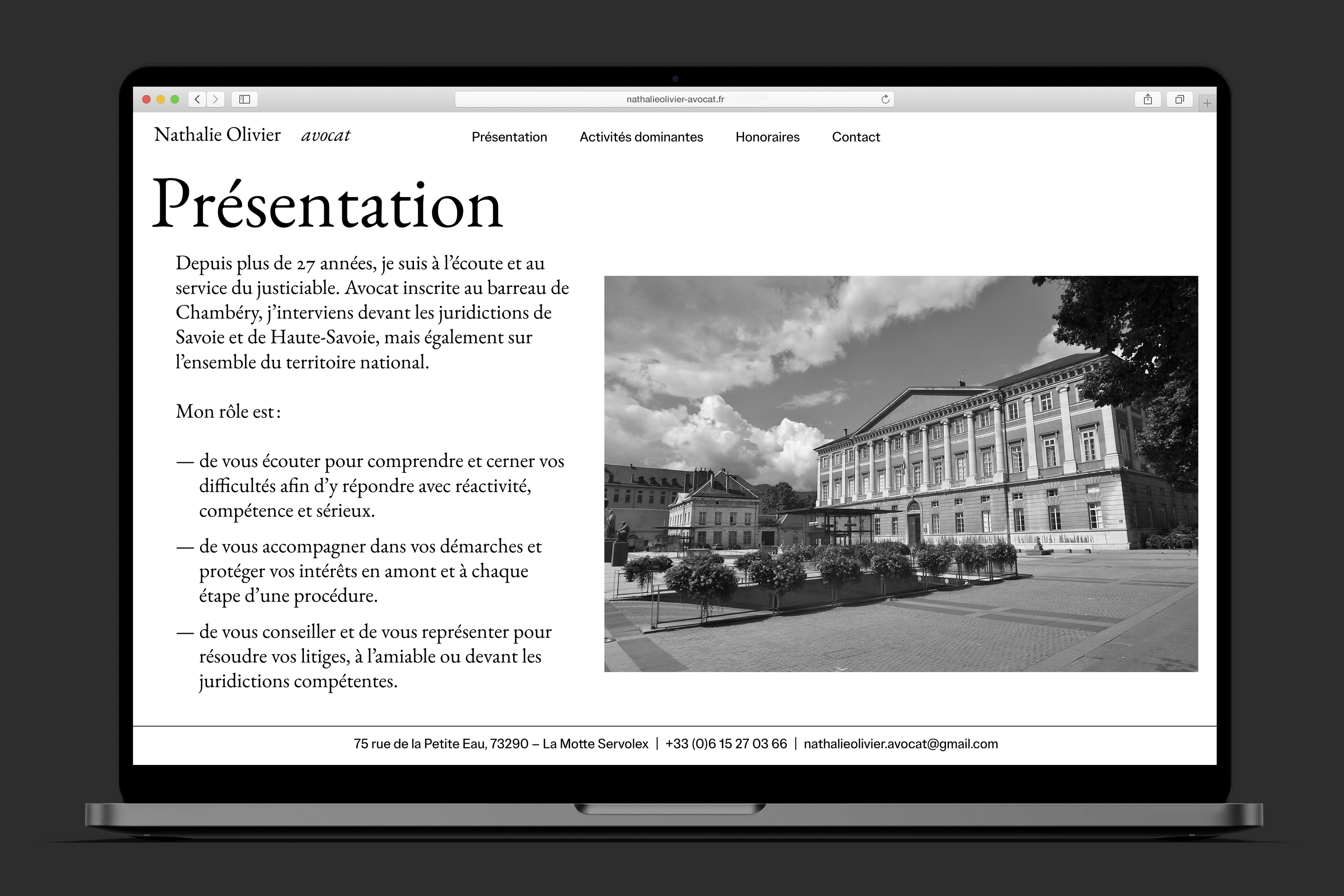
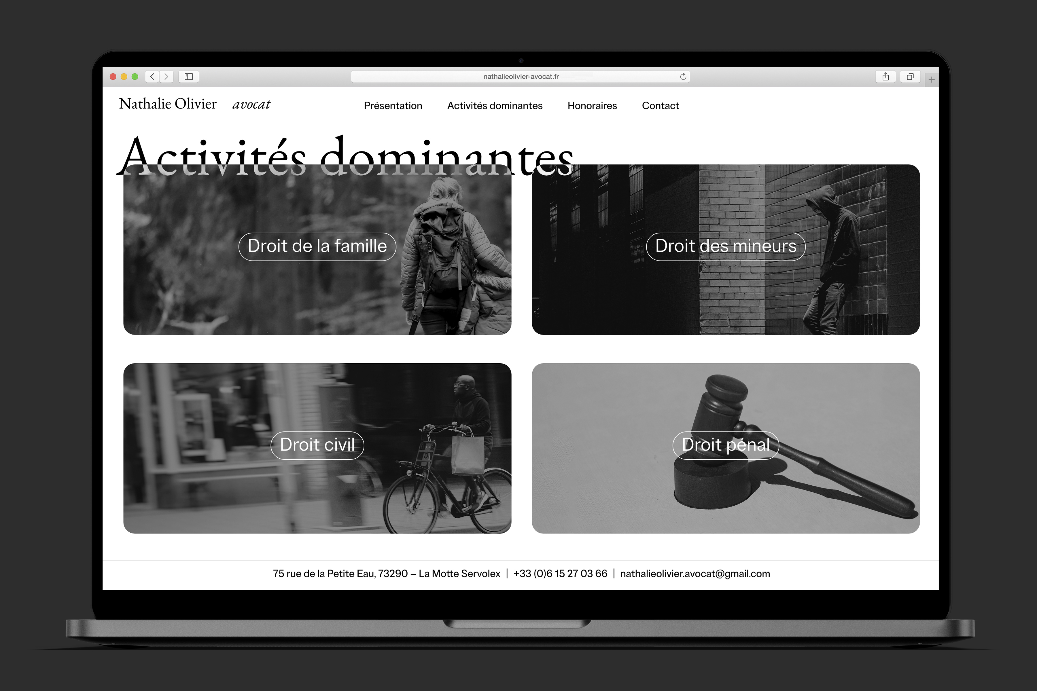
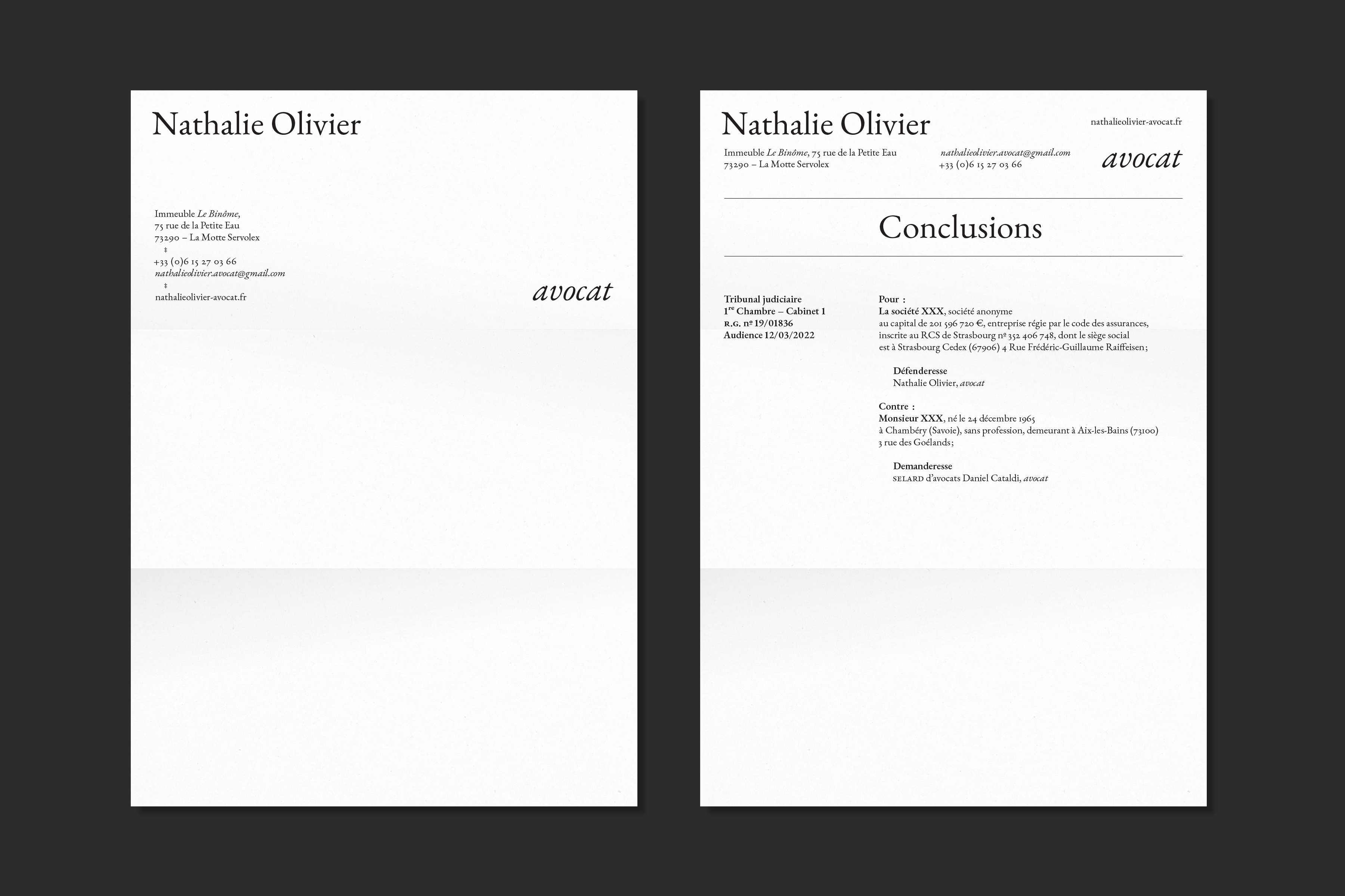
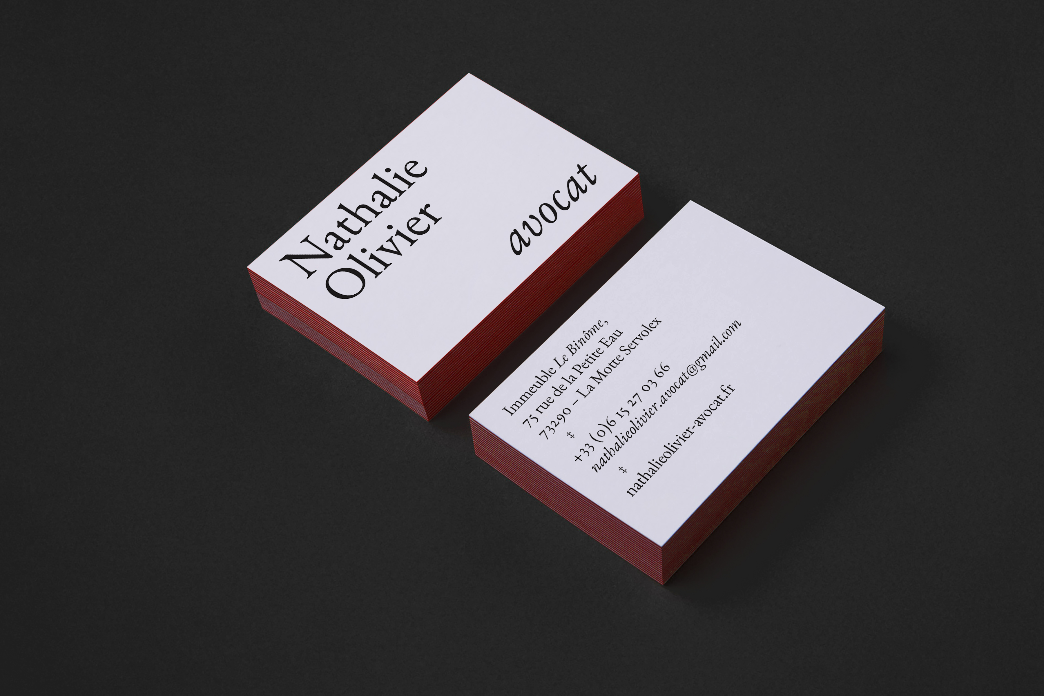
Nathalie Olivier – Avocat
Client: Nathalie Olivier | Year: 2022 | visual identity, website, signage
Visual identity and website design for a lawyer in Chambéry, France.

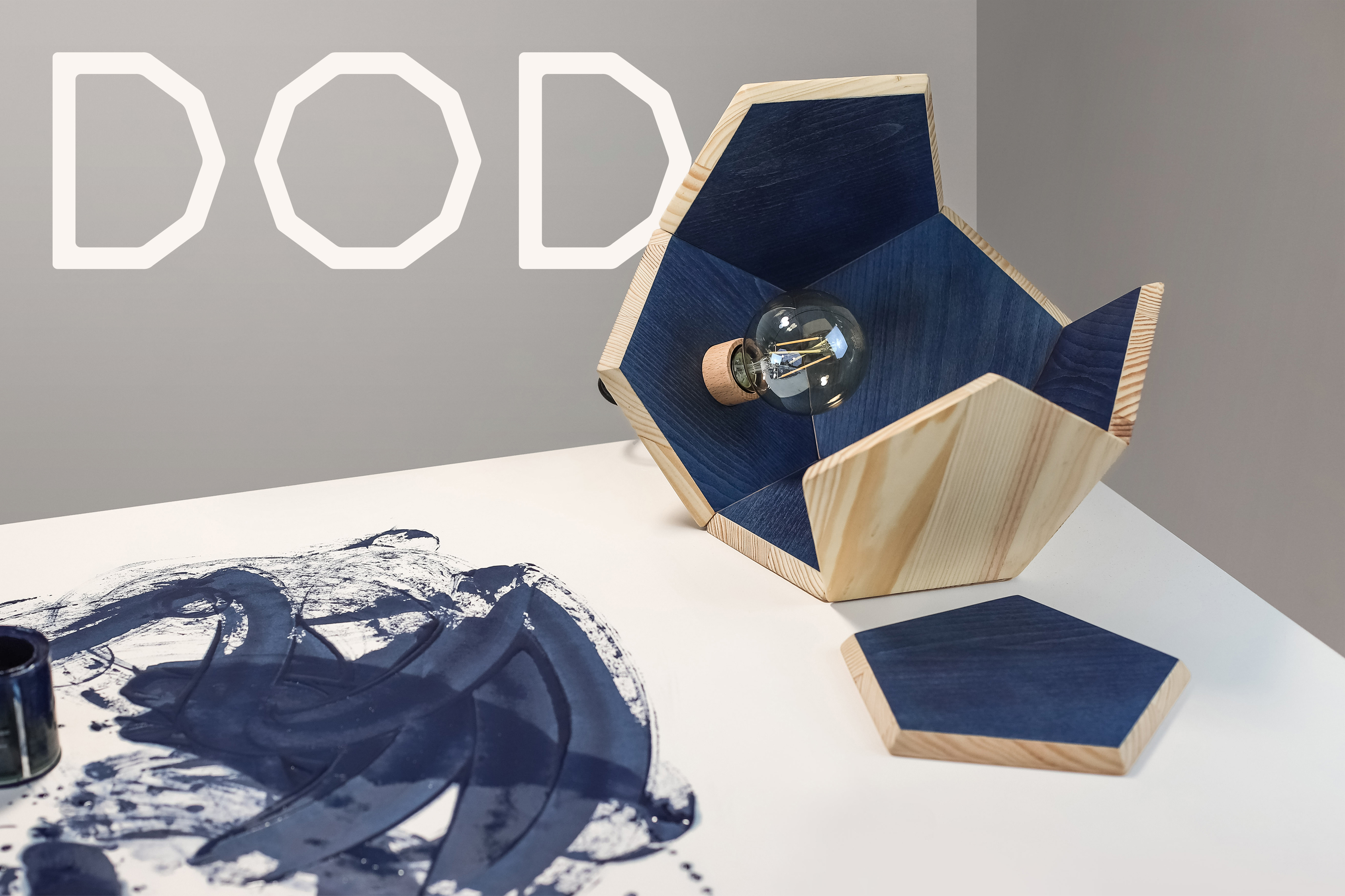
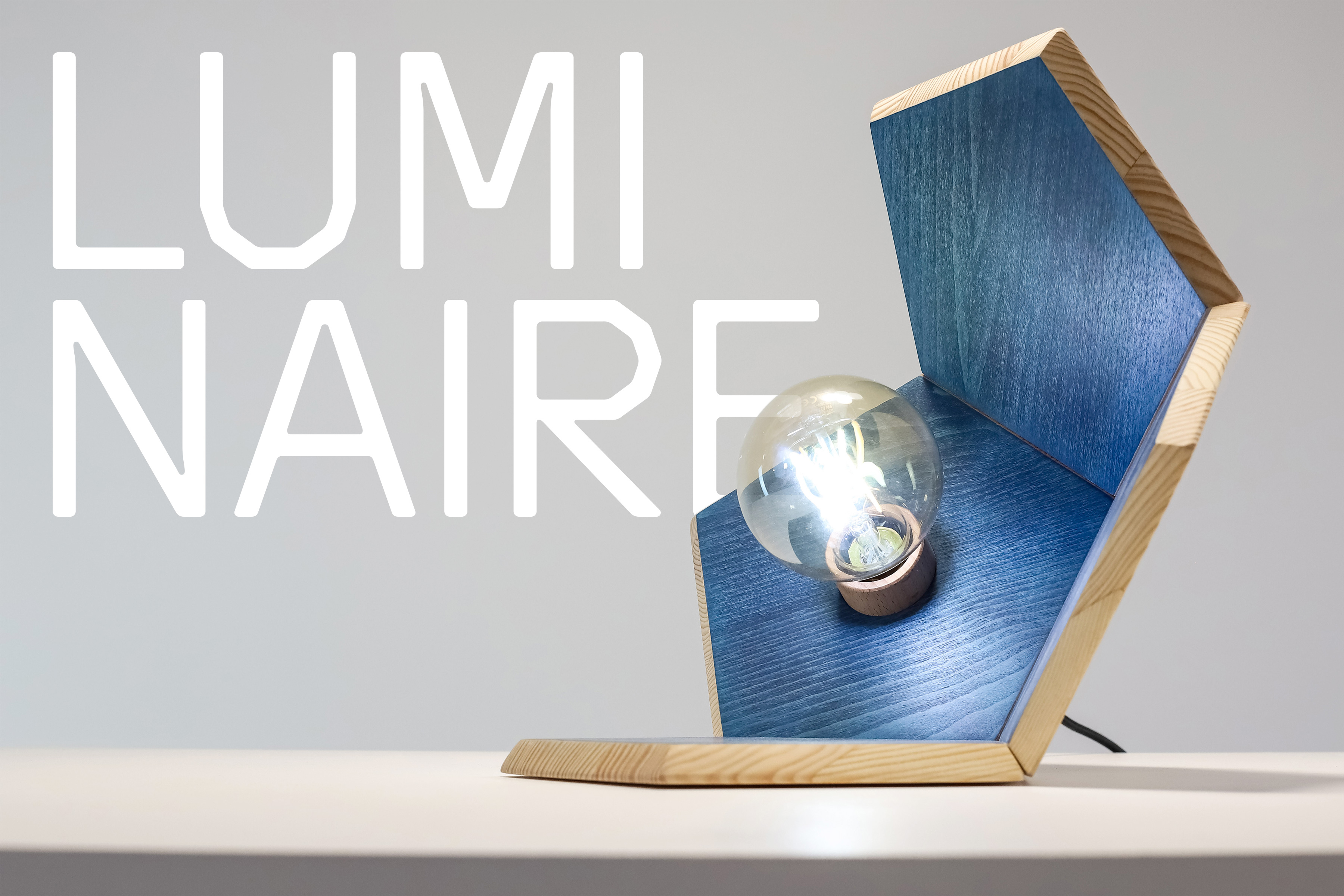


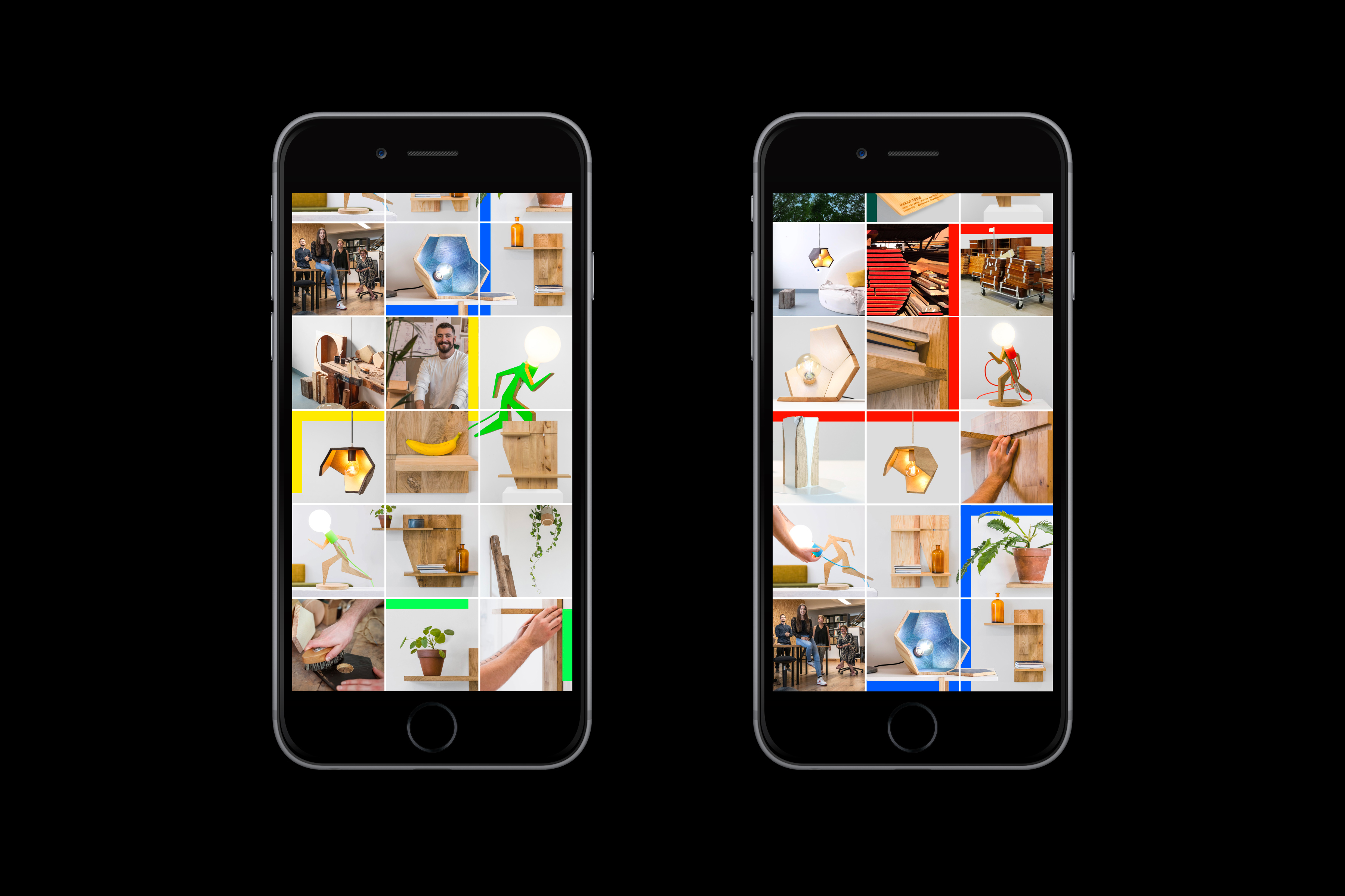
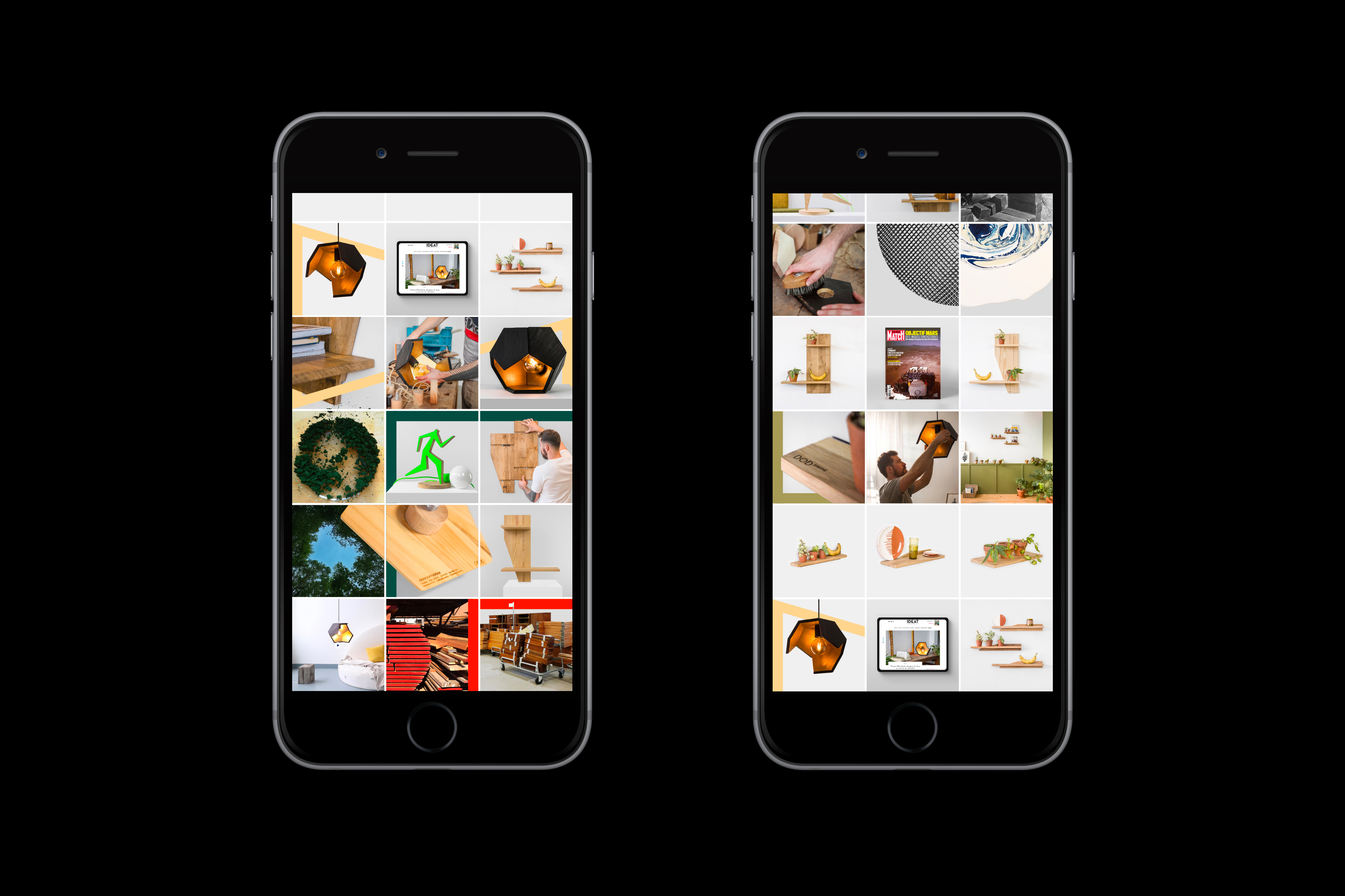
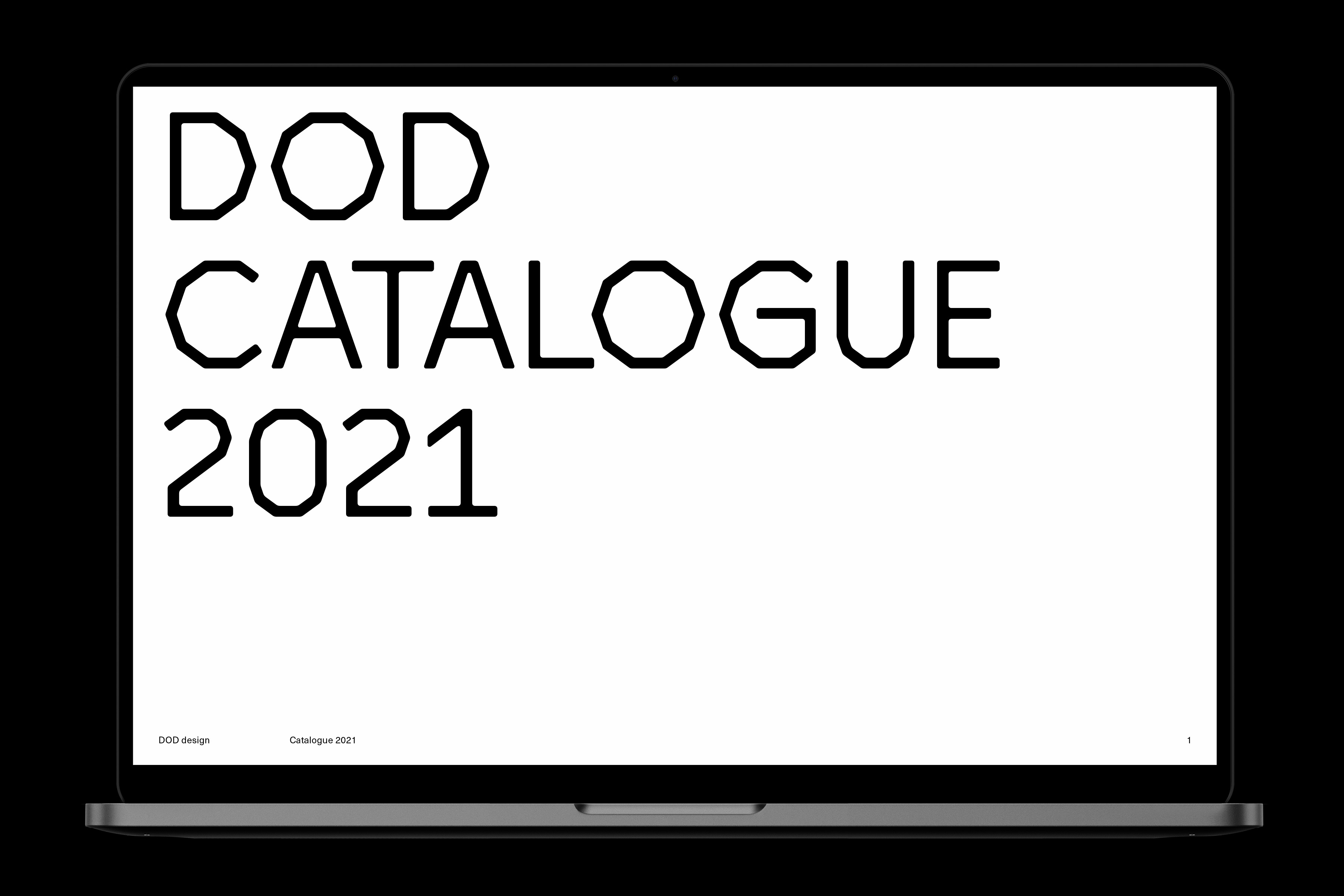
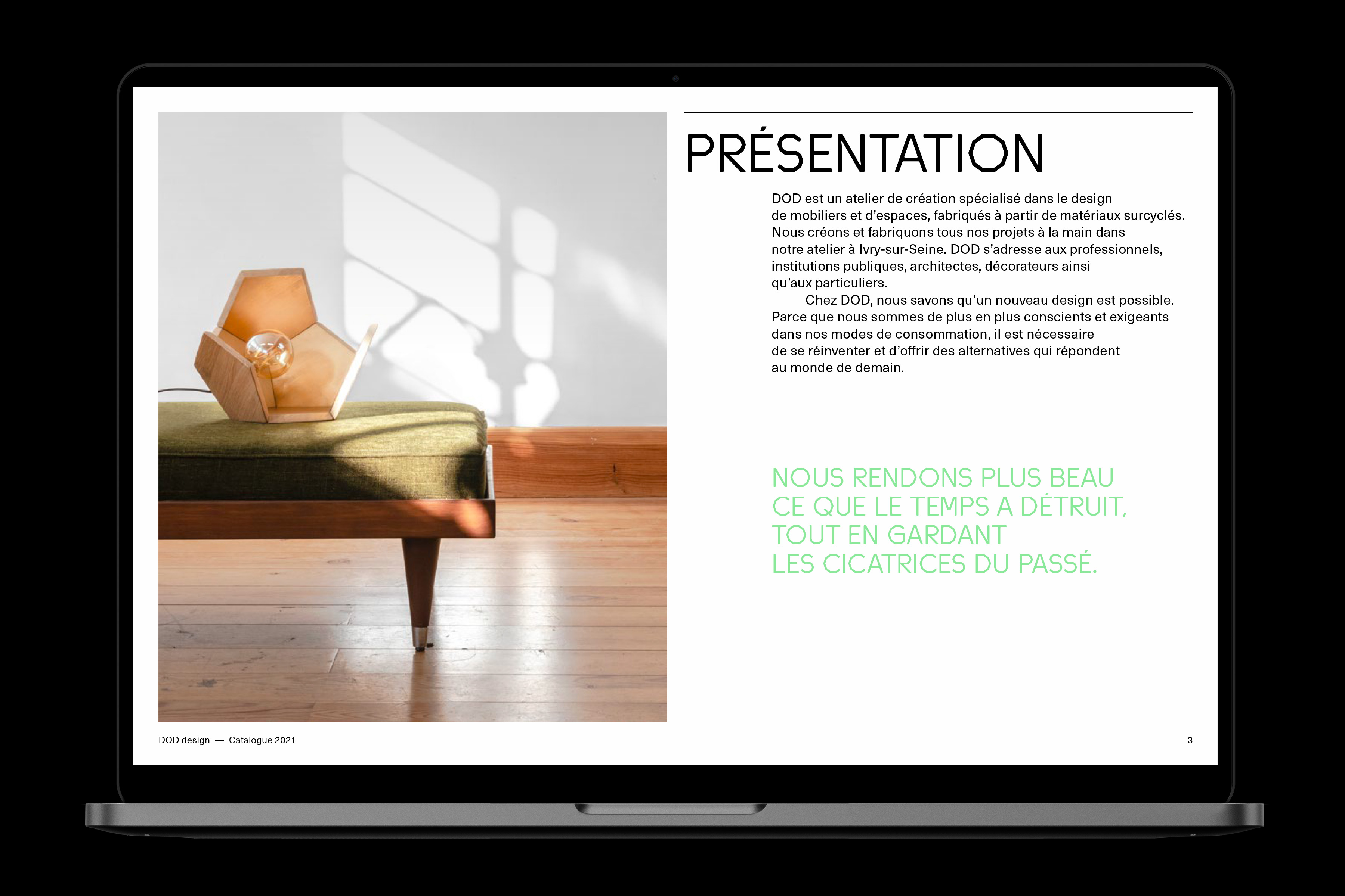
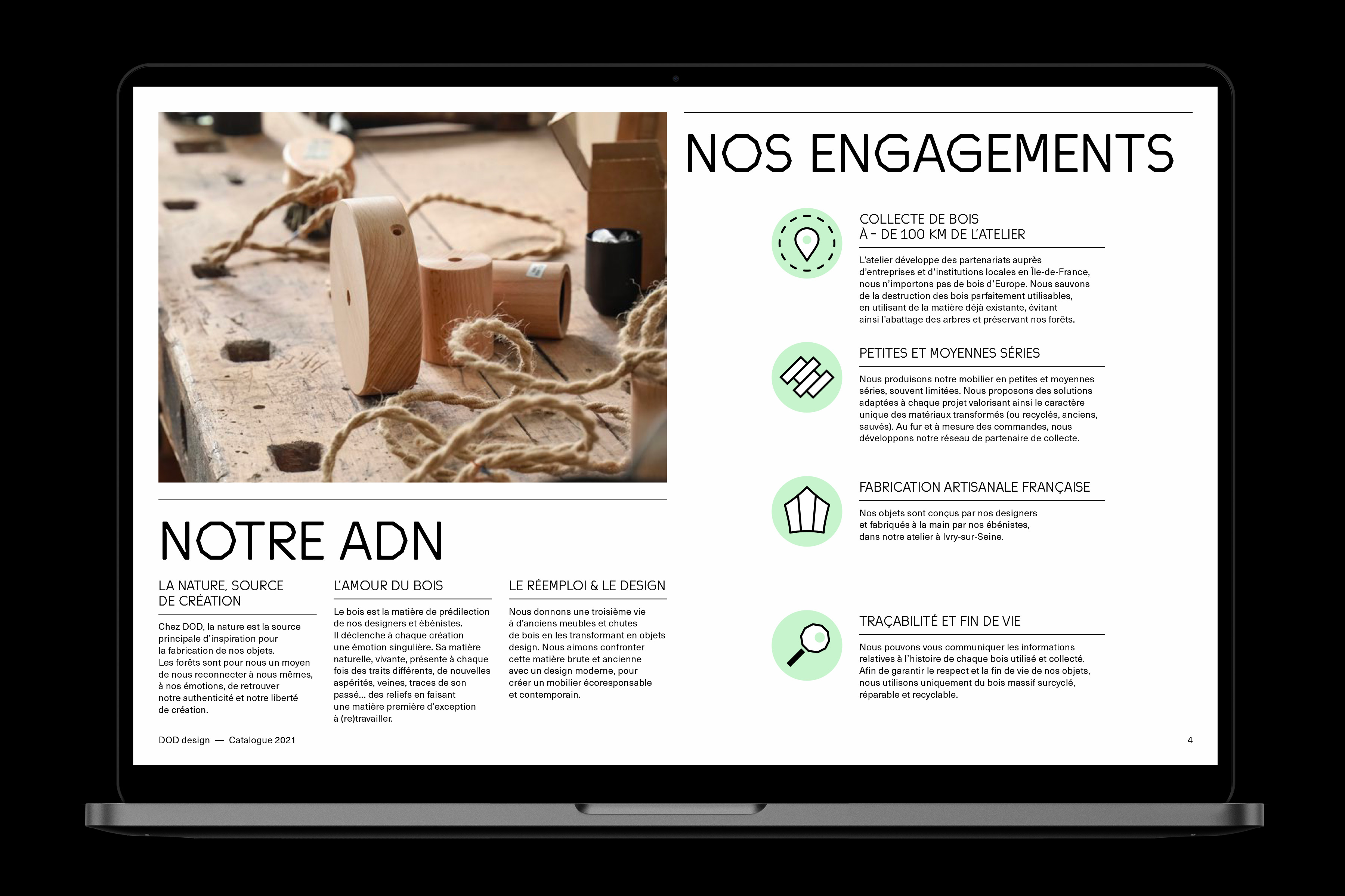
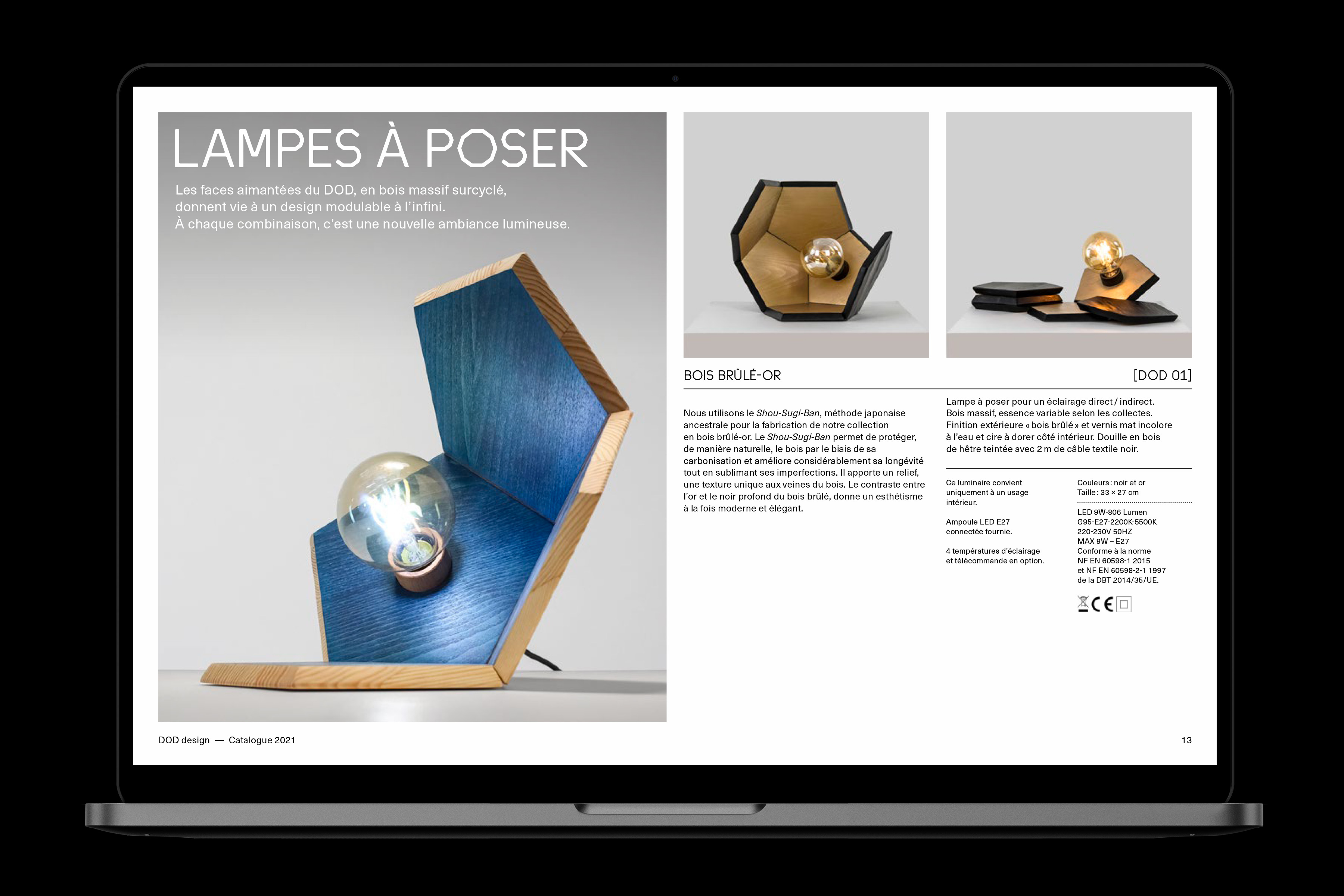
DOD Objets
Client: DOD Objets | Year: 2018-2021 | identity, typeface, catalogue, social medias
DOD is a french design company focused on eco-conceived, recycled wooden objects. Their very first issued product – a ground-breaking, modular, dodecahedron-shaped light – informed the original shape from which we derived the logotype ans all letters of their own custom font. Both monumental and playful, the DOD typeface brings a unique voice to DOD’s identity, encapsulating their spirit and values.

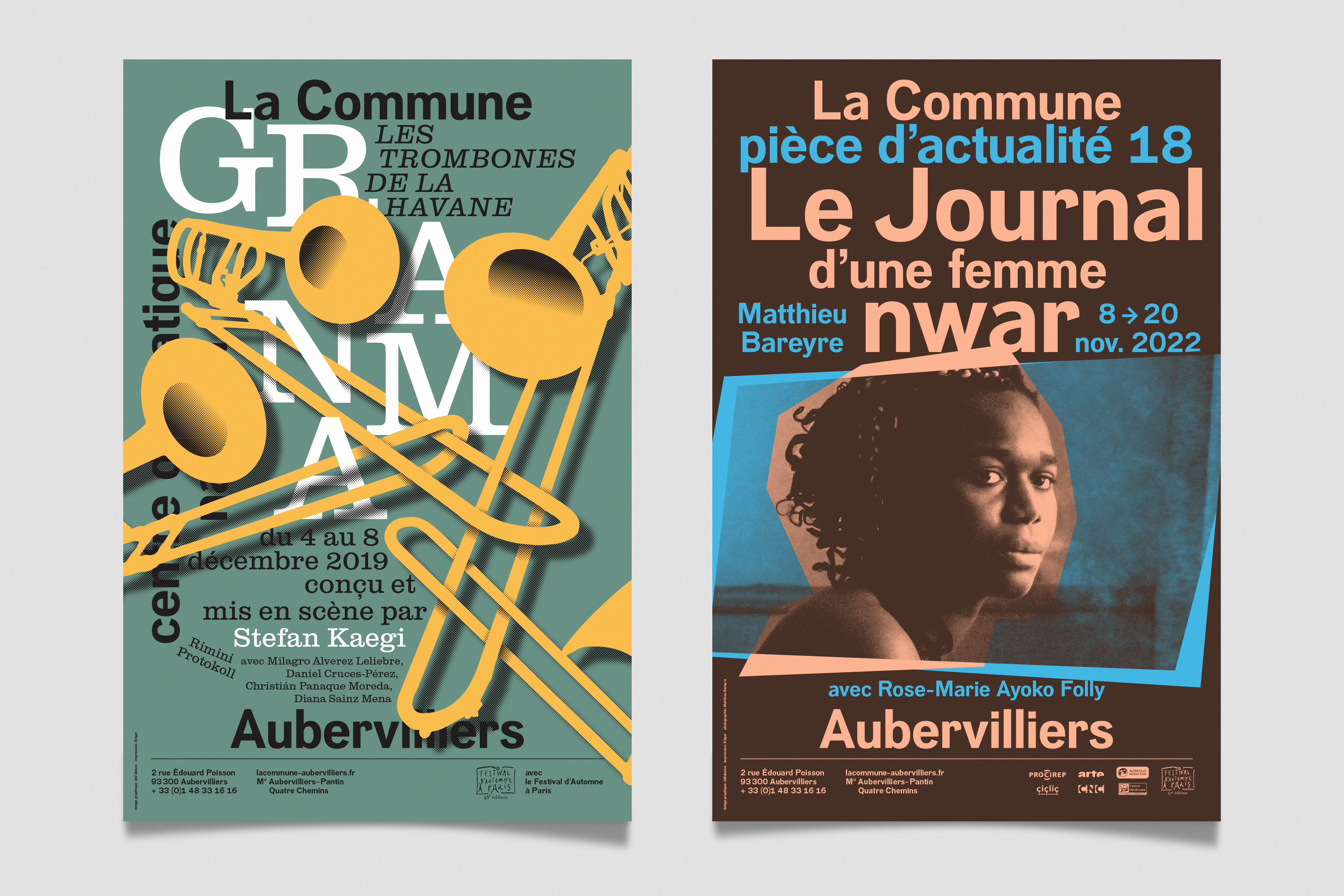
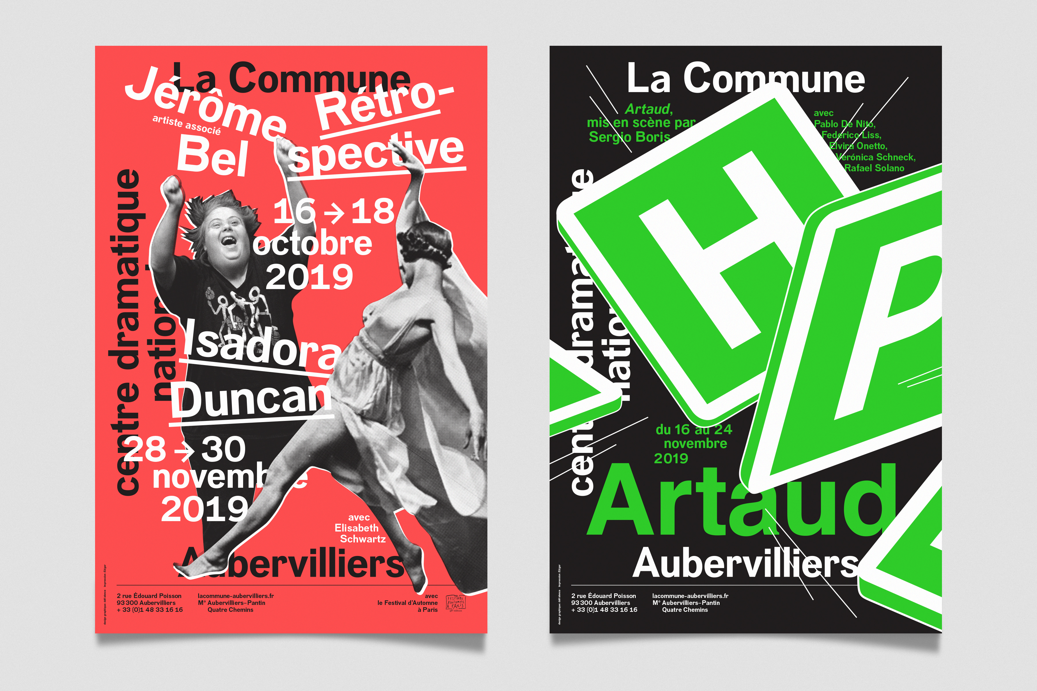
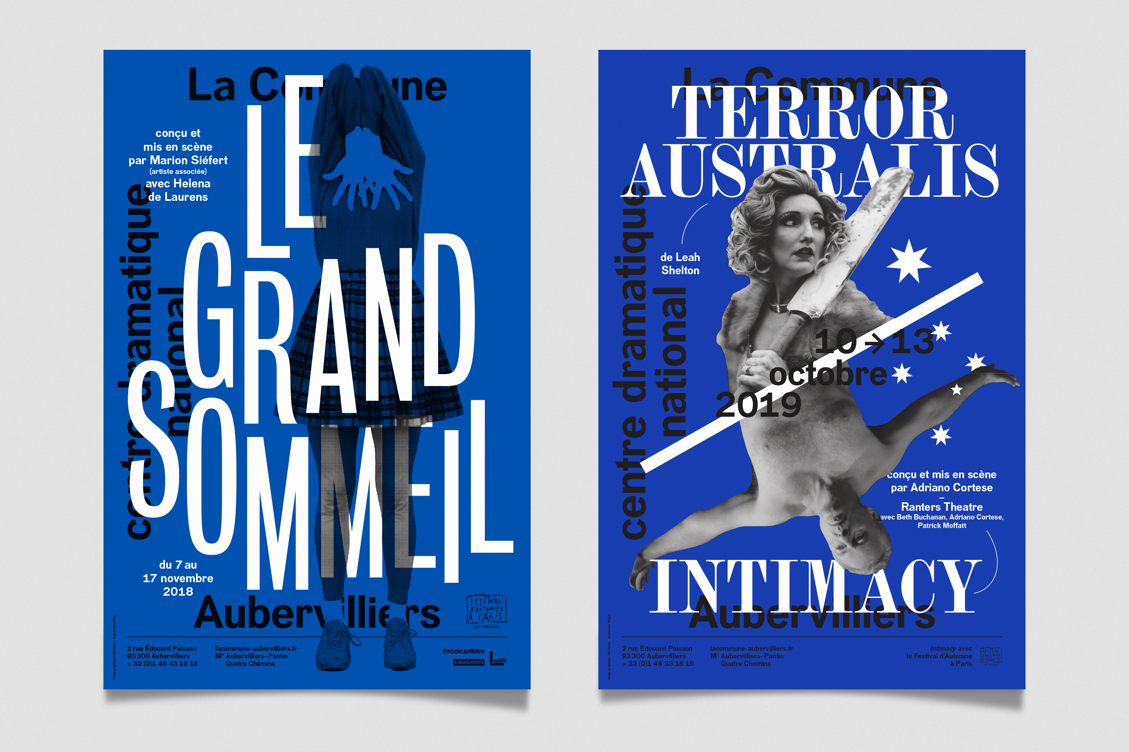
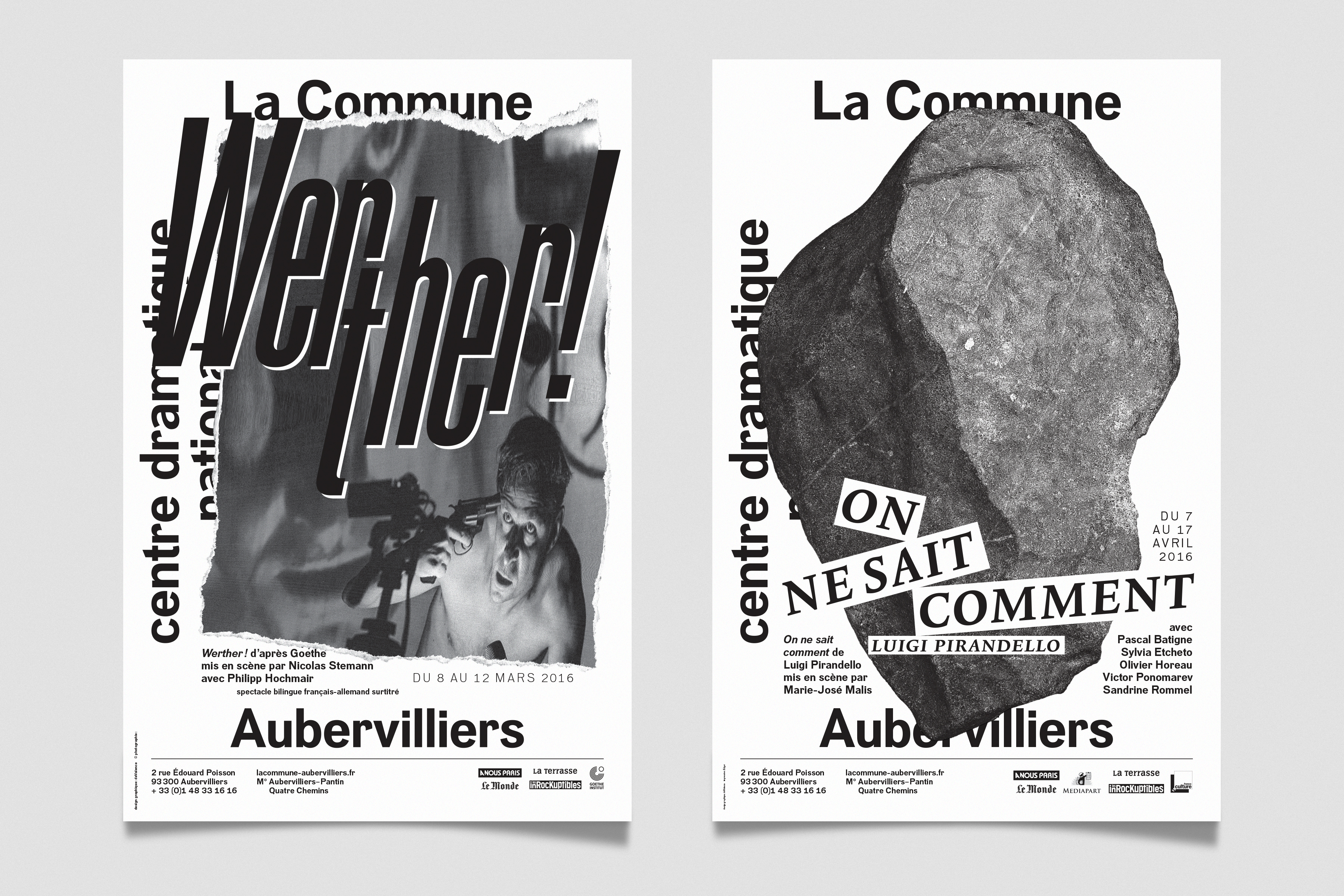
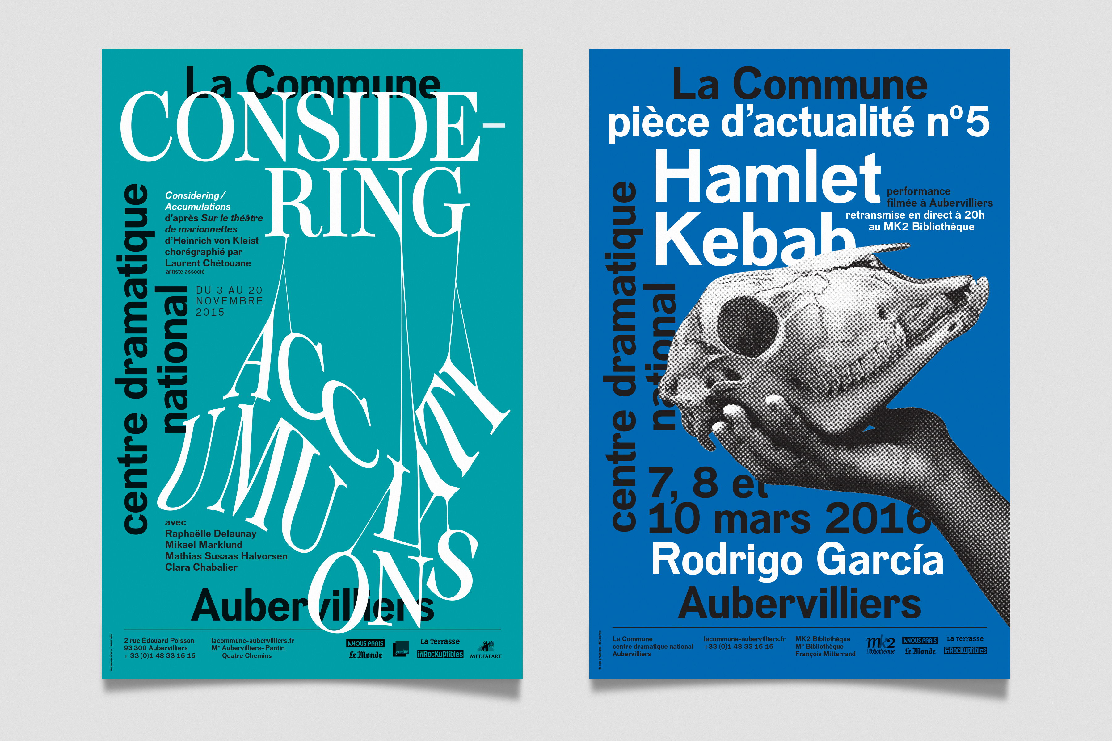
La Commune – Posters
Client: La Commune | Years: 2015-2022 | posters | In collaboration with studio deValence
Posters for La Commune, national art center for theatre in Aubervilliers. Since 2014, studio deValence has been in charge of the theatre’s visual communication. I had the pleasure and opportunity to work with them on several posters over the years.
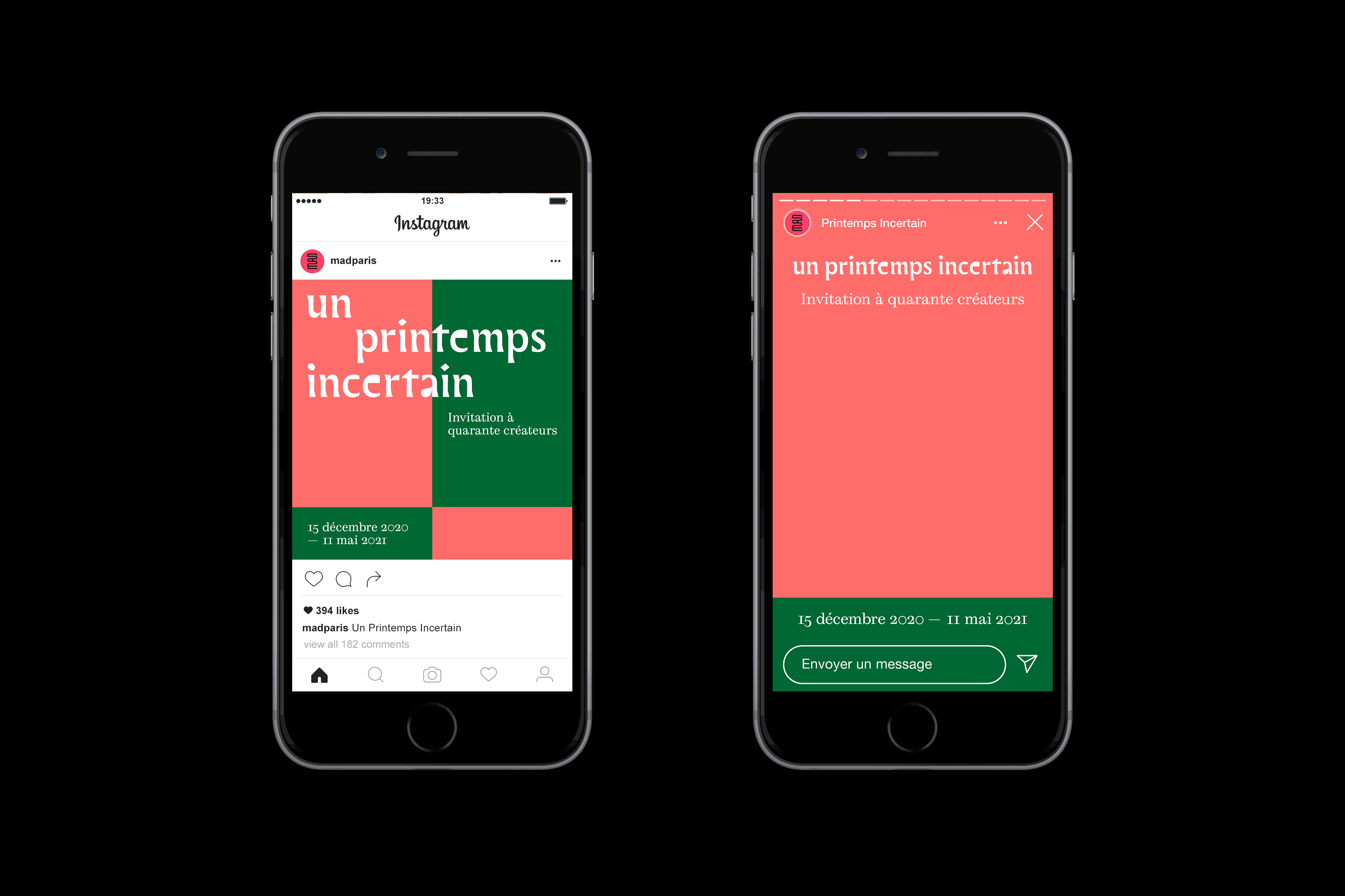
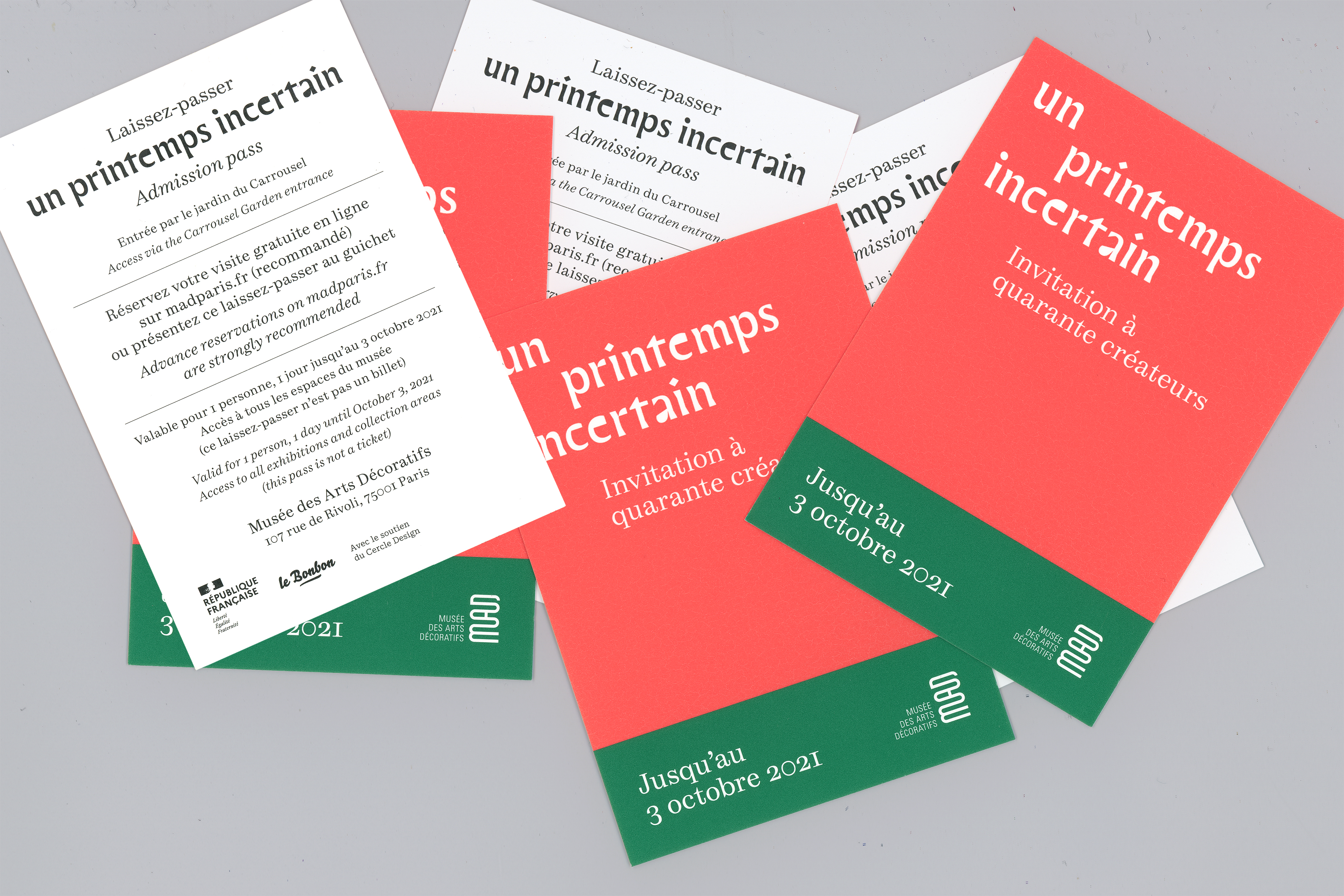
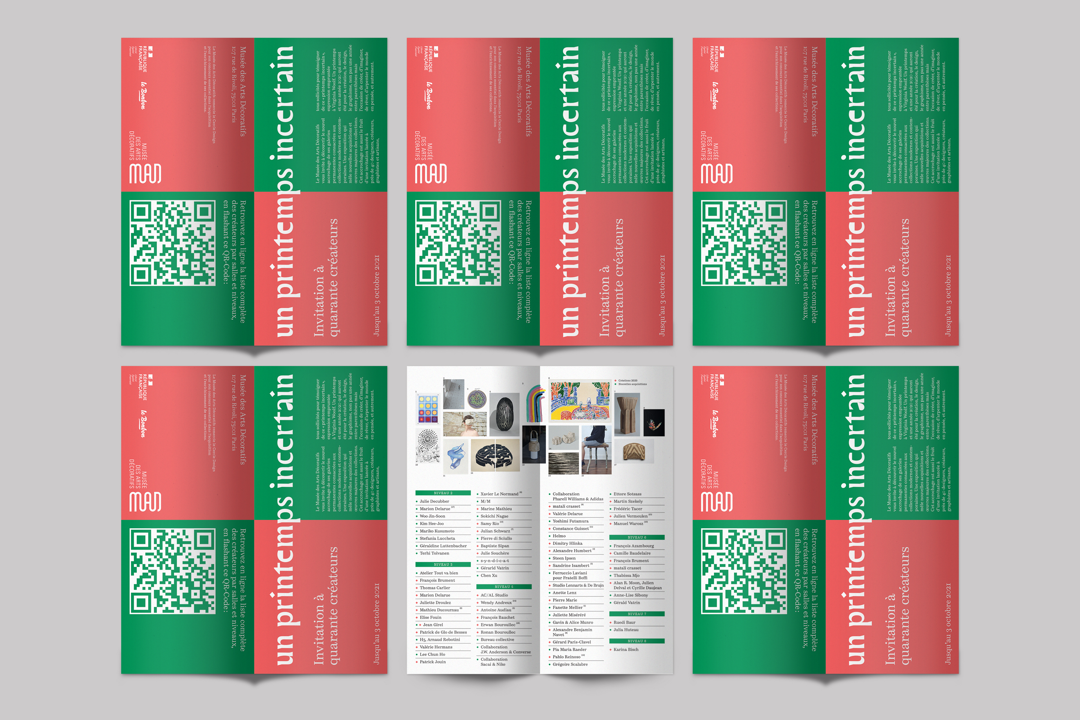
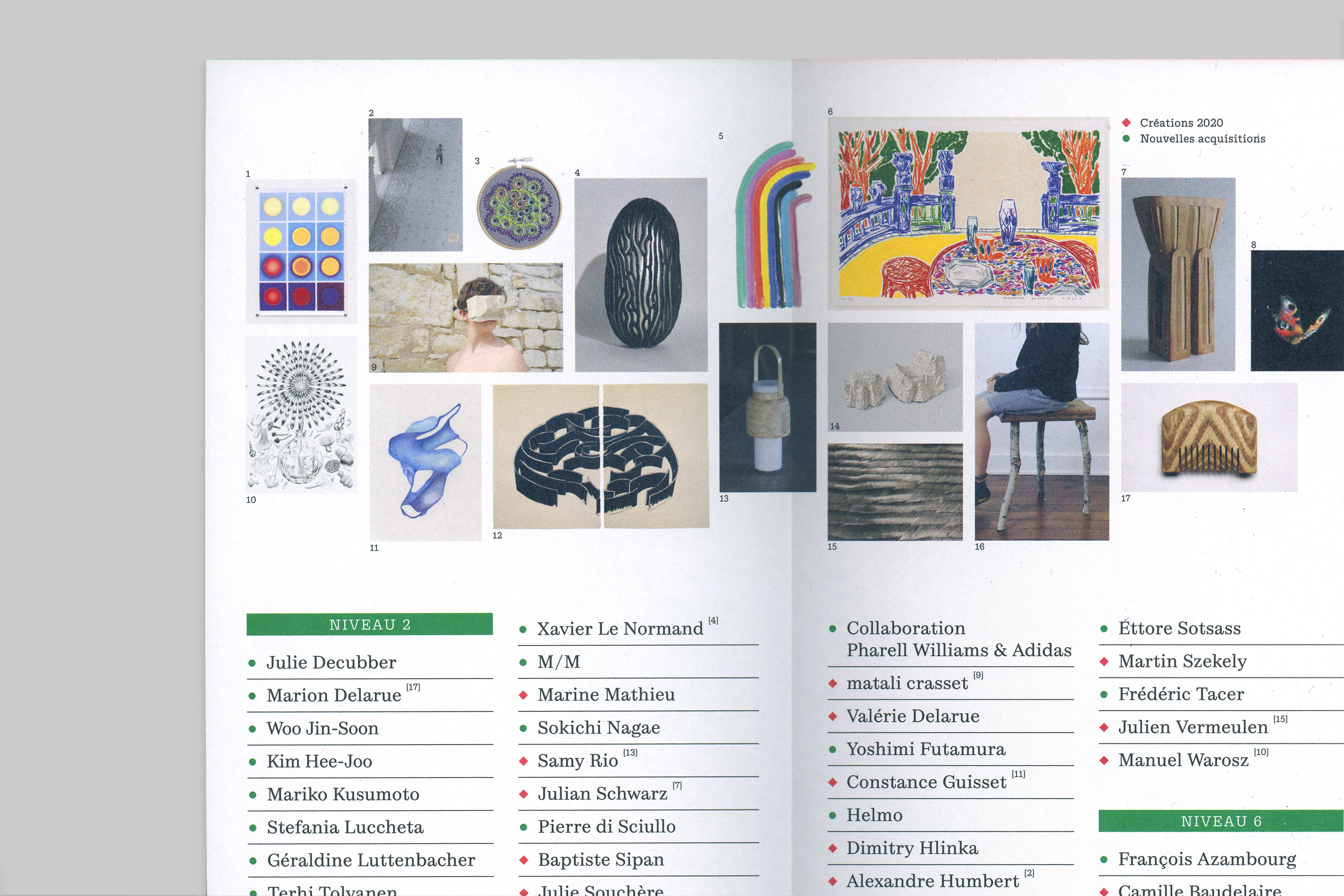
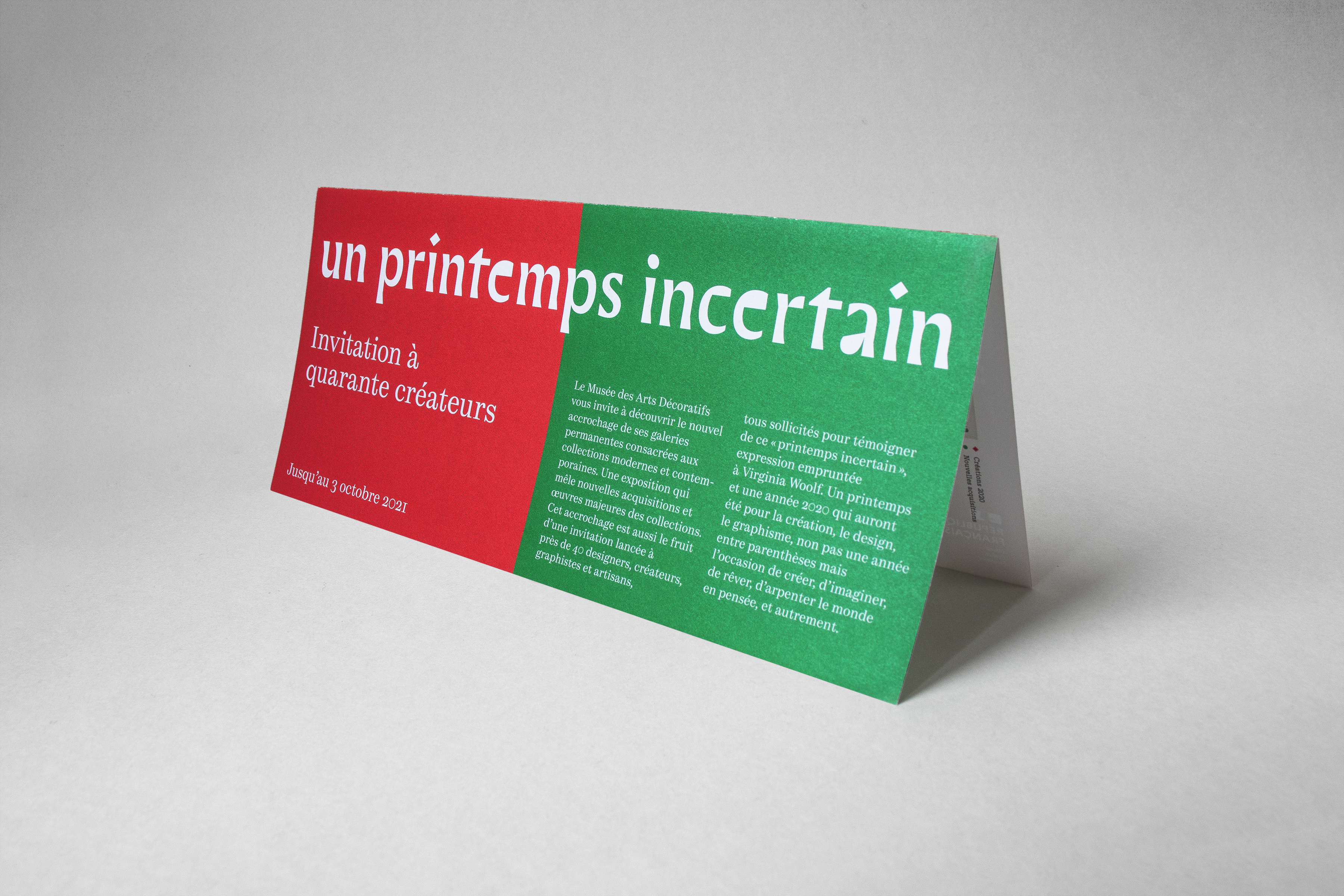
MAD Paris – Un Printemps Incertain
Client: MAD Paris | Year: 2021 | leaflet, minisite, pass, poster & communication | In collaboration with Sandrine Nugue
In 2021, Sandrine Nugue worked on the visual identity and signage system of Un Printemps Incertain, an exhibition offering a sensitive glimpse into the intimacy that marked the confined spring and autumn of 2020. She invited me to collaborate on the communication aspect of the exhibition, handling all the assets for social networks, some posters and window stickers, admission pass and exhibition leaflet. I also designed and developed a minisite devoted to showcase the exhibited artworks online.

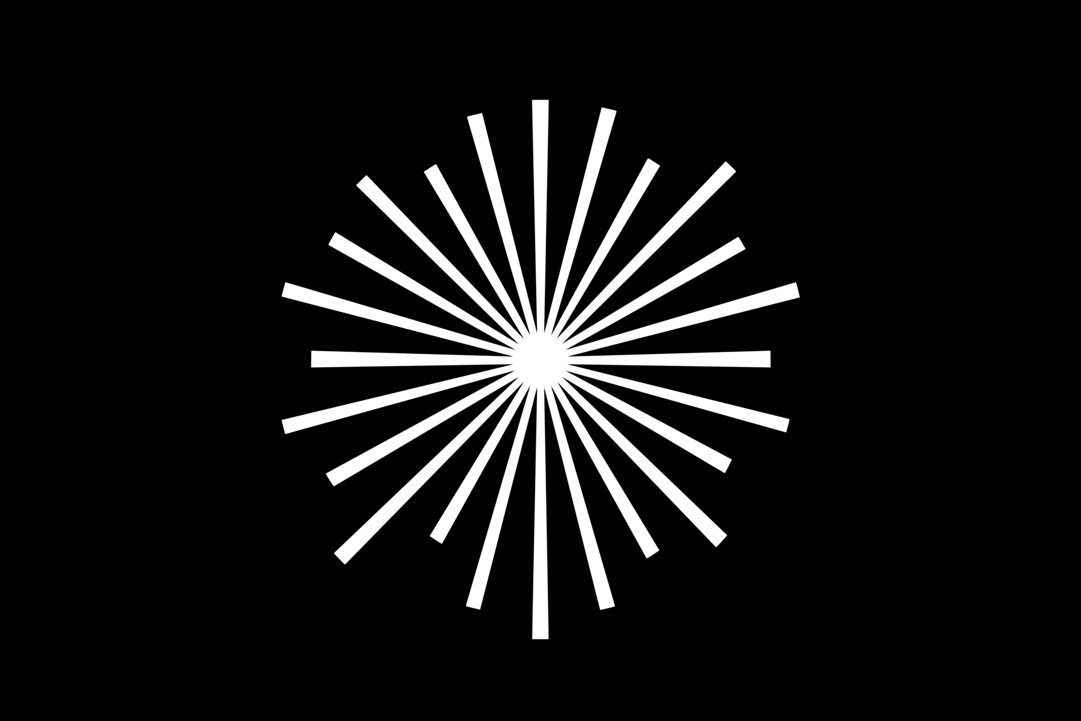
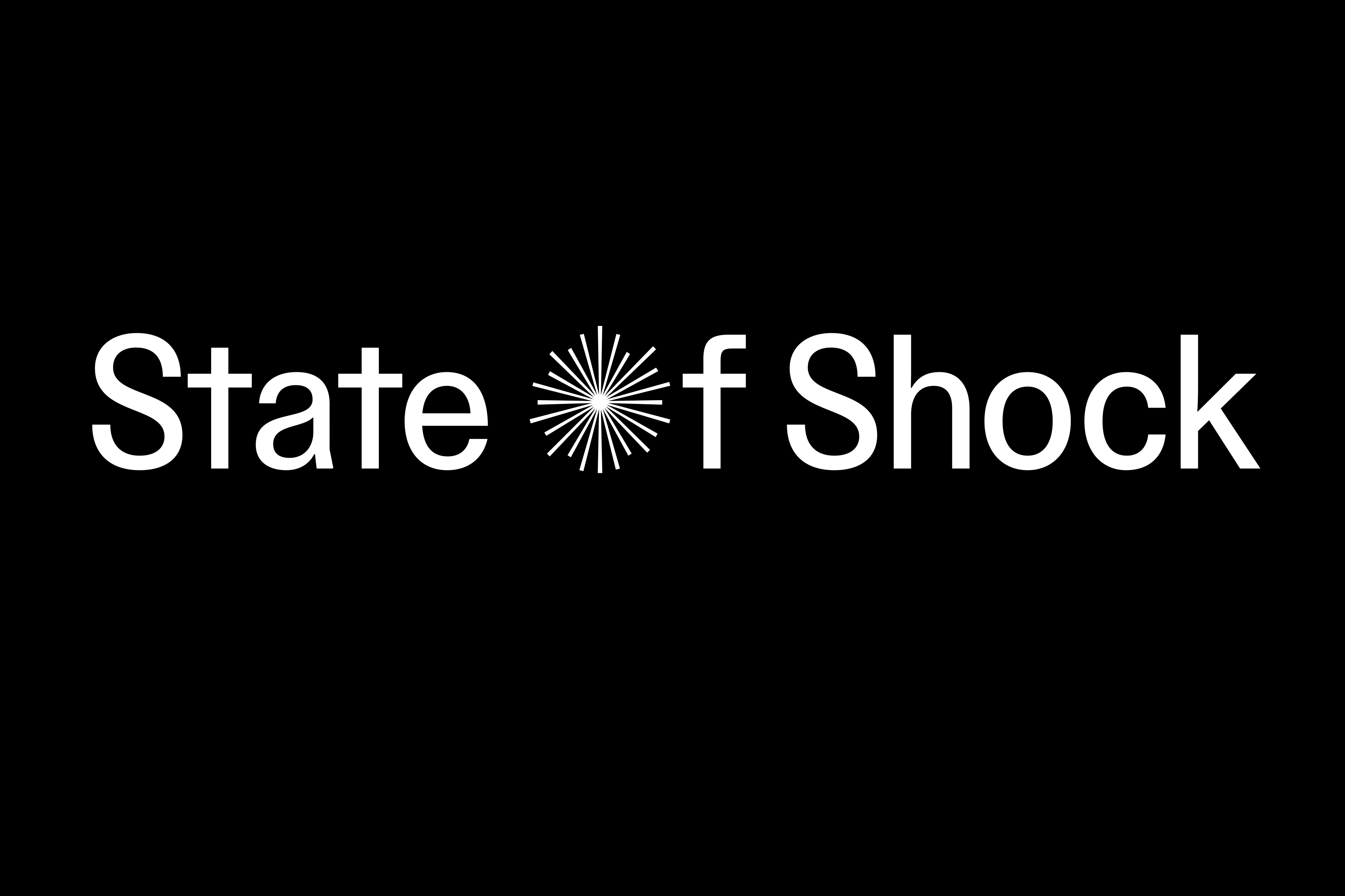
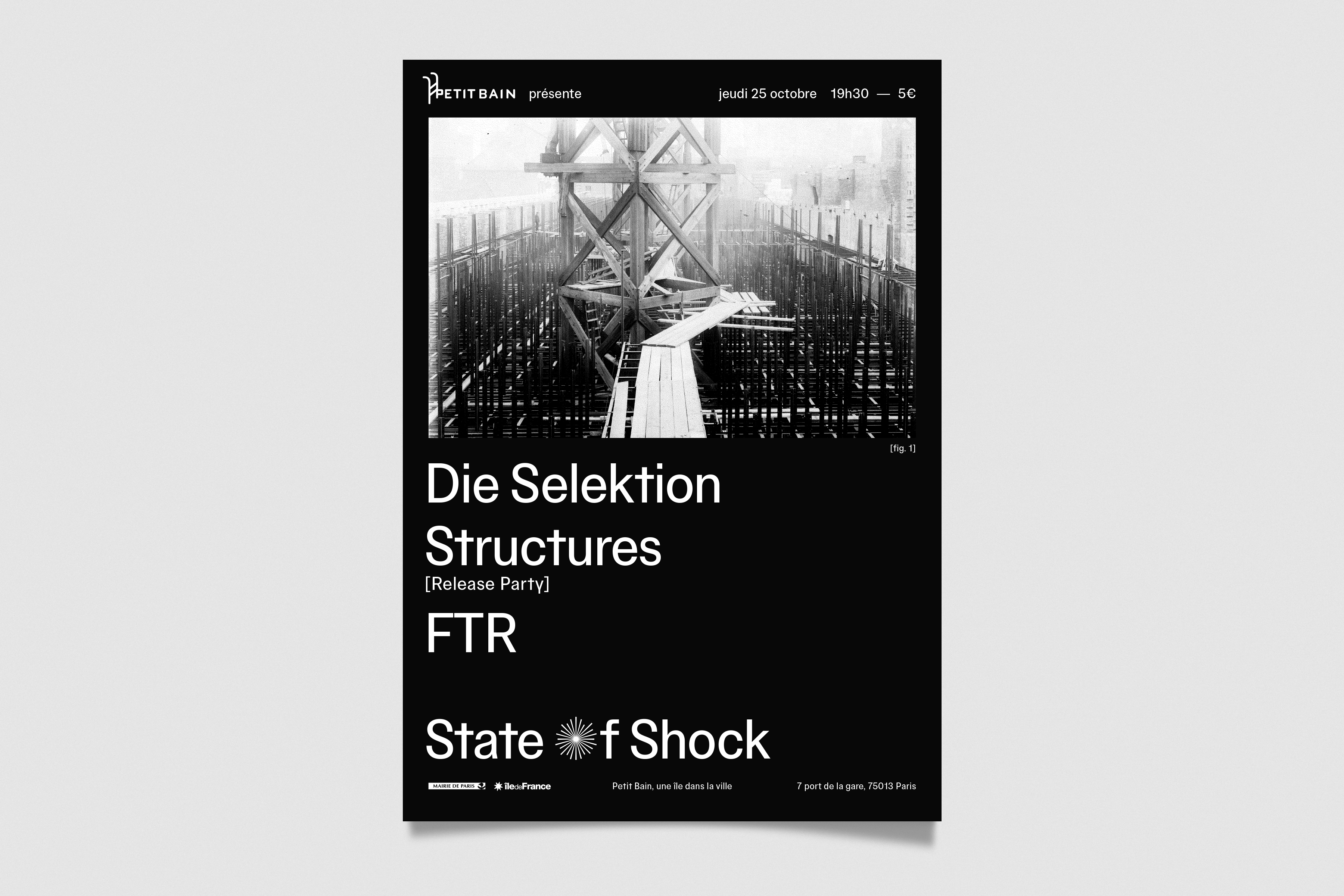
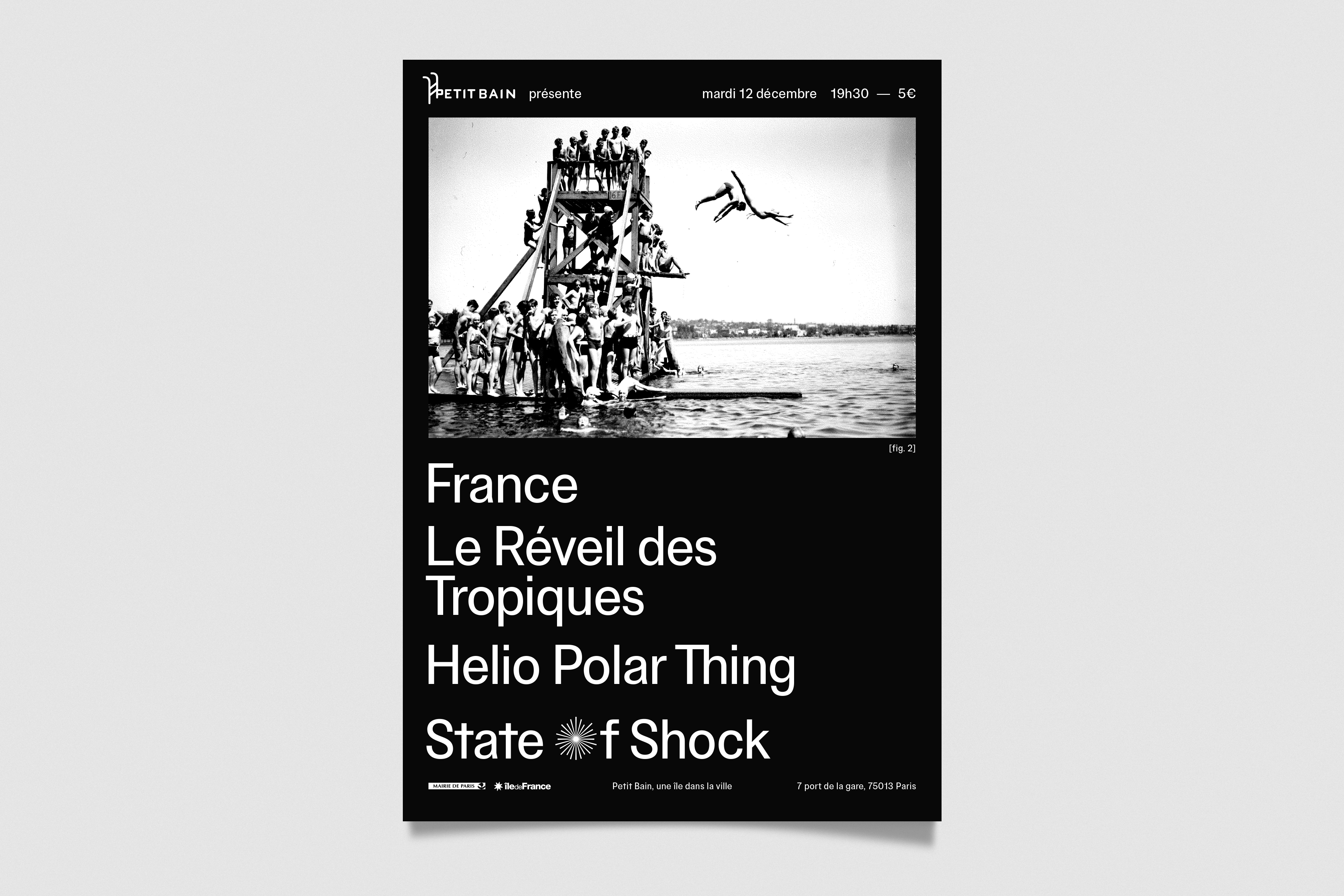
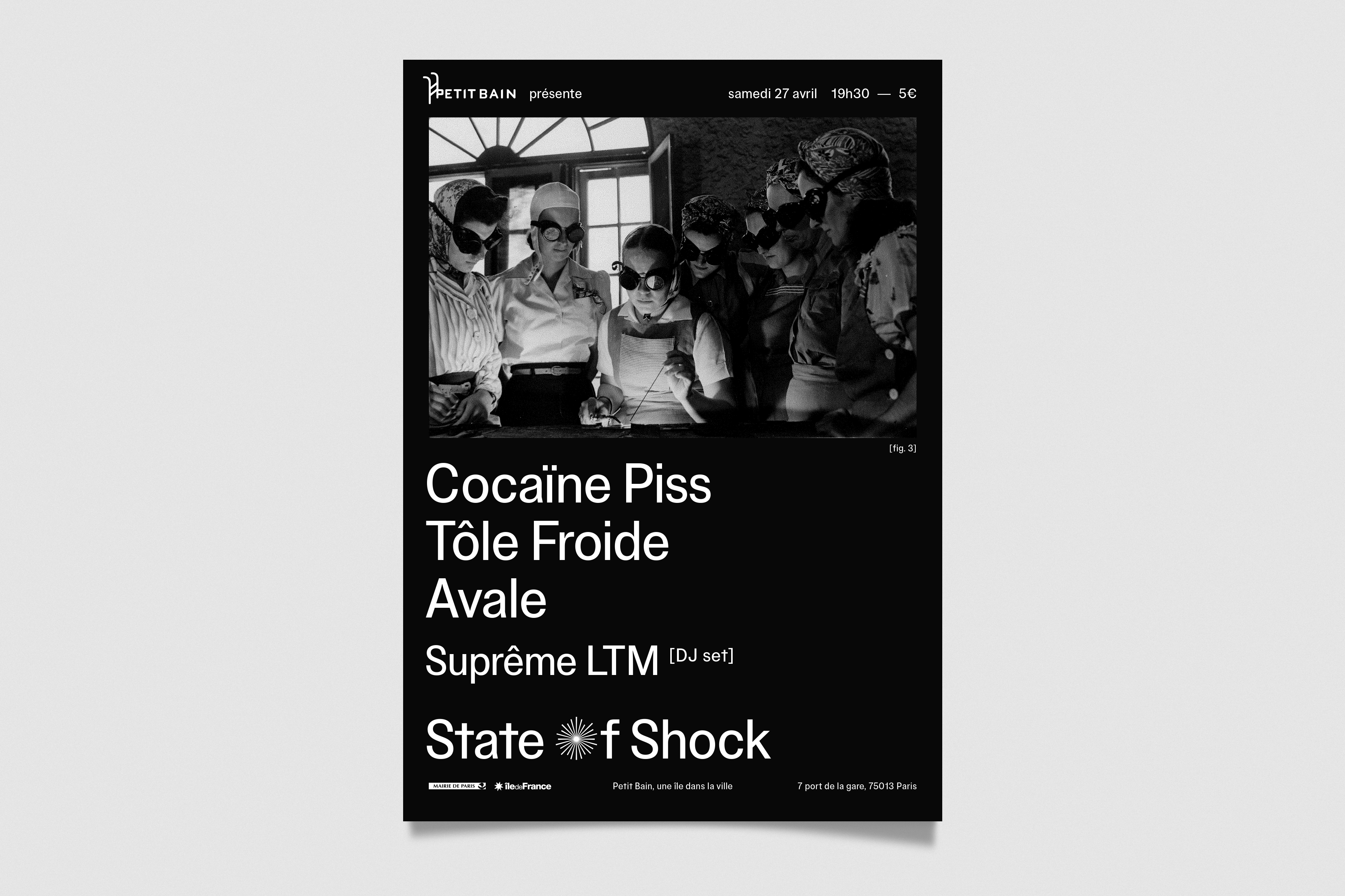
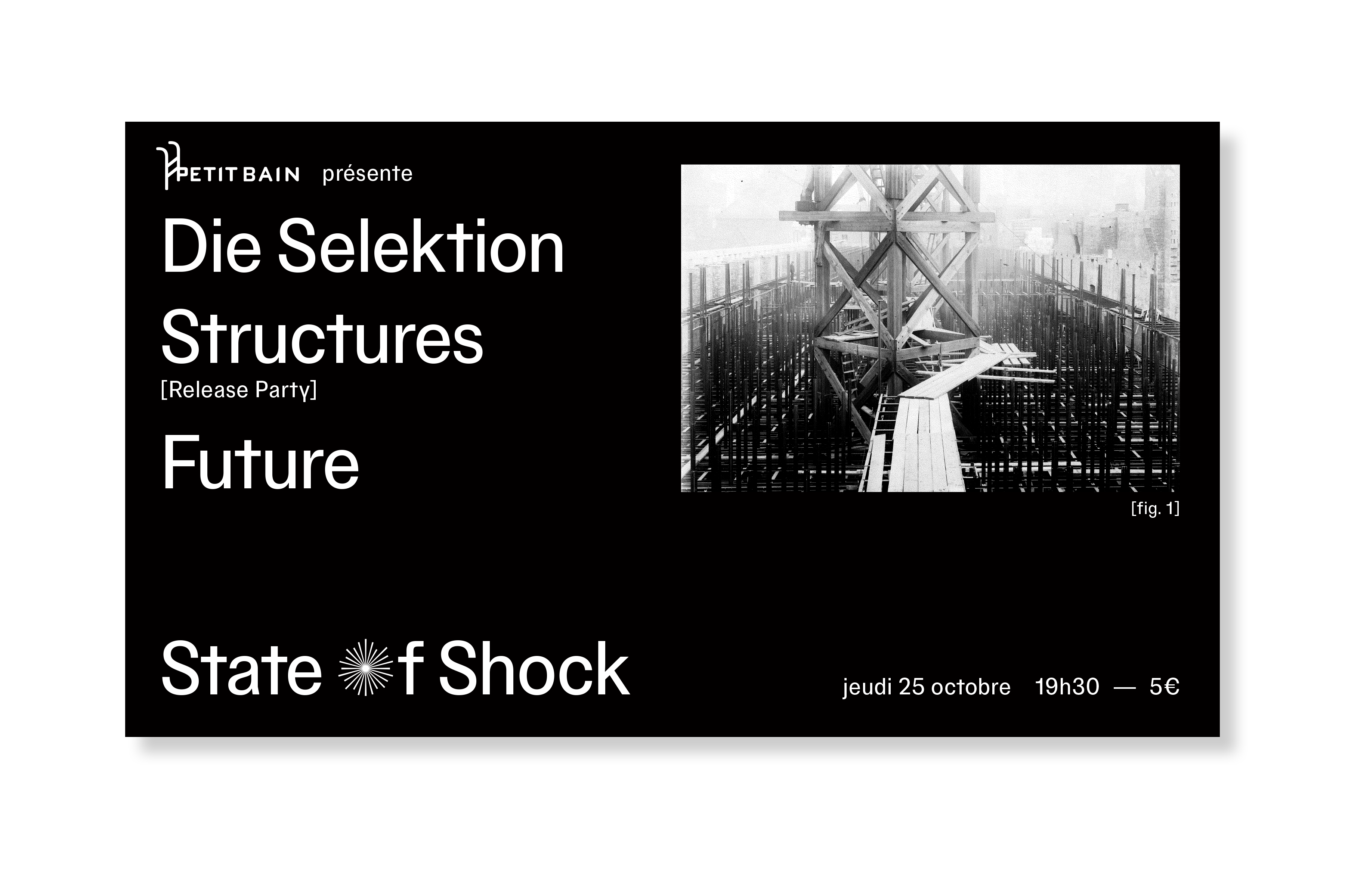
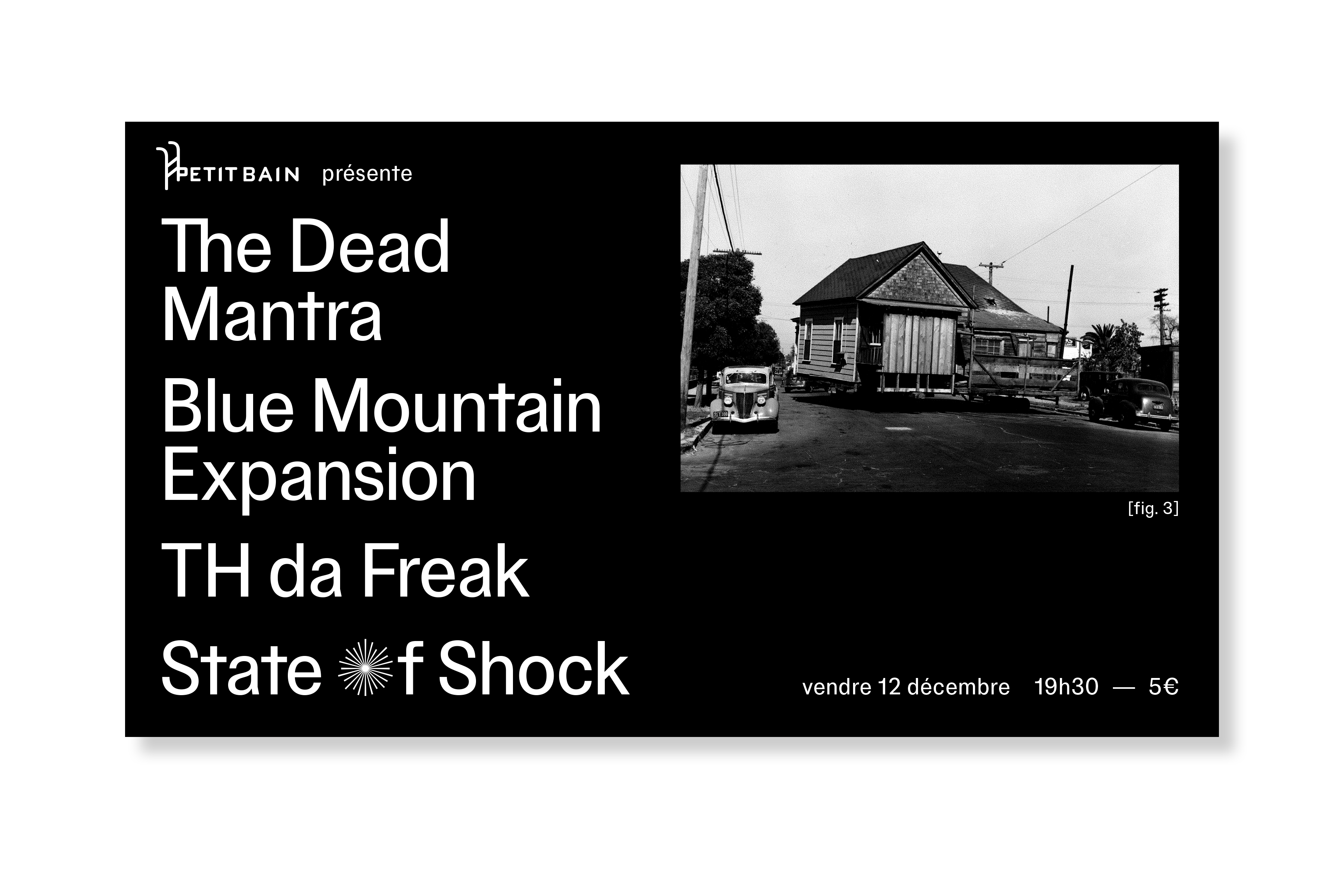
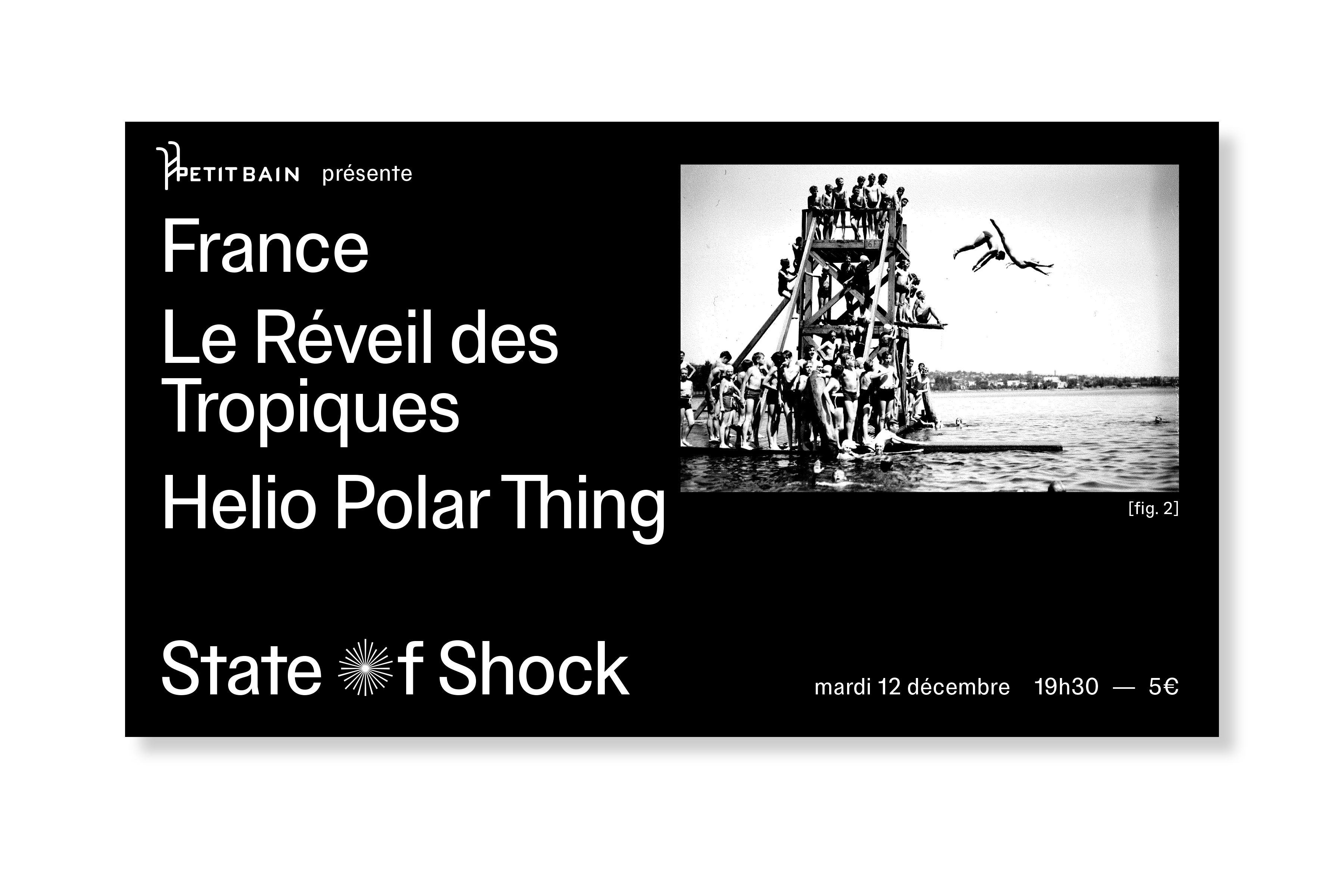
Petit Bain – State Of Shock
Client: Petit Bain | Year: 2018-2022 | identity, poster, social medias
Global identity for the “State Of Shock” events at Petit Bain, a concert venue in Paris.
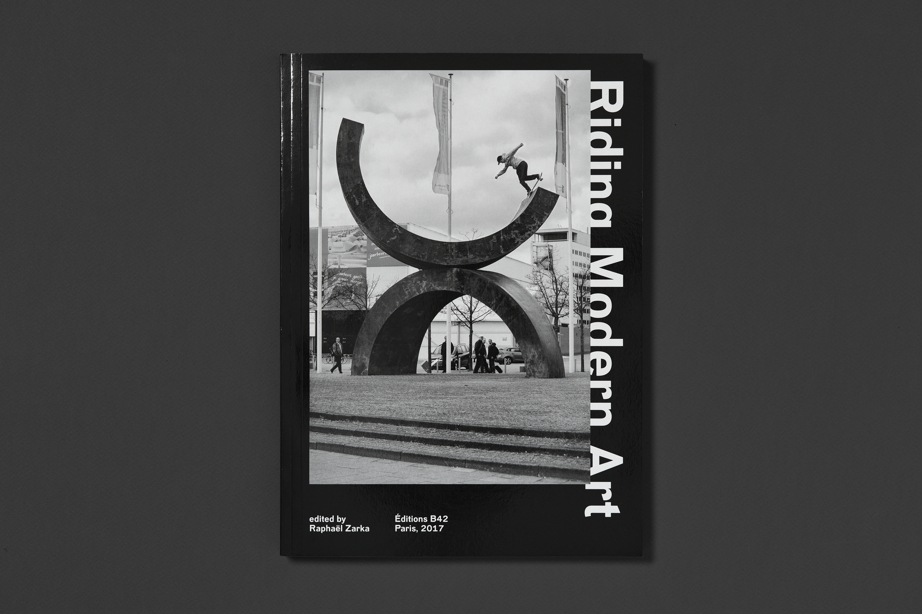
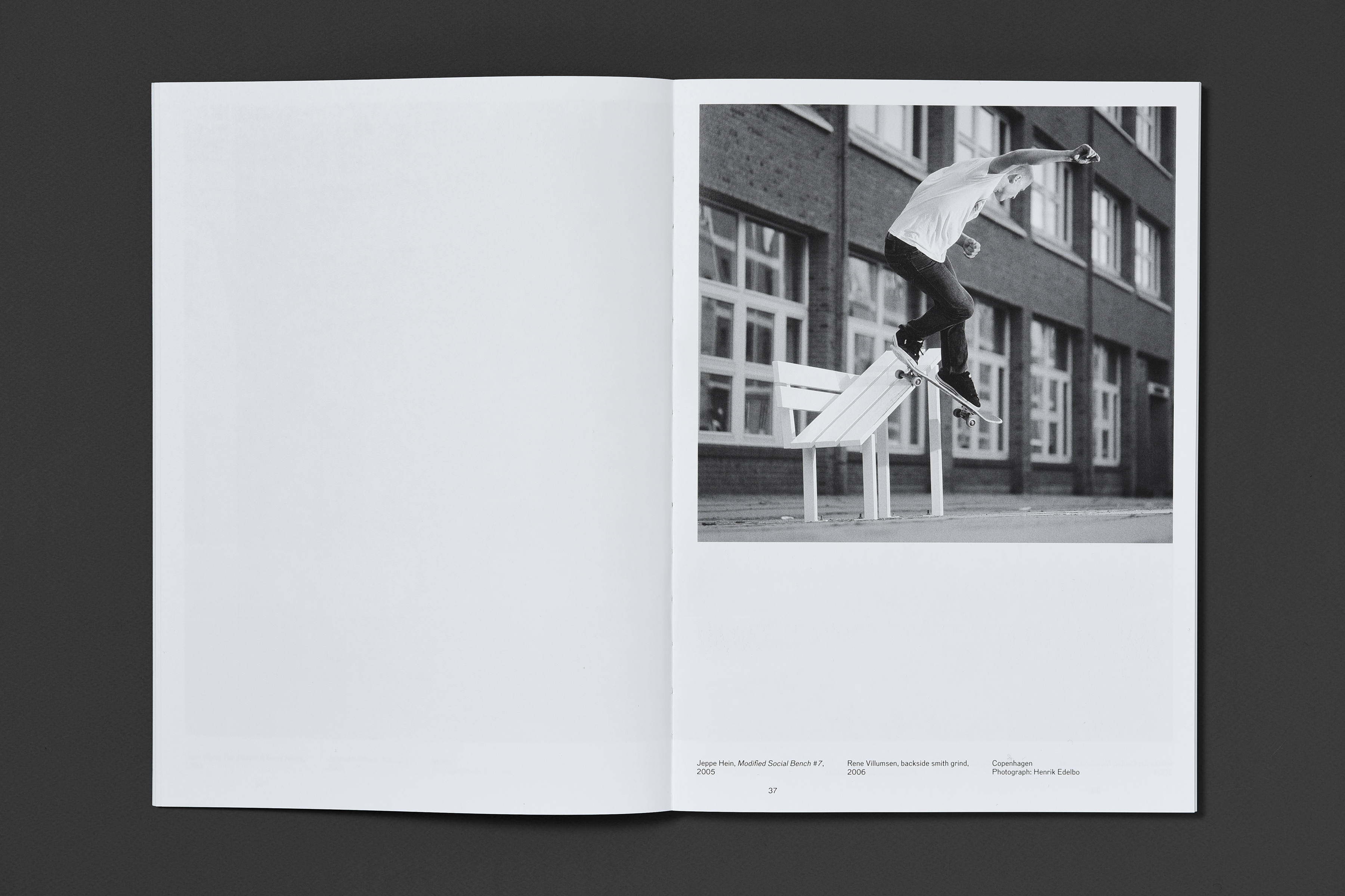
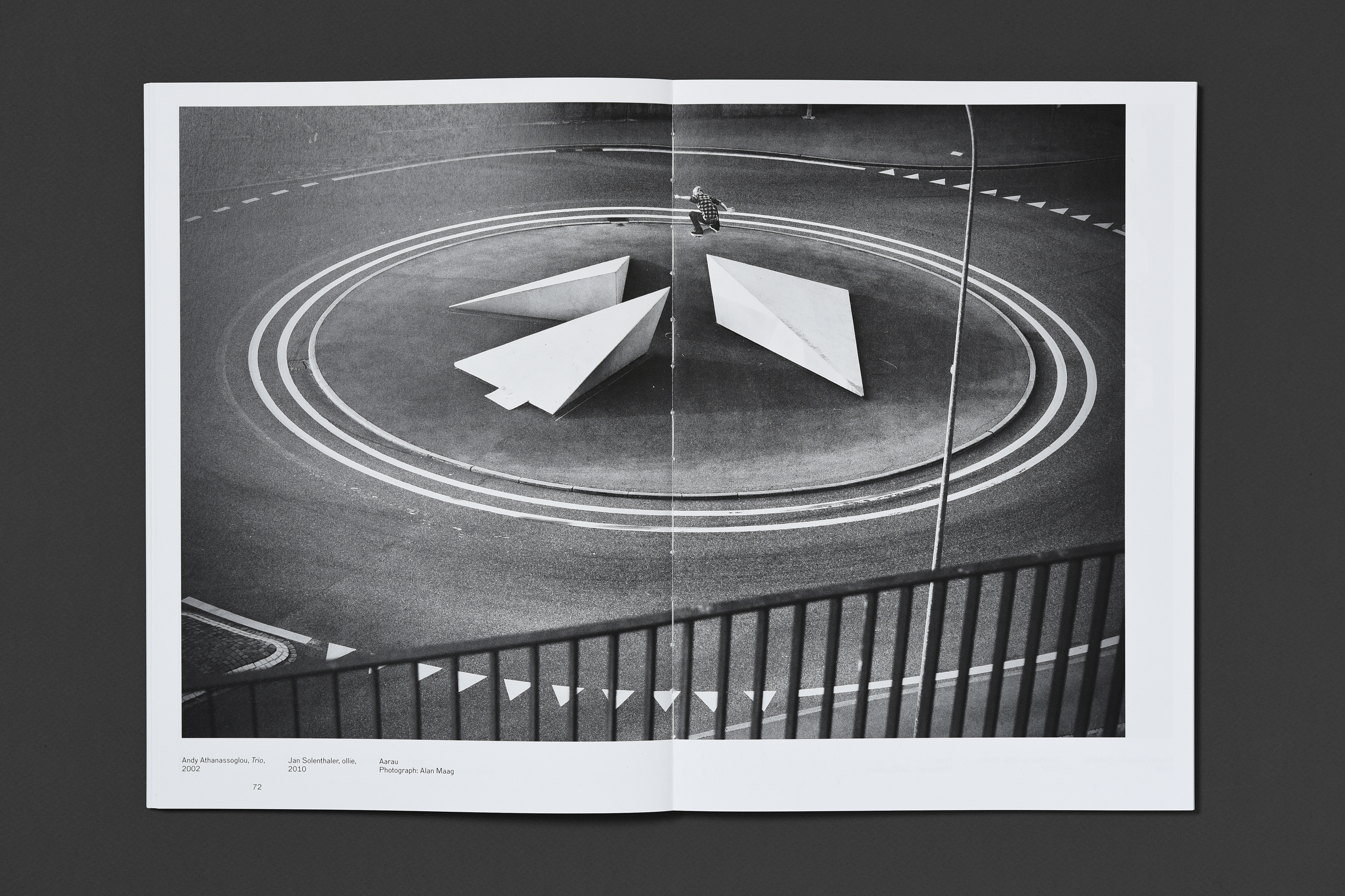
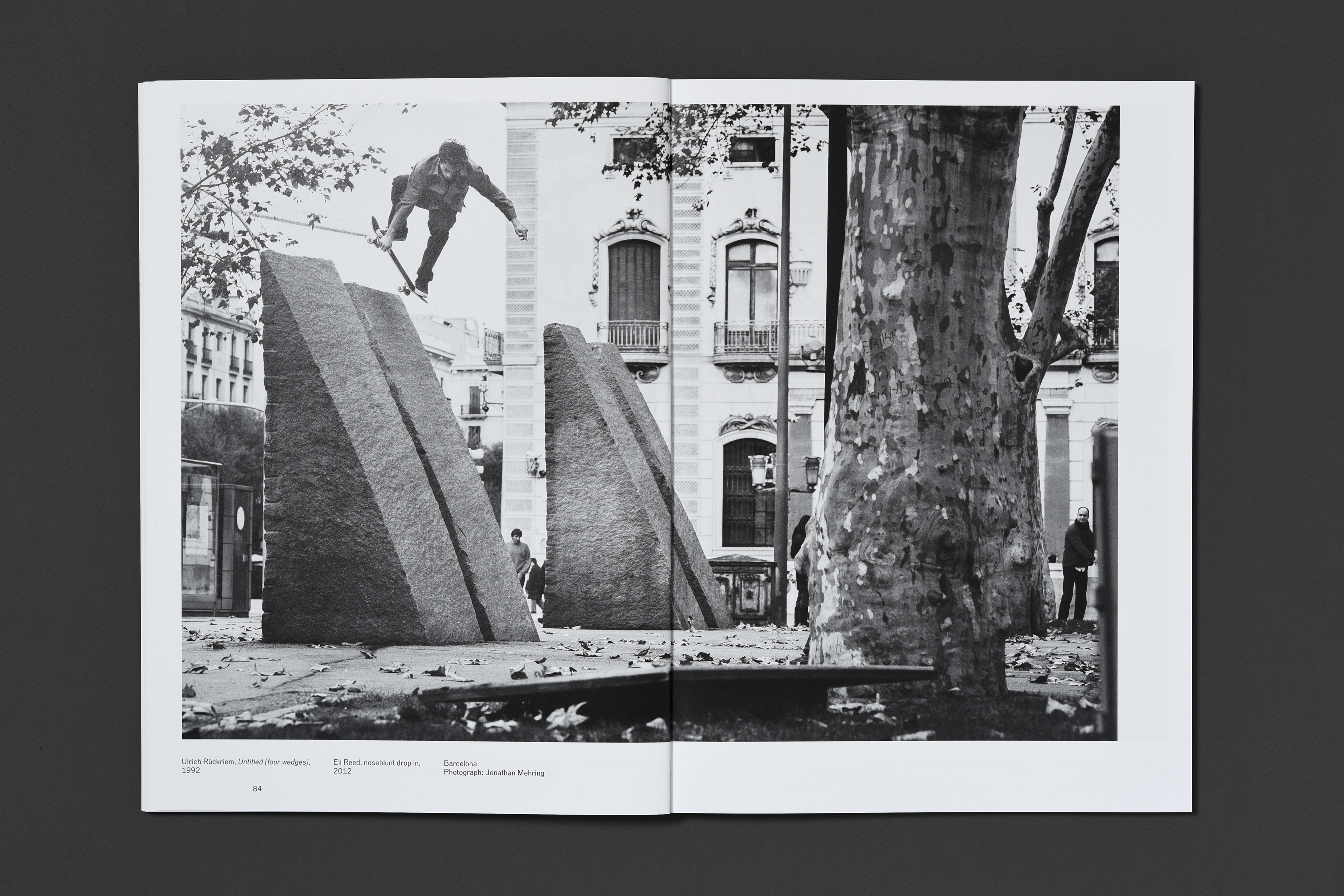
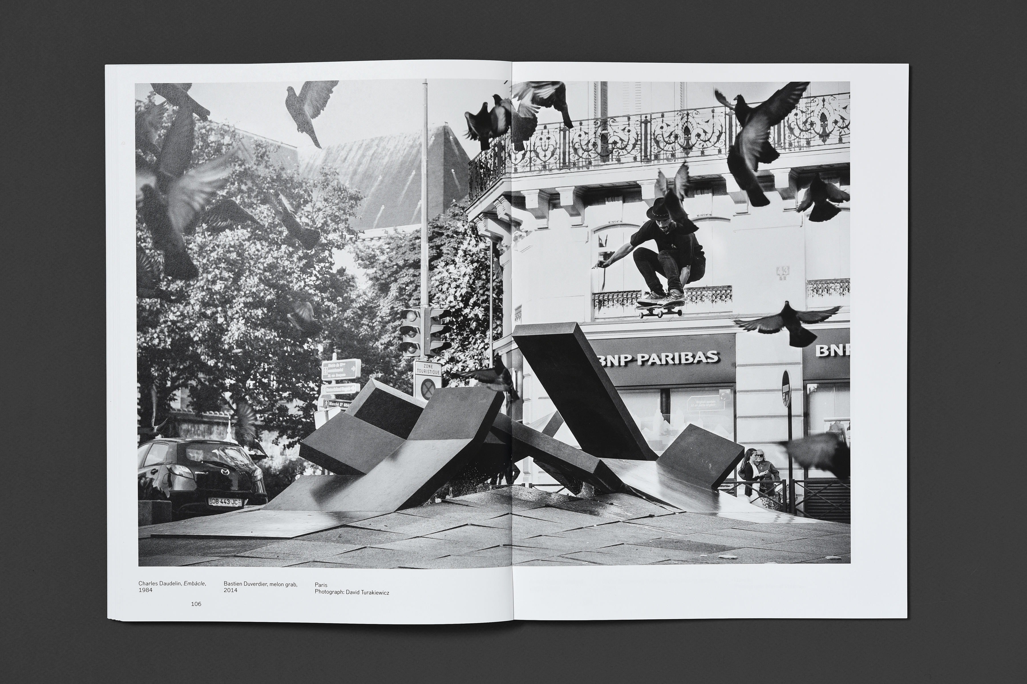
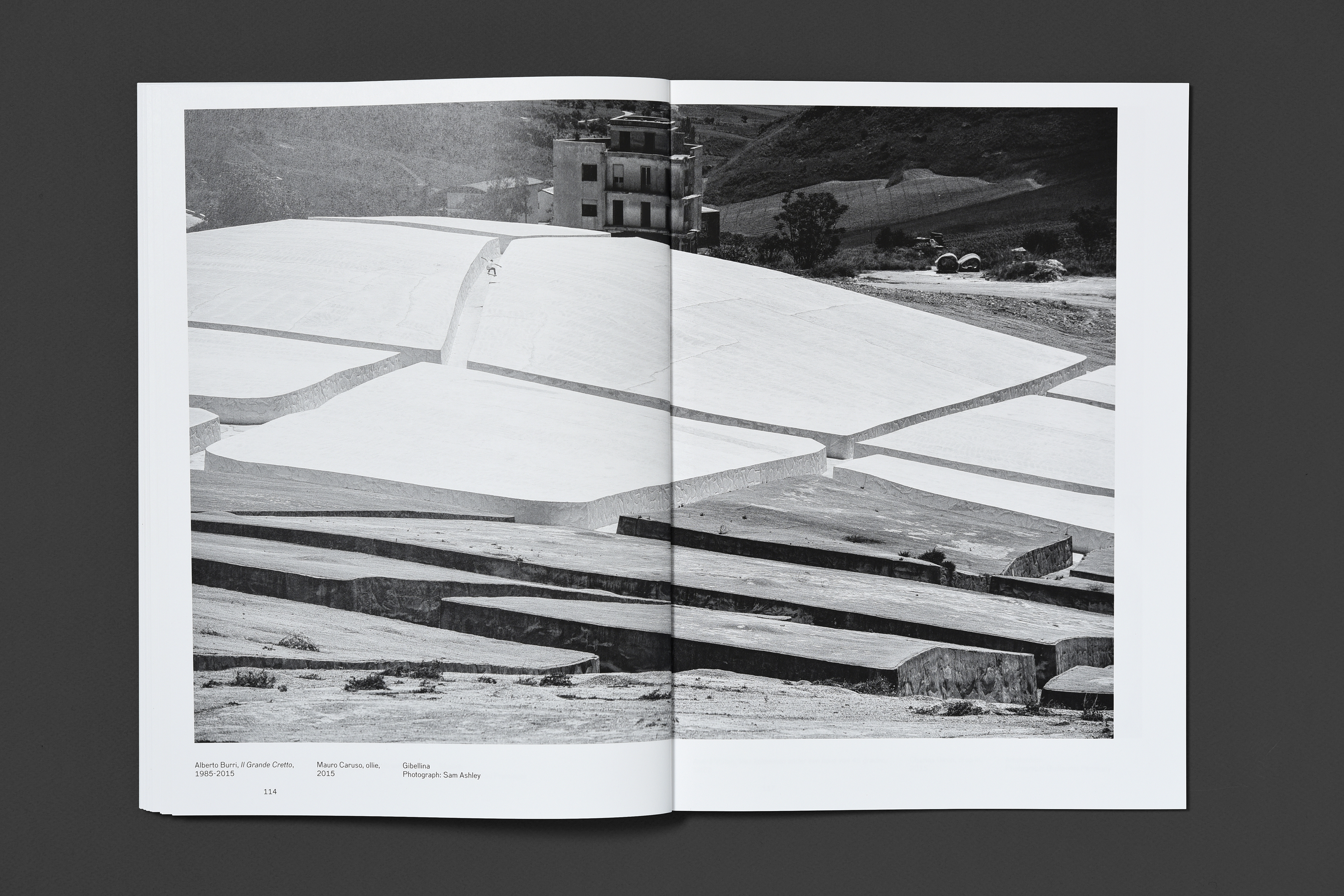
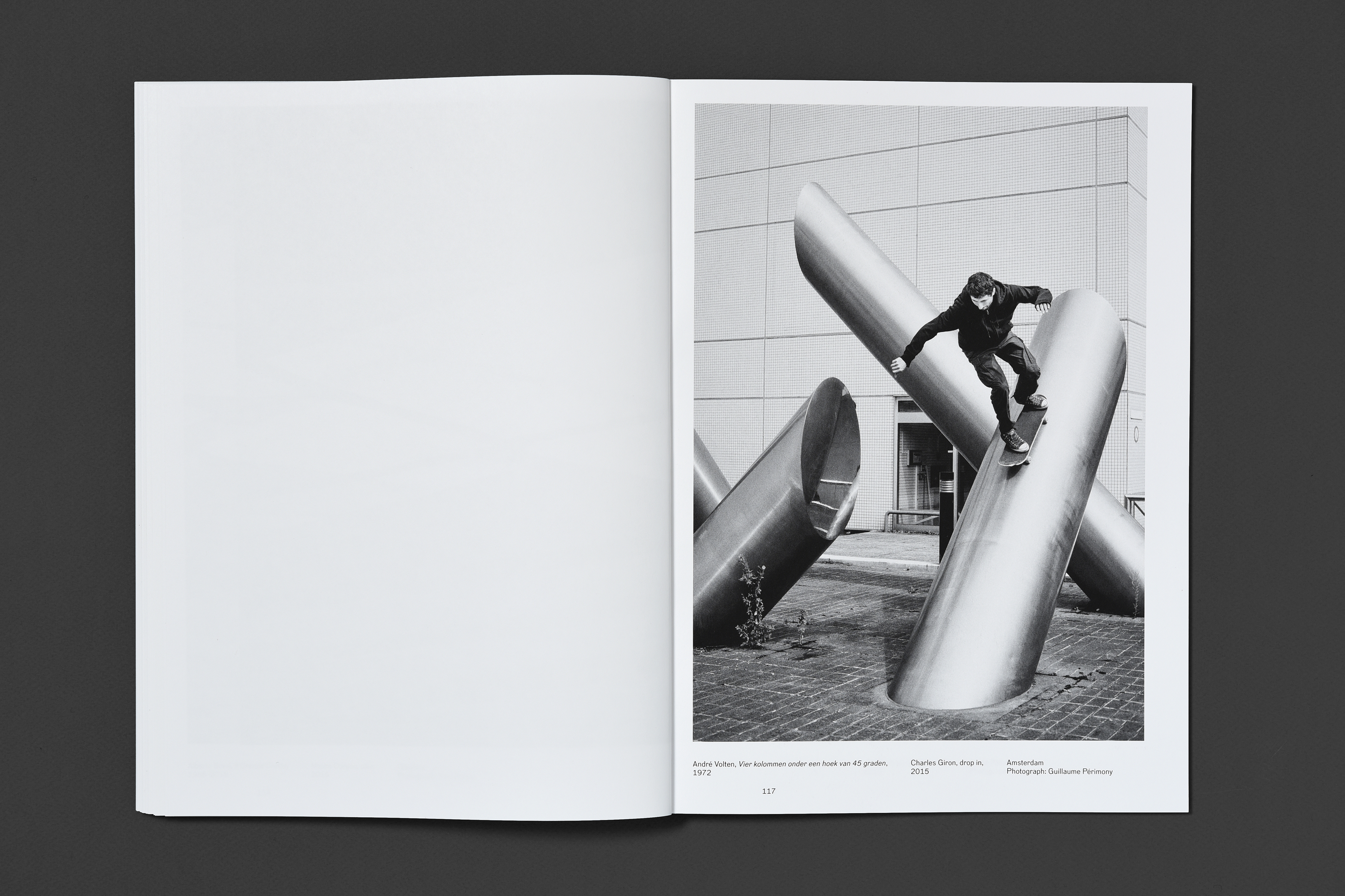
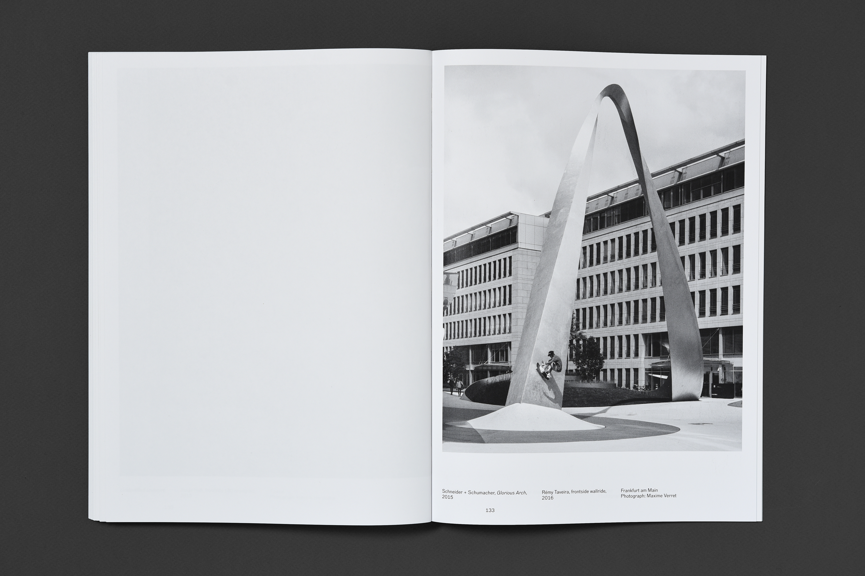
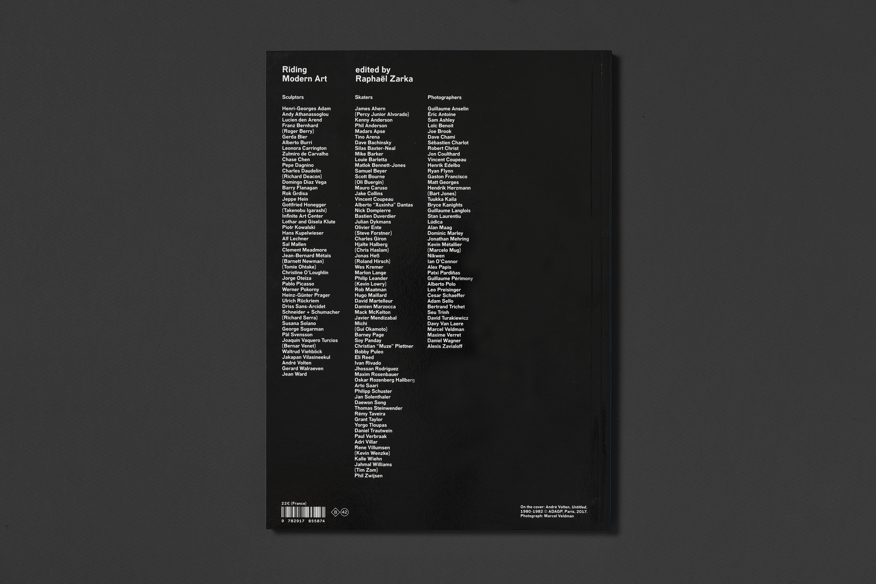
Raphaël Zarka – Riding Modern Art
Client: Éditions B42 | Year: 2017 | book design | In collaboration with studio deValence
Riding Modern Art brings together a collection of 70 black and white photographs of people skateboarding on sculptures in public spaces. Through his study of the process of appropriation and reuse of works of art in public places, used by skateboarders as further challenges for their sport, Raphaël Zarka offers a way of approaching a work of art that underlines the dynamism of modern sculpture, casting a critical light on the idea of movement in these often abstract and geometric works, inspired by Cubist, Futurist or Constructivist art. The skateboarder’s approach to a sculpture, more mechanical than conceptual, brings out the variety of movement it seeks to suggest. While it is not possible to “freeze” or represent movement in a solid form (it cannot be sculpted) it is, nevertheless, a constituent element of the work, as also is space. Thus, the body of the skateboarder becomes a choreographic form on a sculptural form, and the presence of a human body on a work of art transforms it from something perched on a pedestal into a living sculpture. Some images are missing from this collection, as sculptors have refused to see their artwork reproduced. The spaces dedicated to those photographs remain purposely empty.

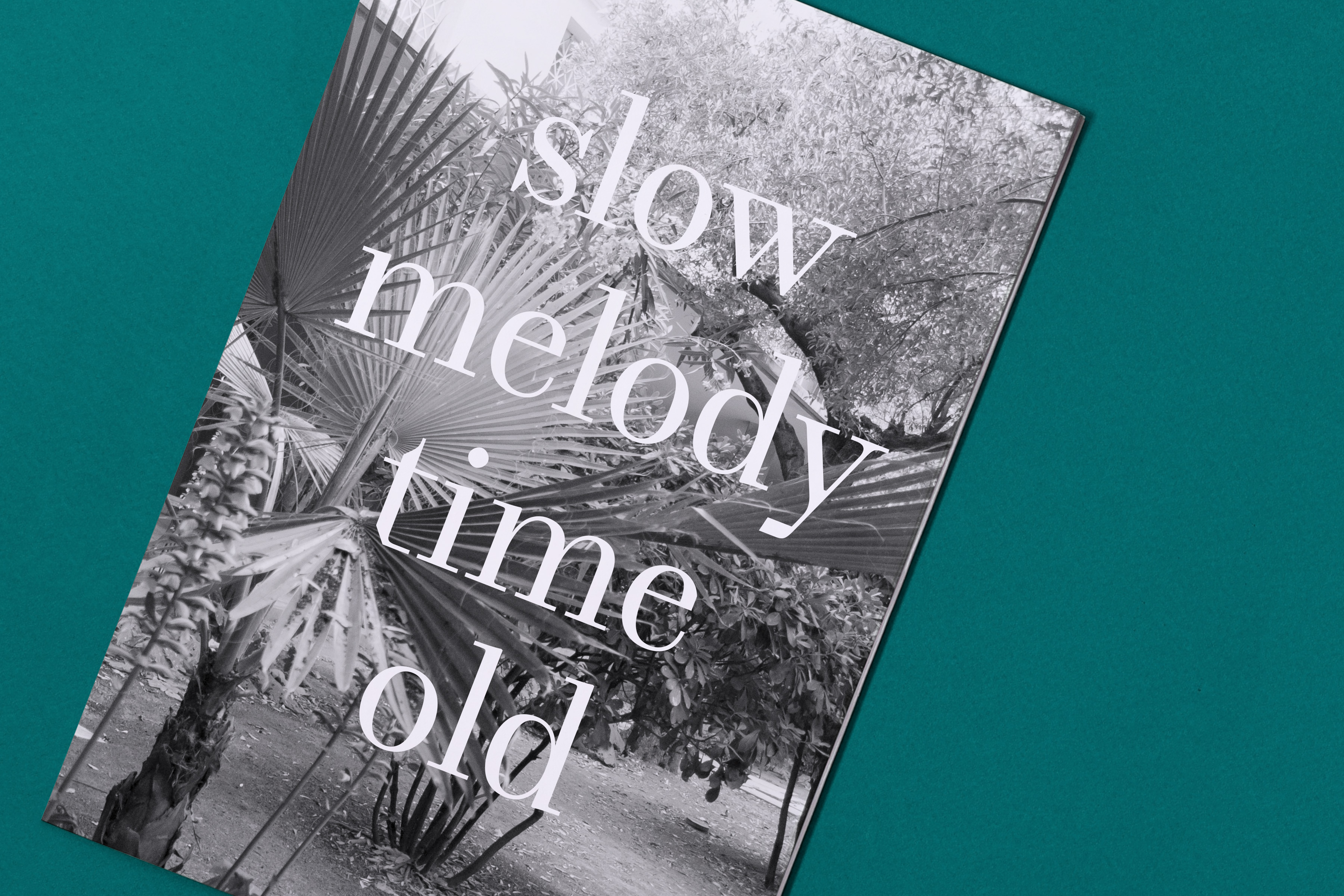
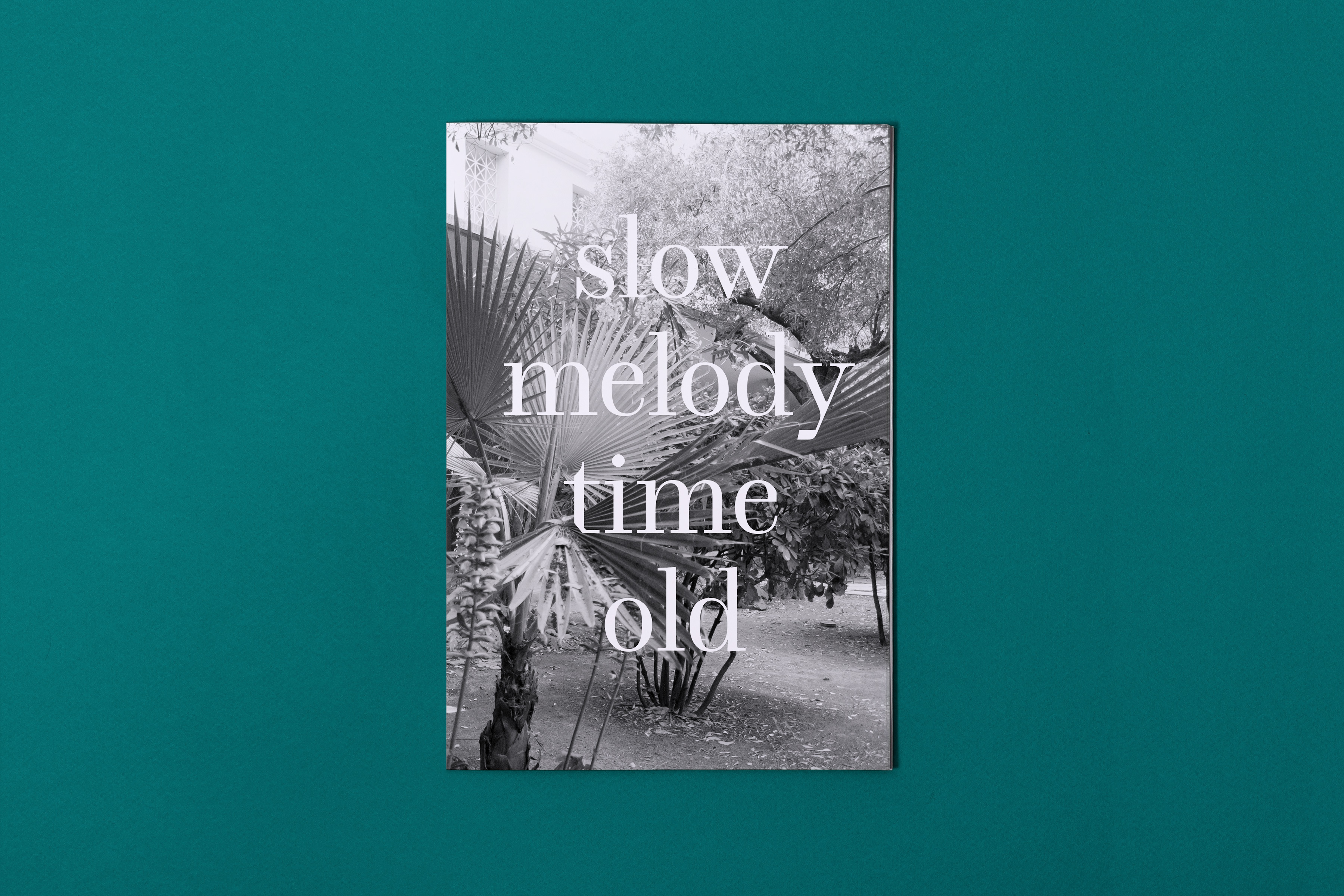
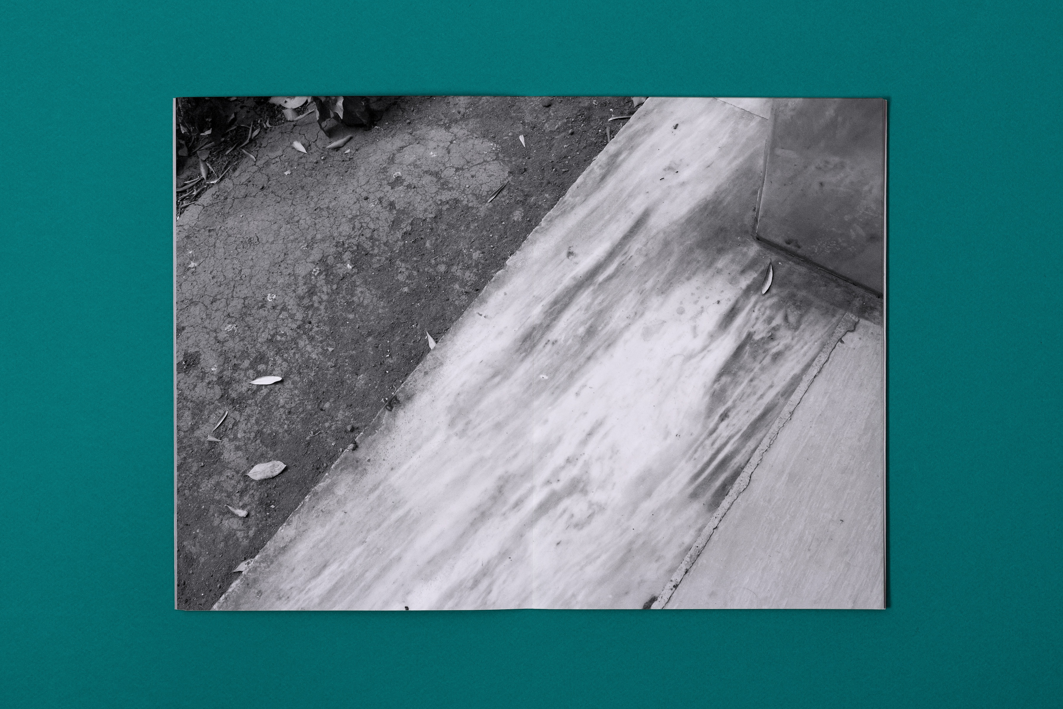
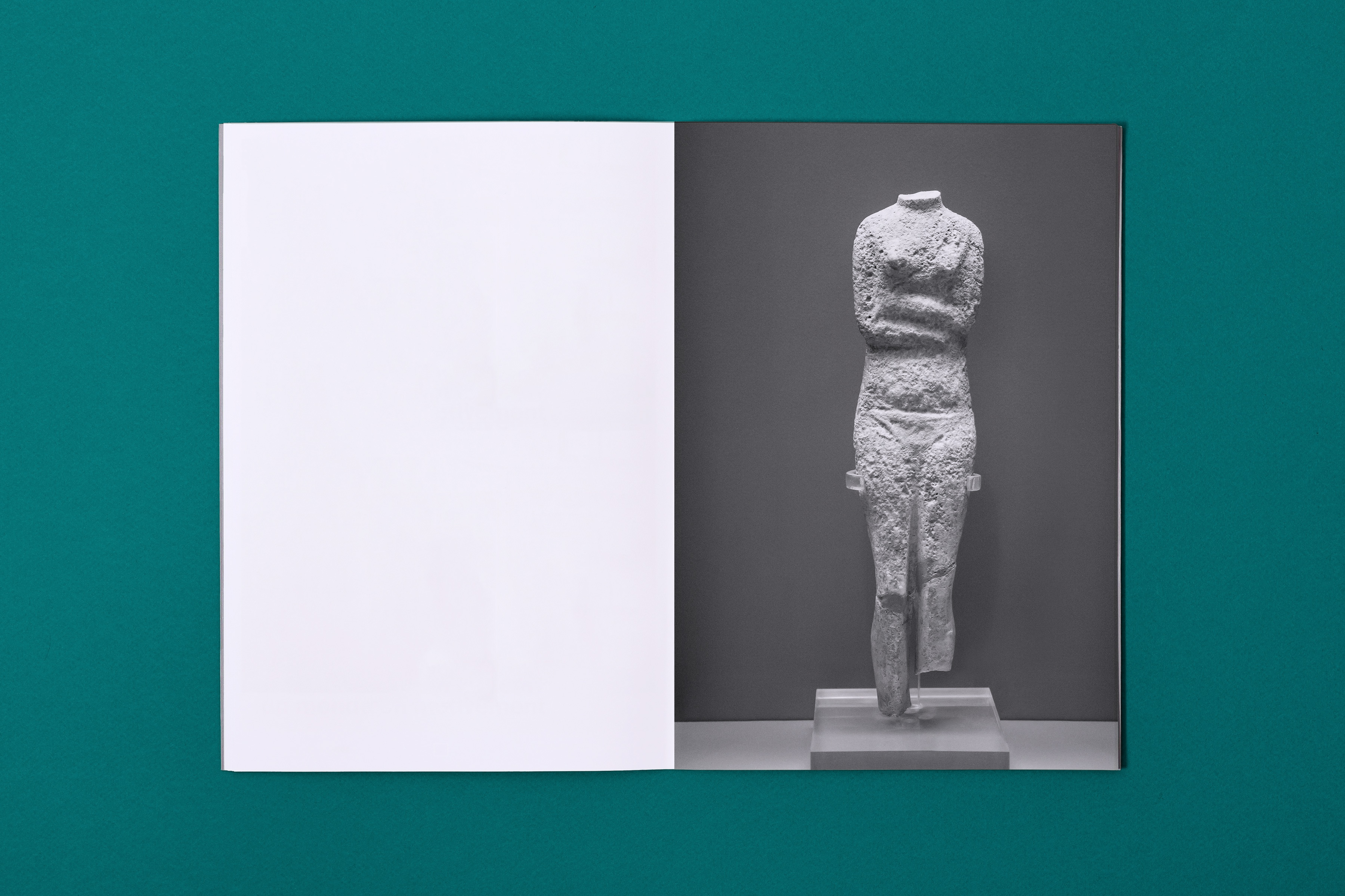
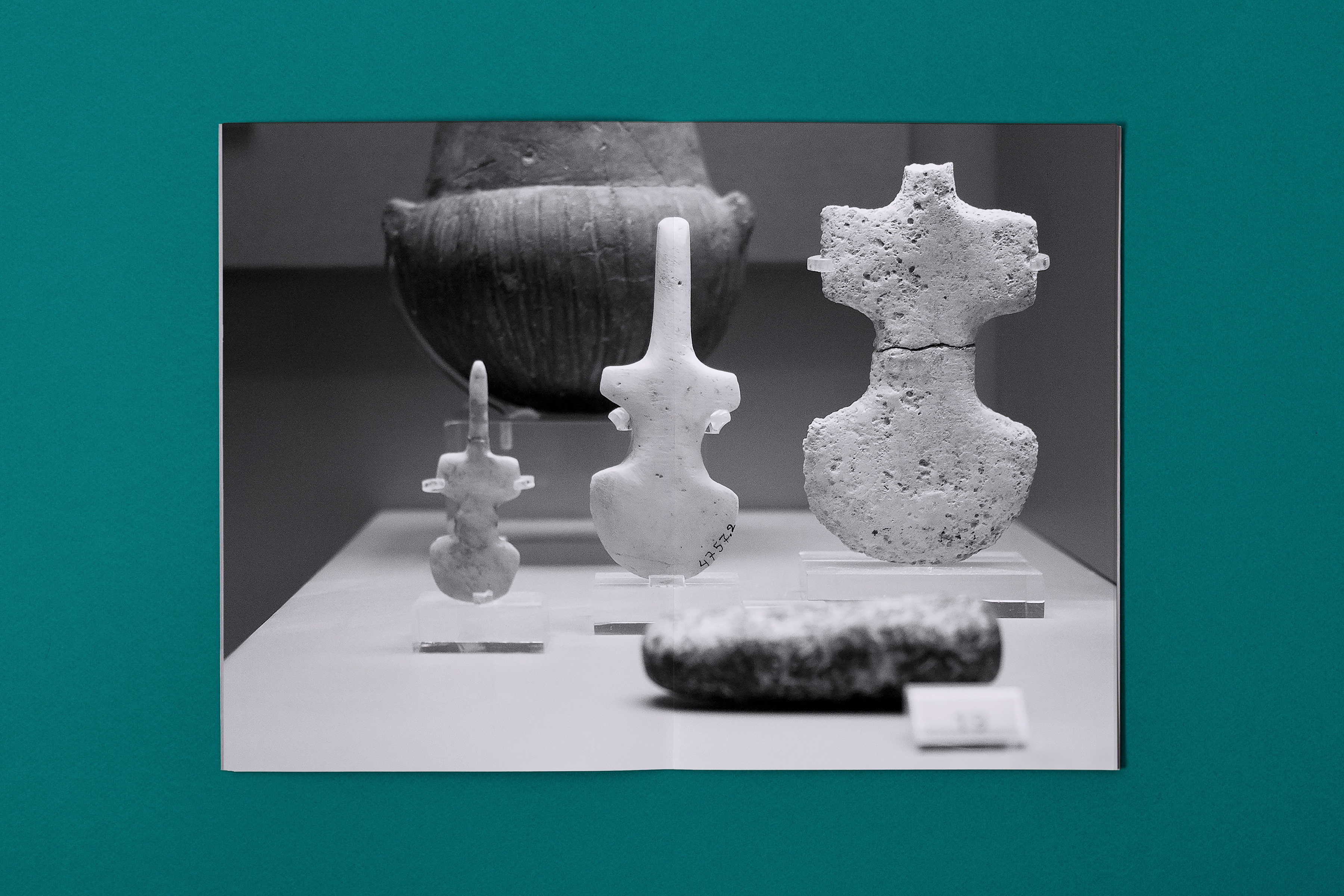
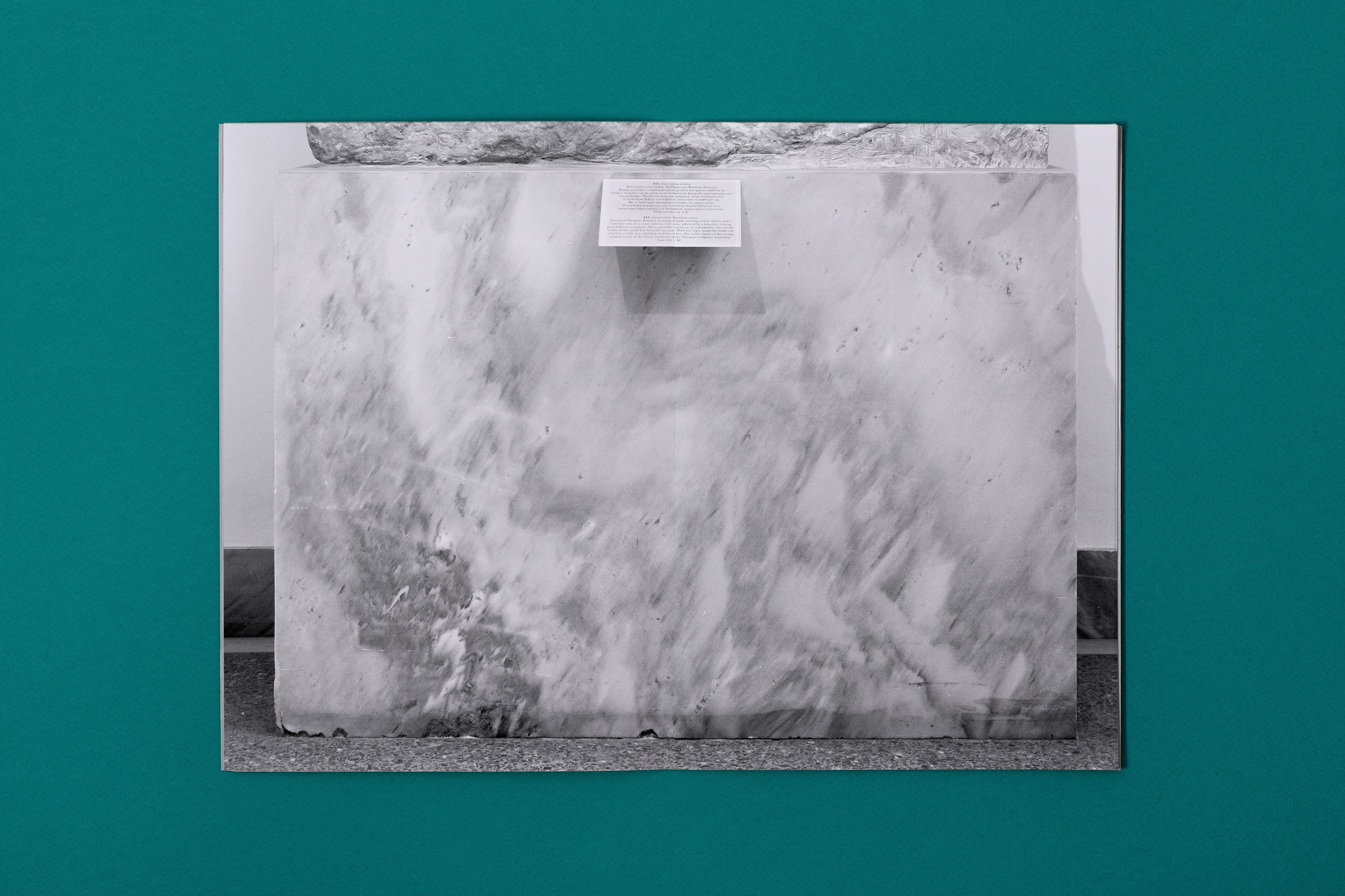
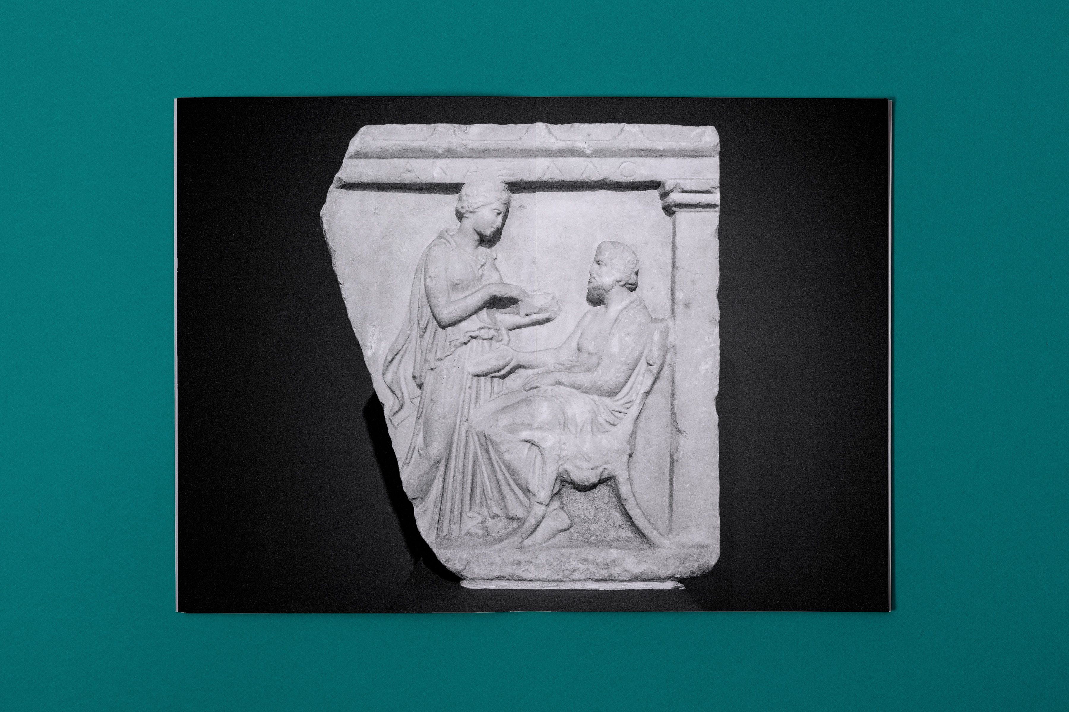
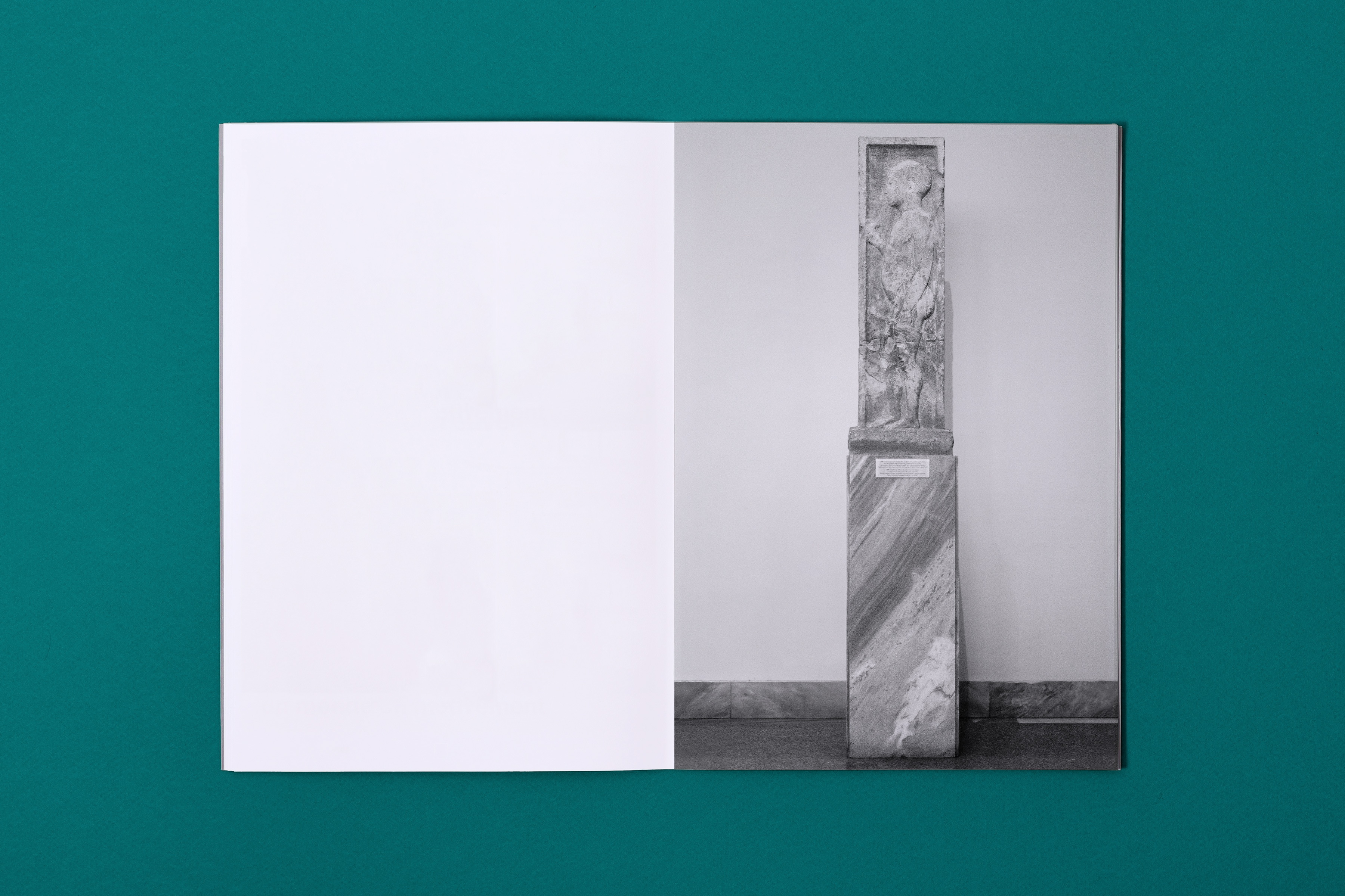
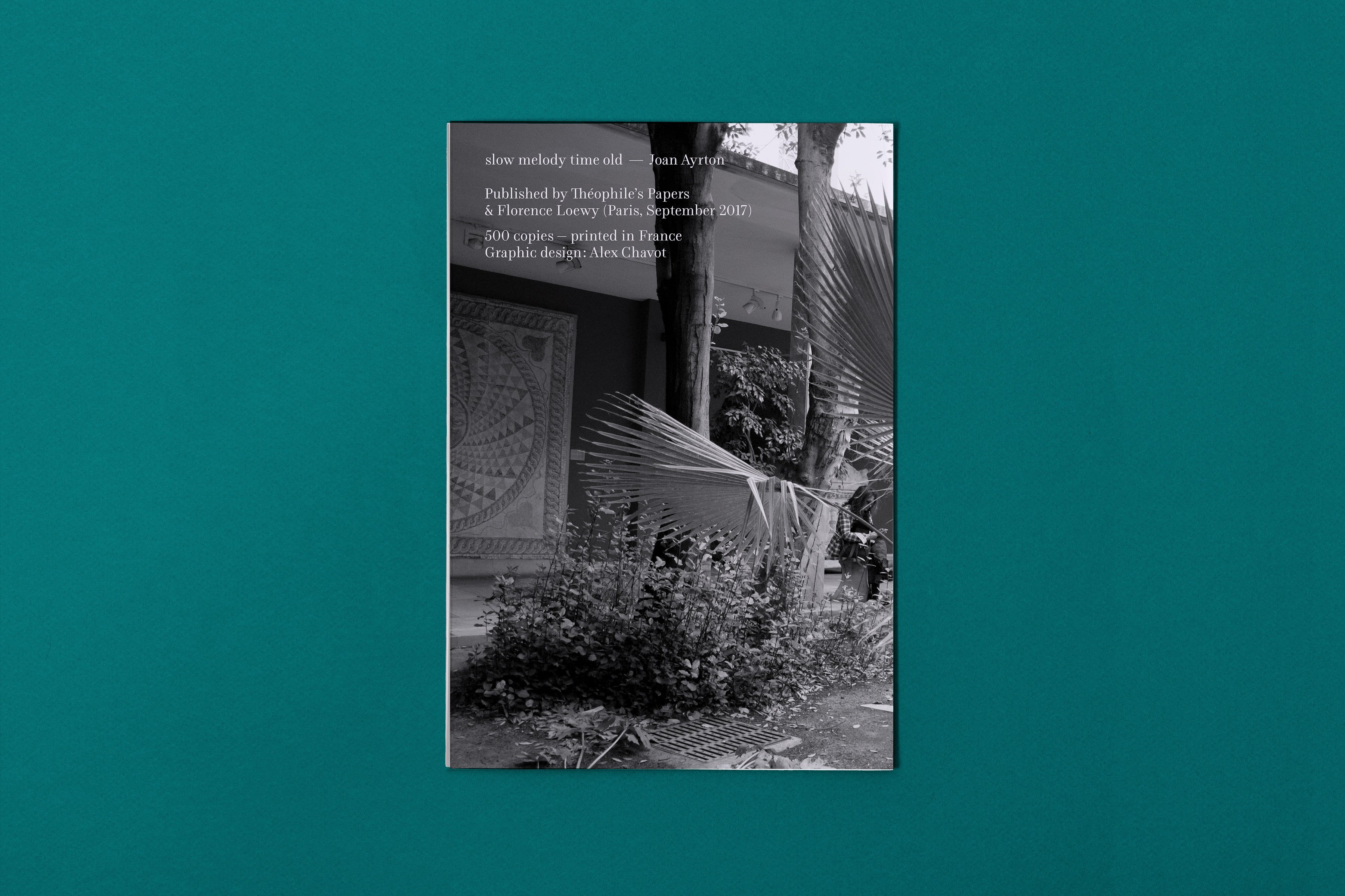
Joan Ayrton – slow melody time old
Client: Joan Ayrton | Year: 2017 | book design
This small photo book is a piece by British artist Joan Ayrton wandering around the sculptures and marble bases of the National Archaeological Museum of Athens. A journey into time, stones and violin-shaped figures…
Co-edited by Théophile’s Papers & Florence Loewy. Distributed by les presses du réel.
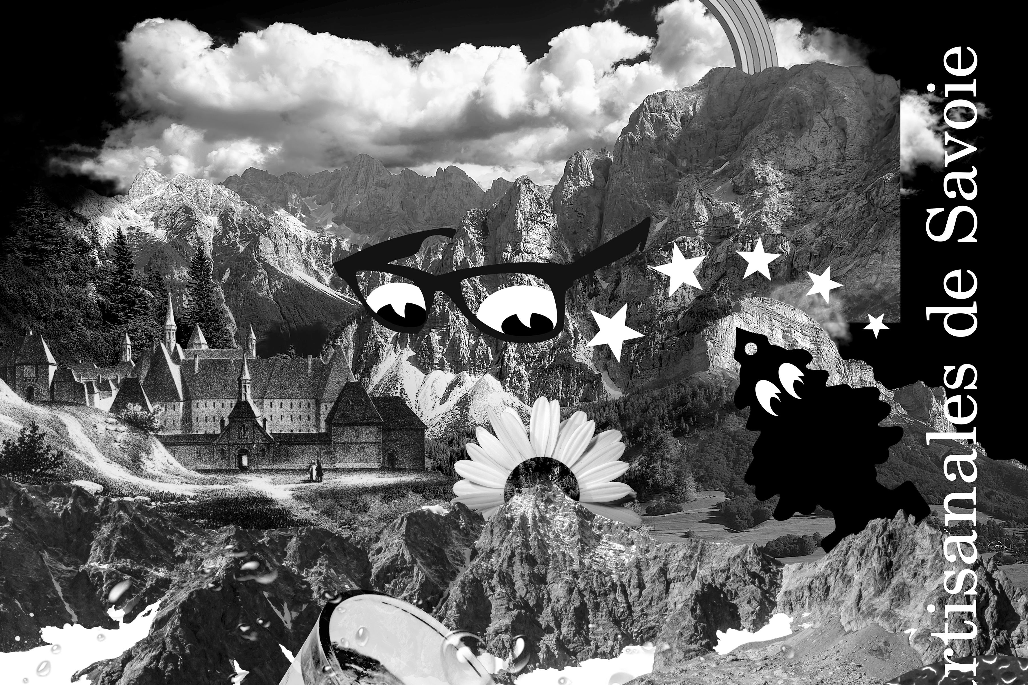
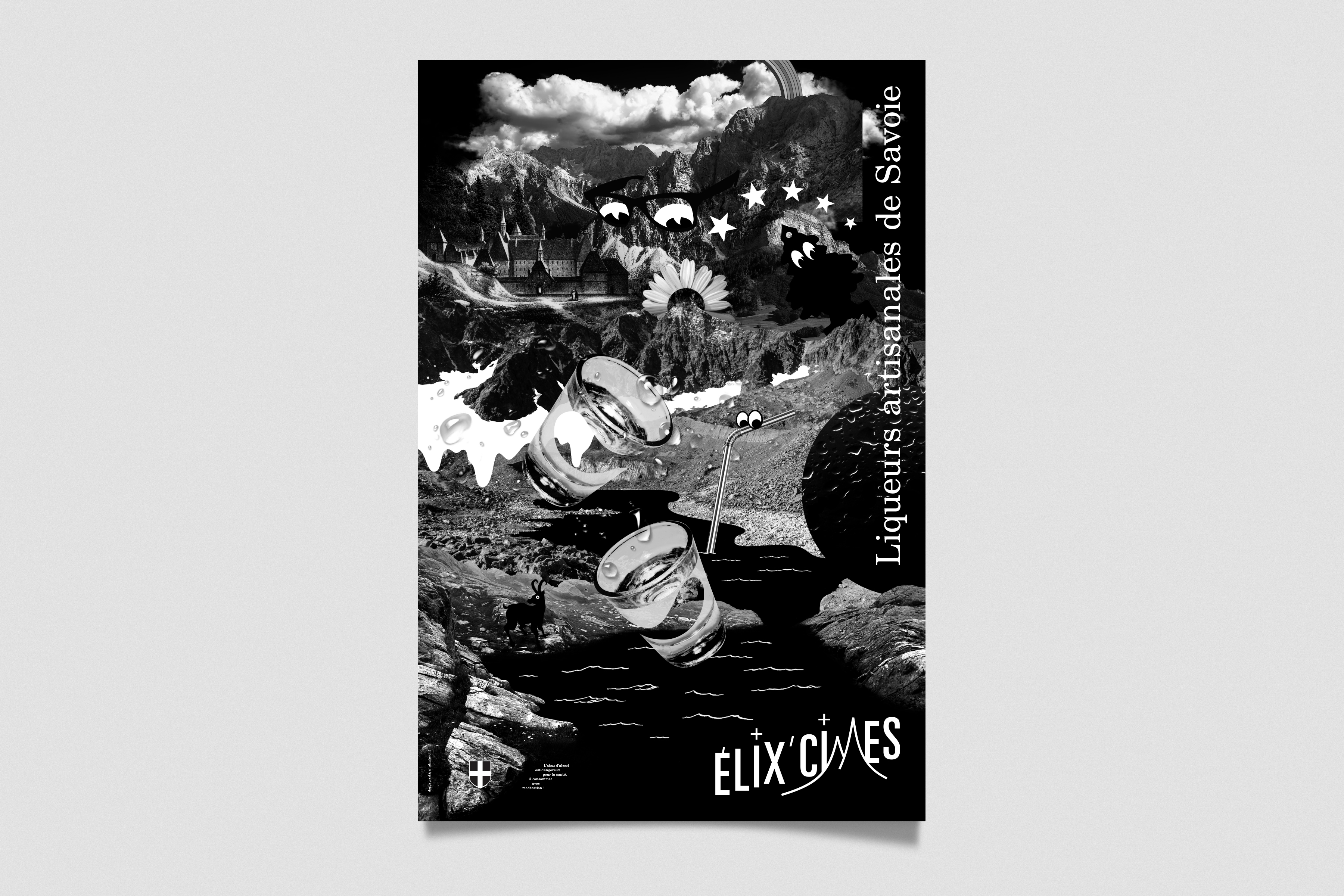
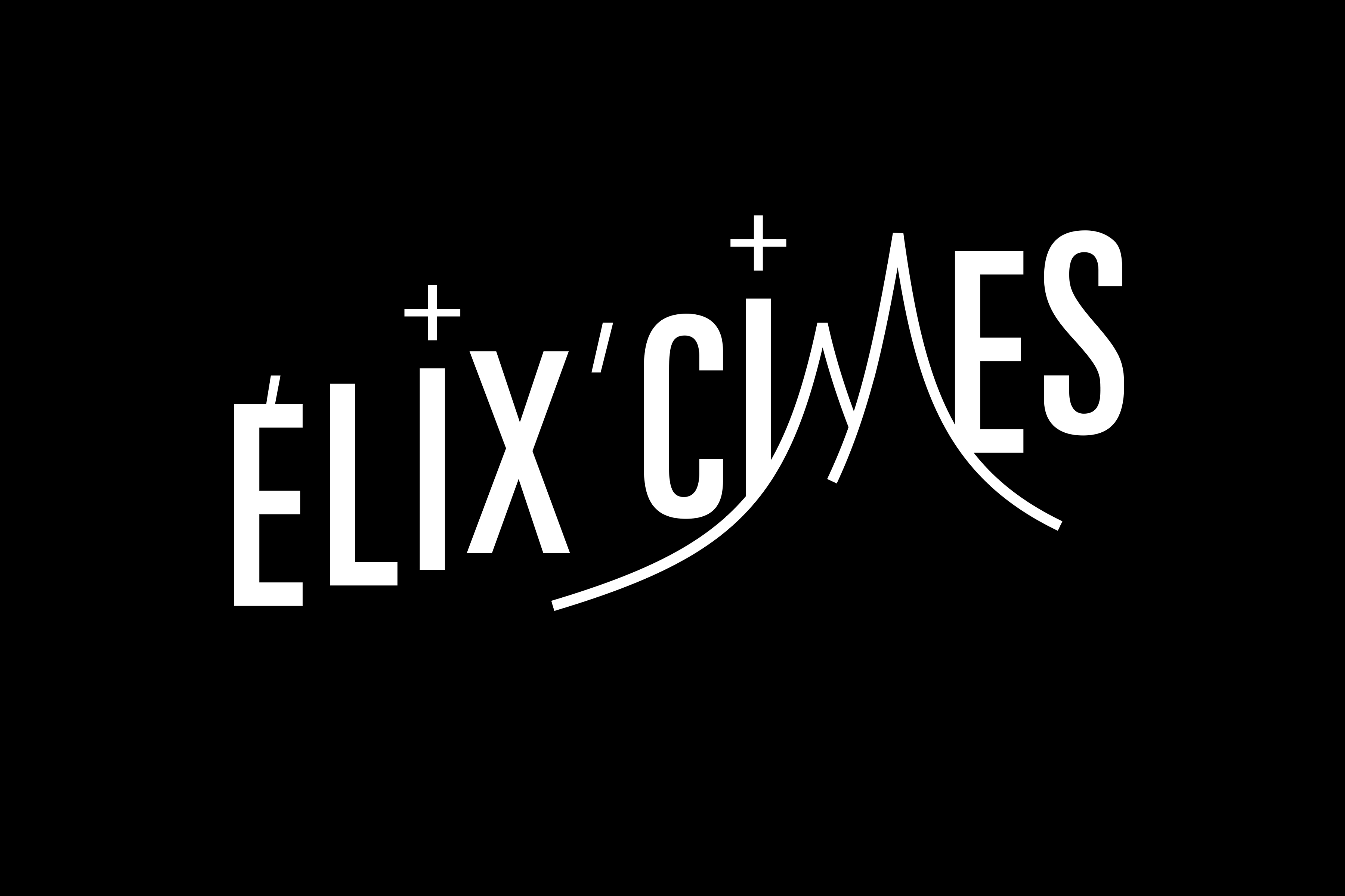
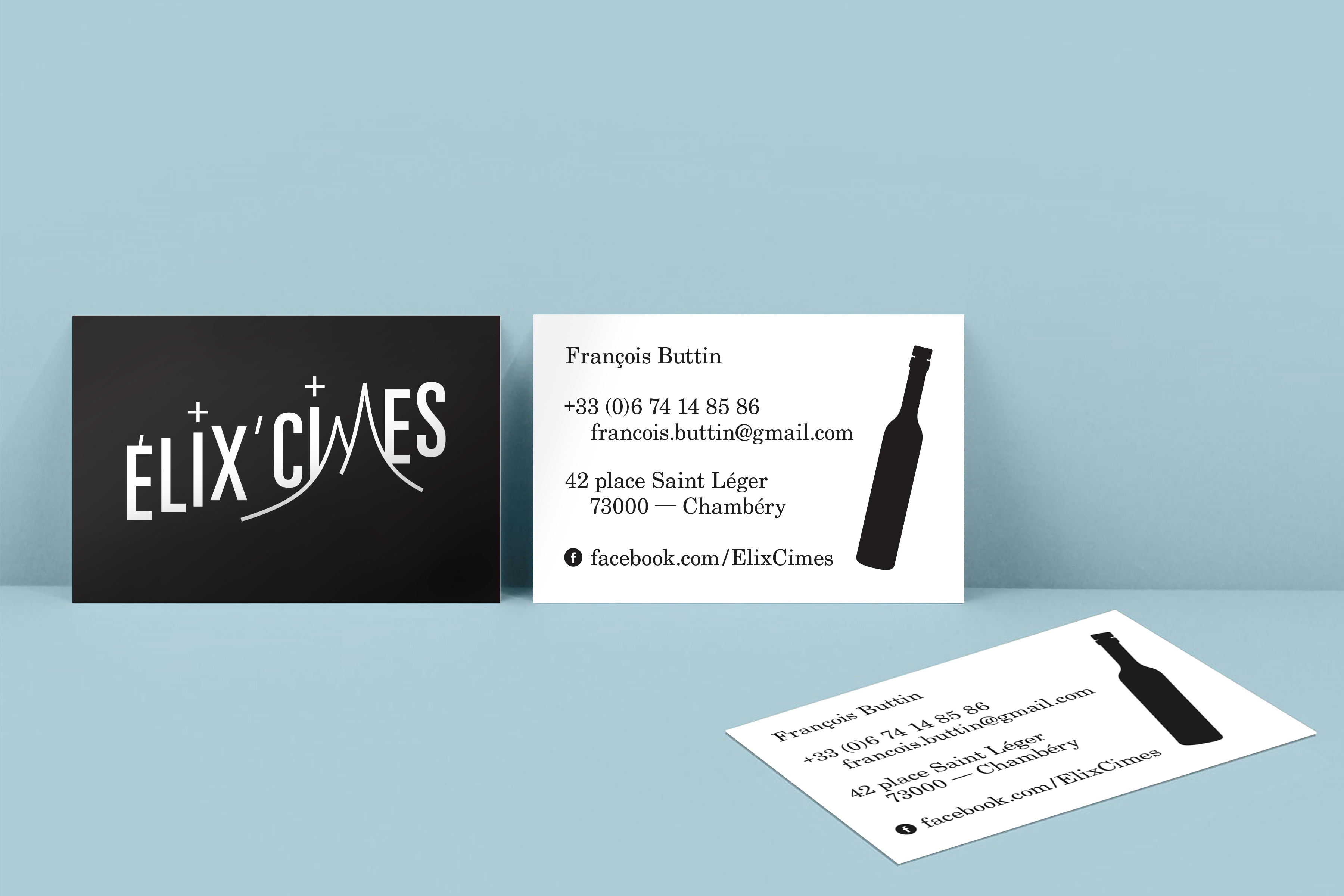
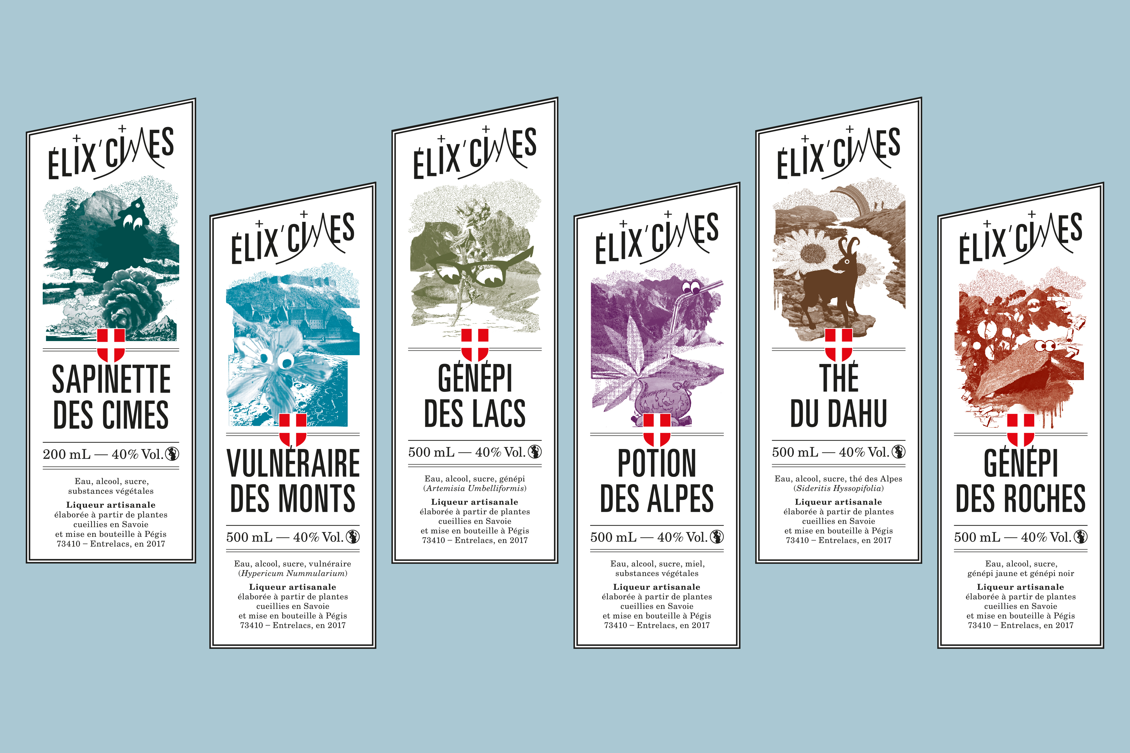
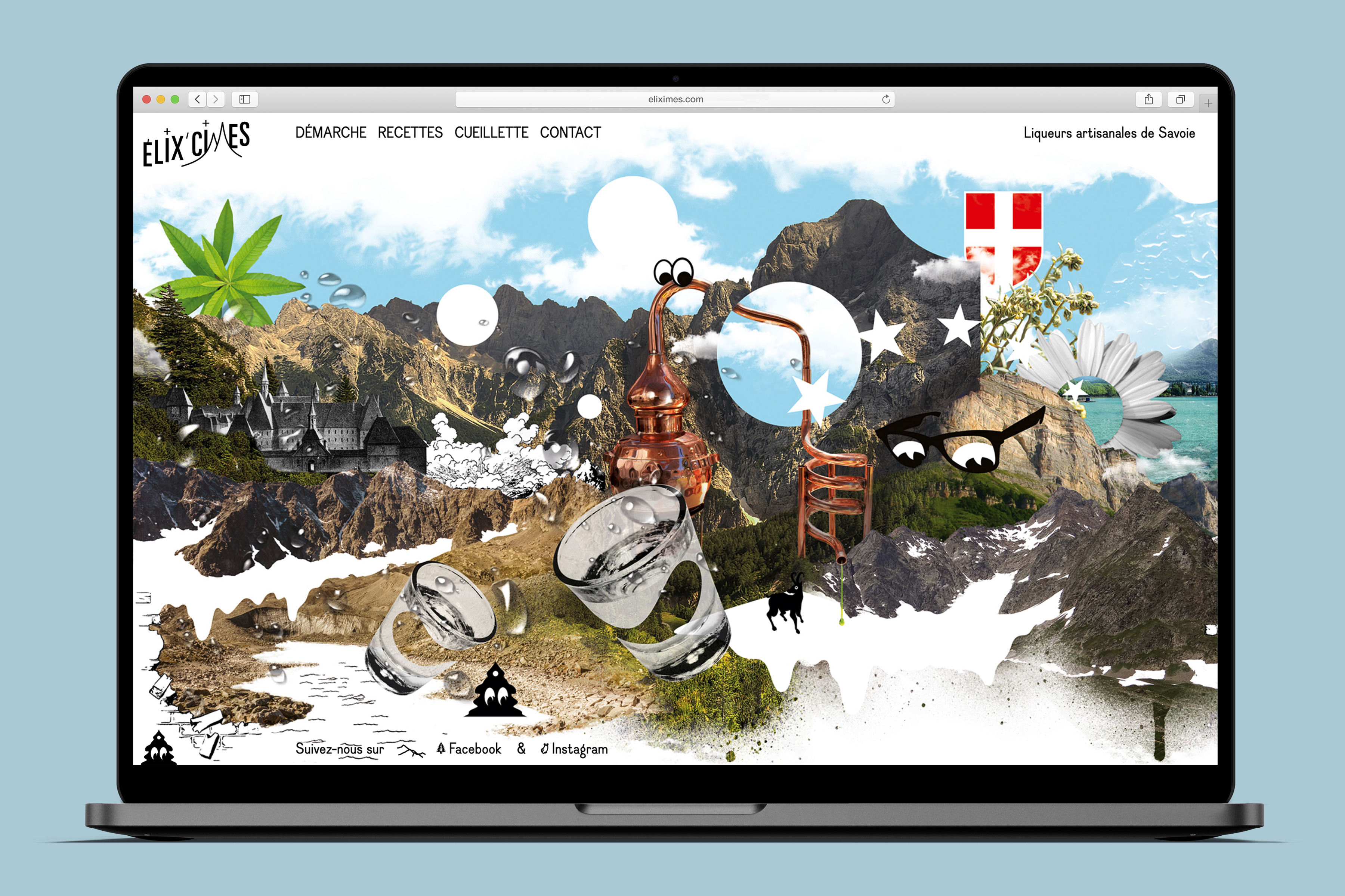
Élix’Cimes
Client: Élix’Cimes | Year: 2017-2022 | logotype, identity, poster, labels, website
Élix’Cimes is a young French liquor producer from Savoie (France). Nestled in the heart of the Alps, François Buttin is dedicating his time to wander the mountains in search for the precious plants to be conscientiously hand-picked. His rare know-how is then dedicated to a responsible artisanal production method to sublimate the plants of his region and turn them into the most delicious nectars.

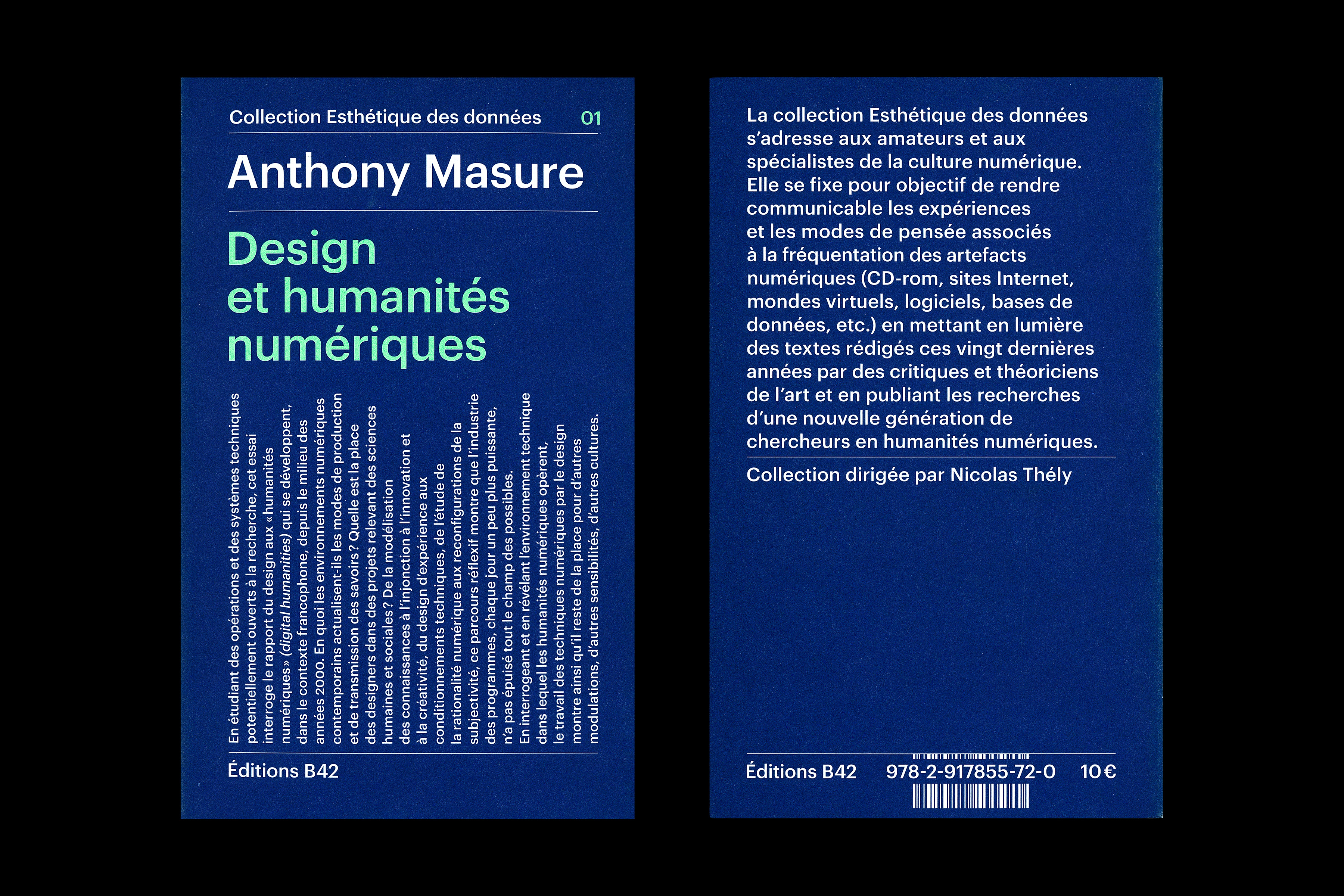
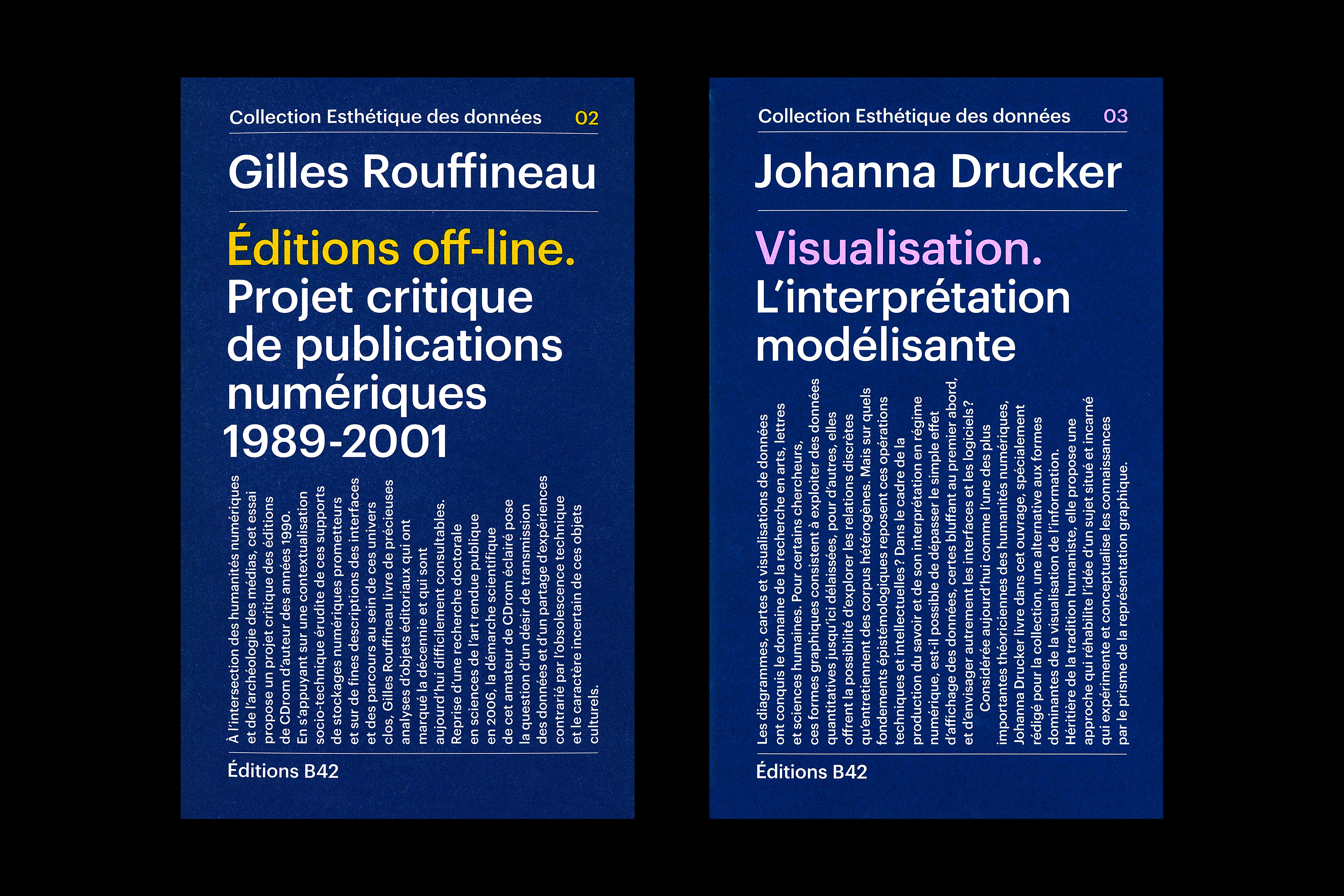
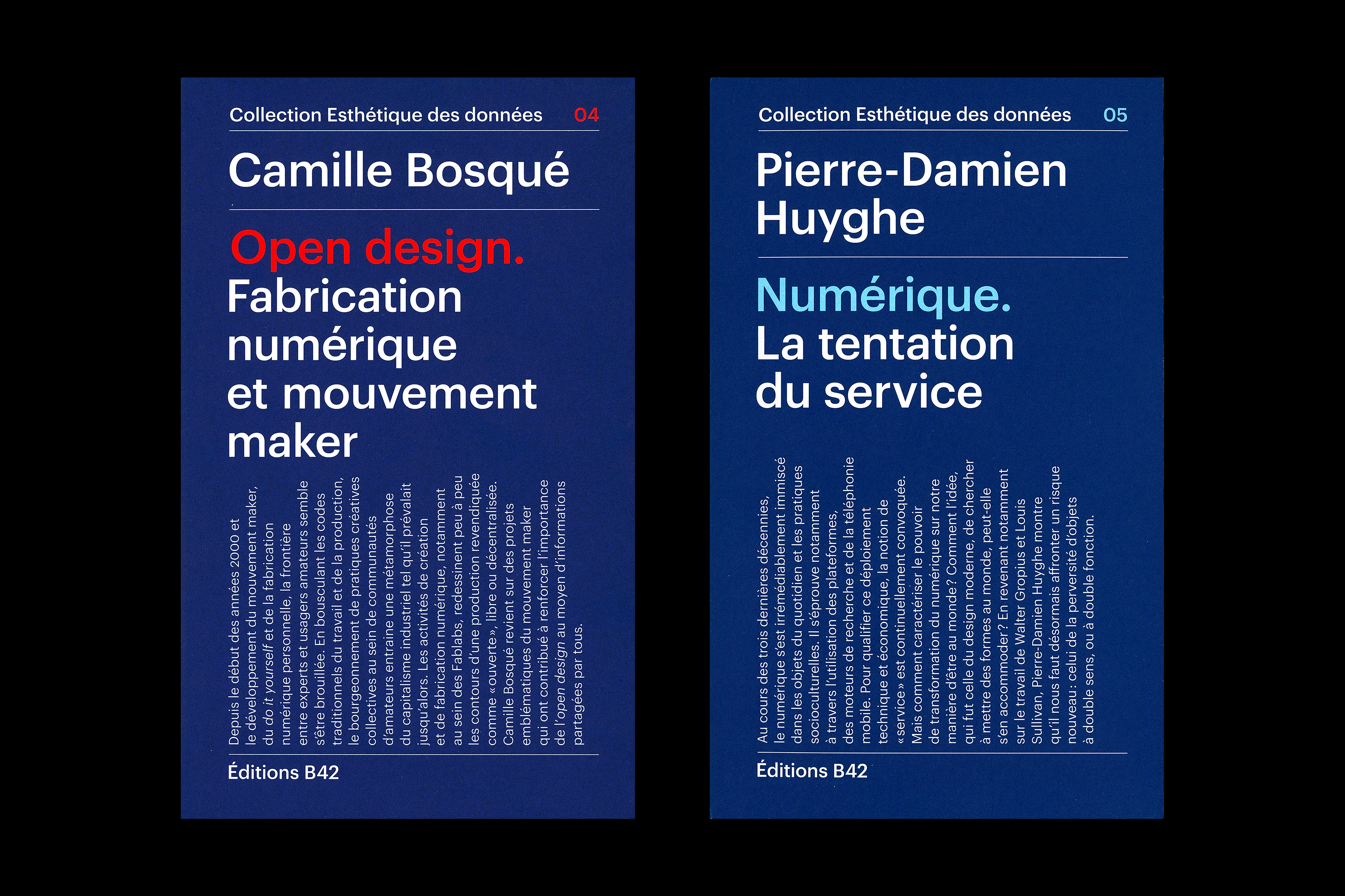
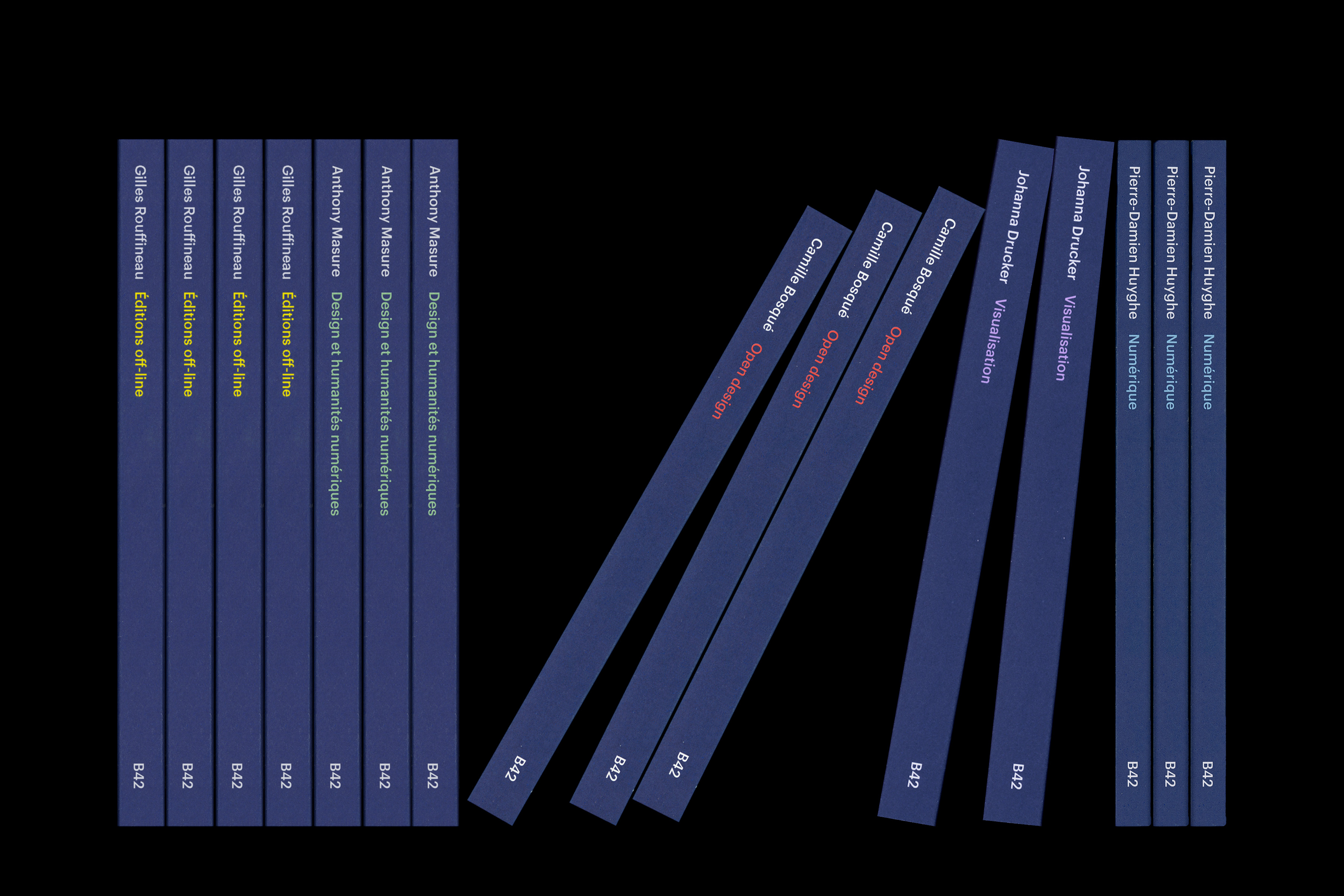
Collection Esthétique des données
Client: Éditions B42 | Year: 2017-2022 | identity, books | In collaboration with studio deValence
Creation of the “Esthétique des données” collection’s graphic principles (directed by Nicolas Thély and published with the help of the Rennes 2 University) for the parisian publishing house B42. Realisation of the collection’s first five books.
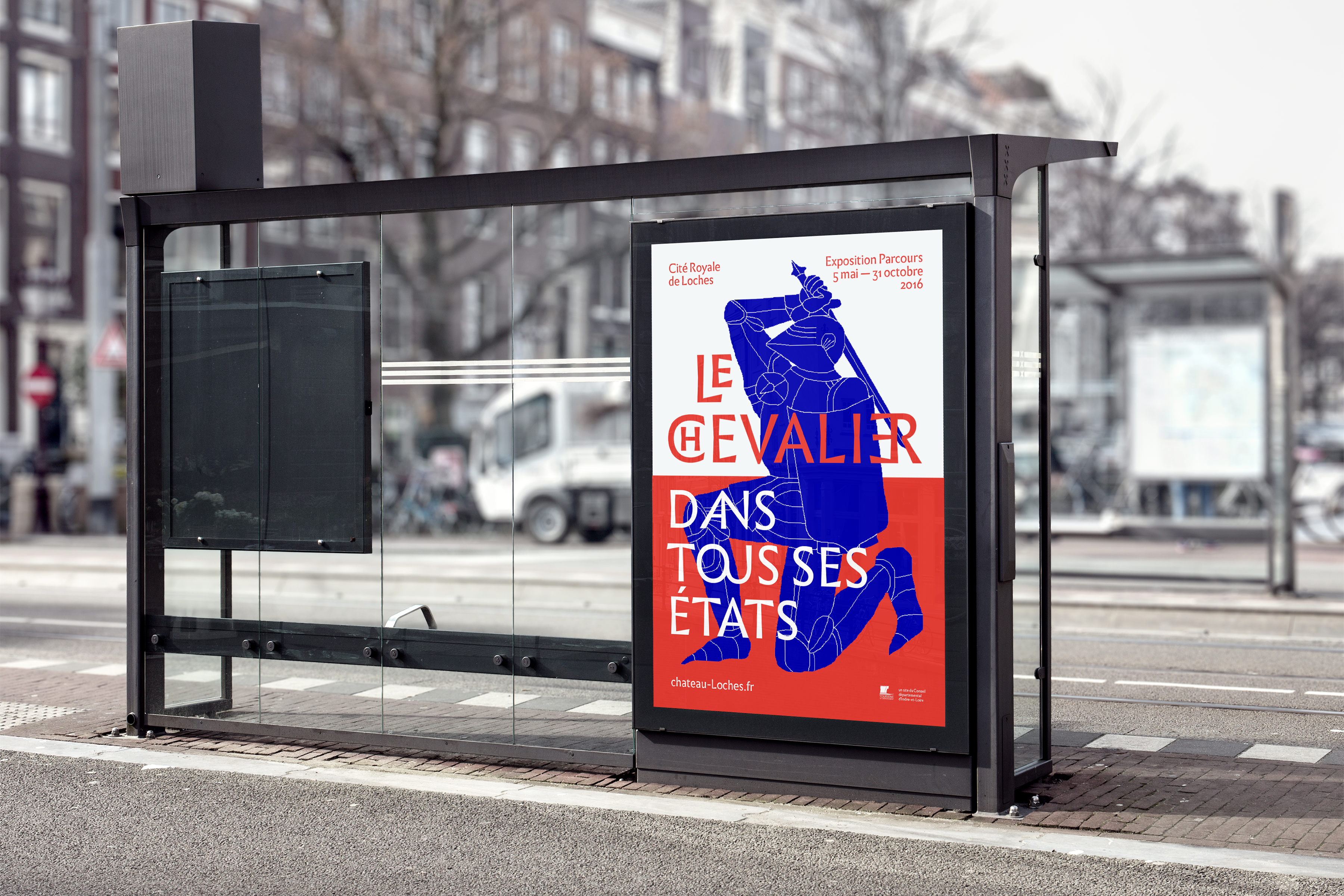
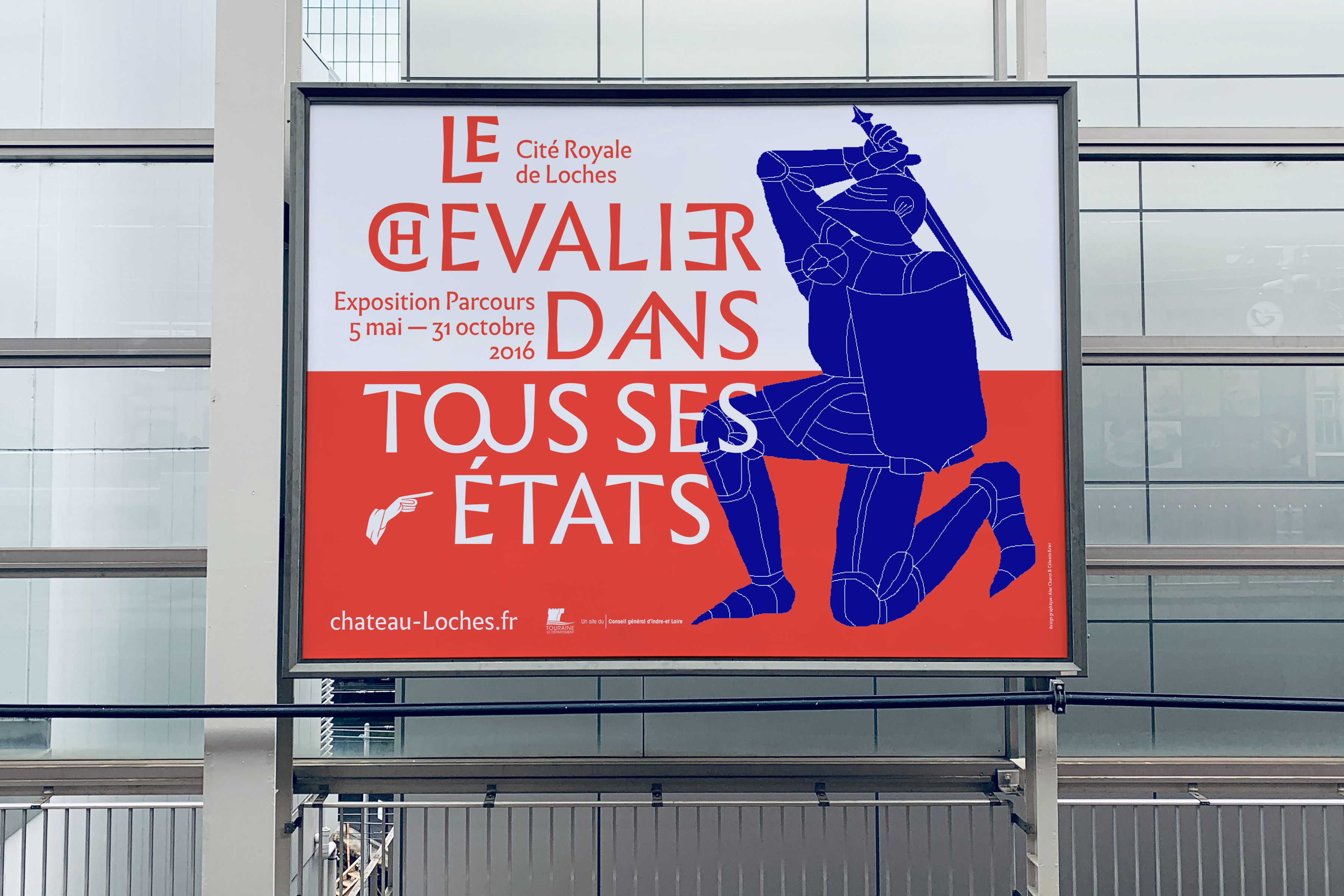
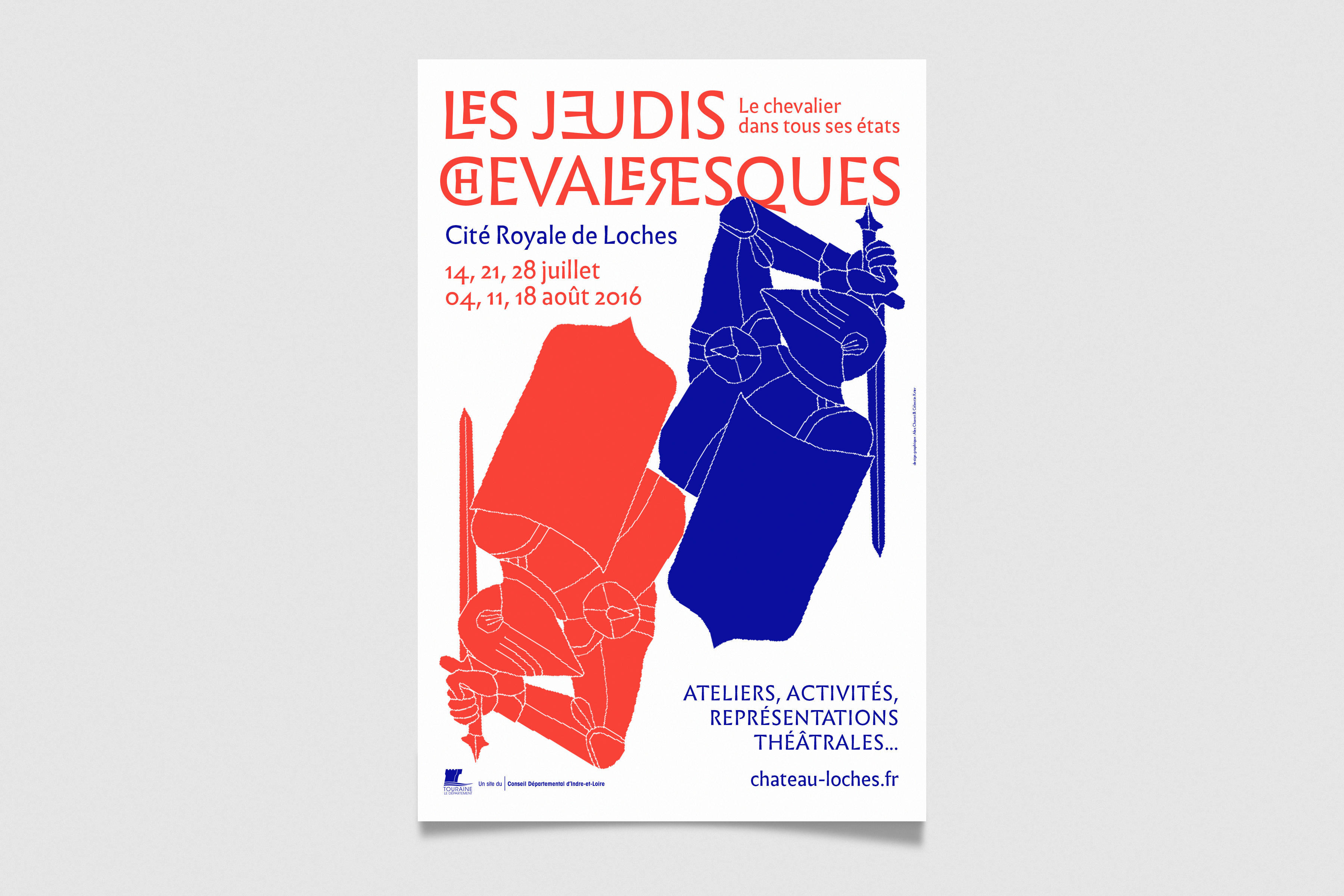
Cité Royale de Loches – Le Chevalier dans tous ses états
Client: Cité Royale de Loches | Year: 2016 | identity, programs, posters & signage | In collaboration with Célestin Krier
For an exhibition about knights at the Cité Royale of Loches (France), illustrator Célestin Krier and I joined forces to design the identity, signage and overall communication. Based on a simple but striking heraldic palette, the identity takes advantage of a strong typographic treatment (Infini, by Sandrine Nugue) paired with Krier’s iconic style of illustrations. Bold and playful!
Exhibition design by Francisca Würz and Florent Blanchard.

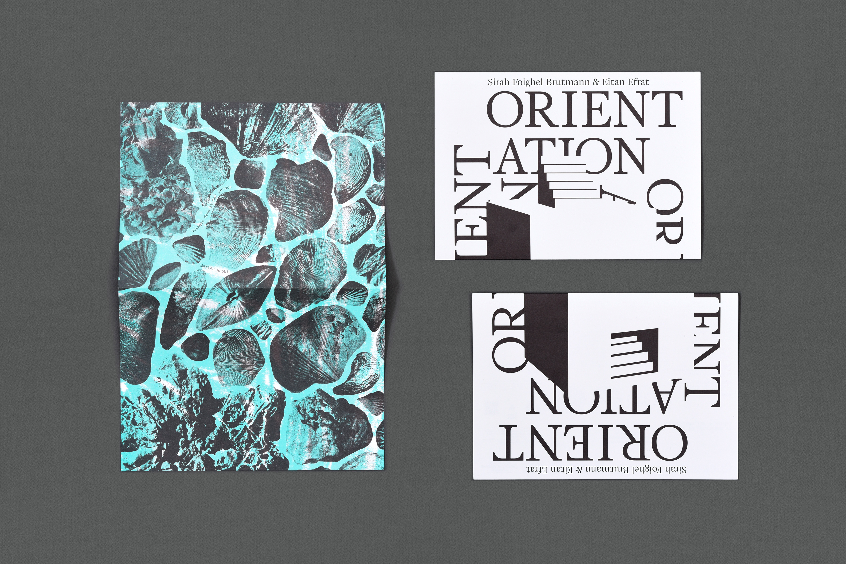
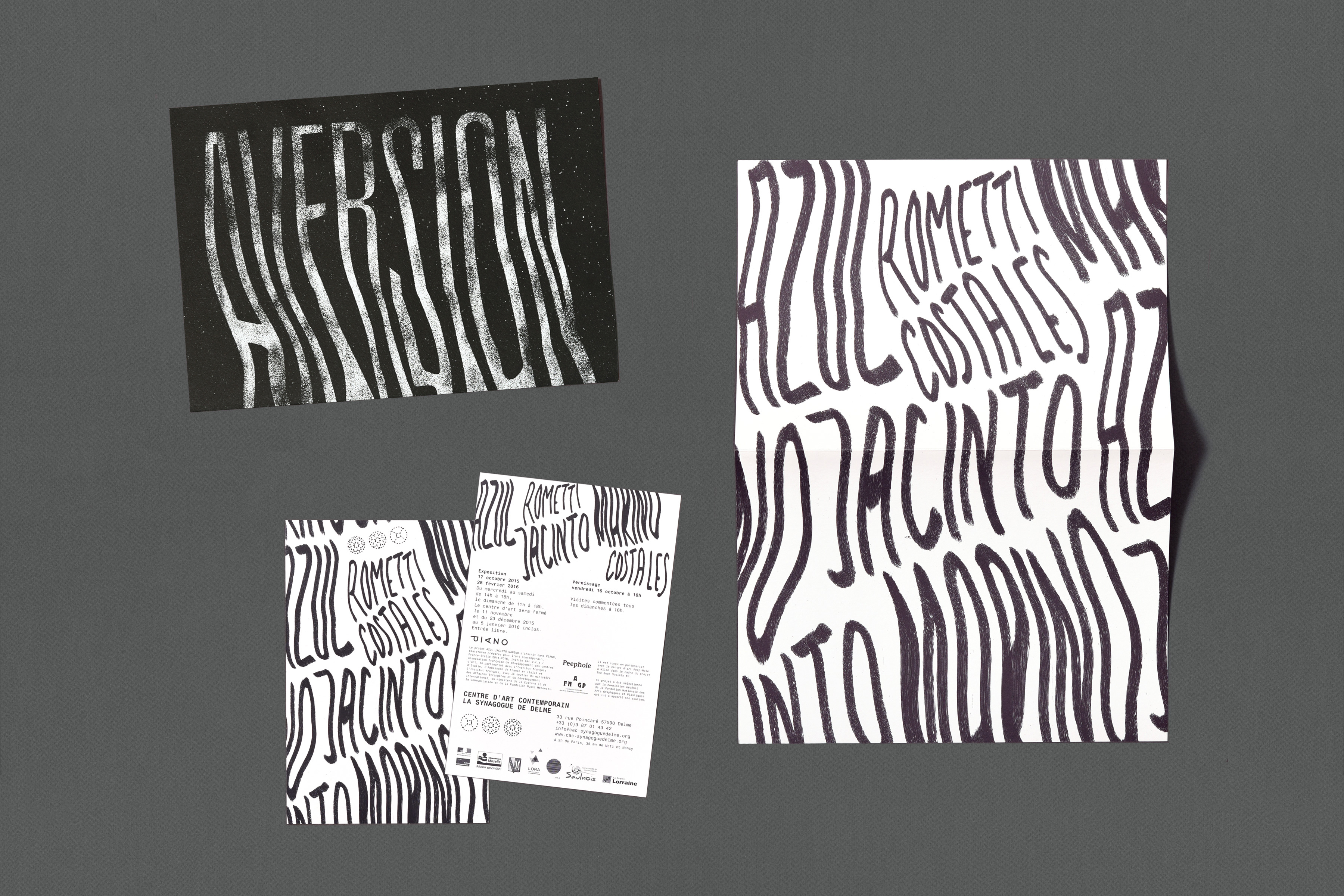
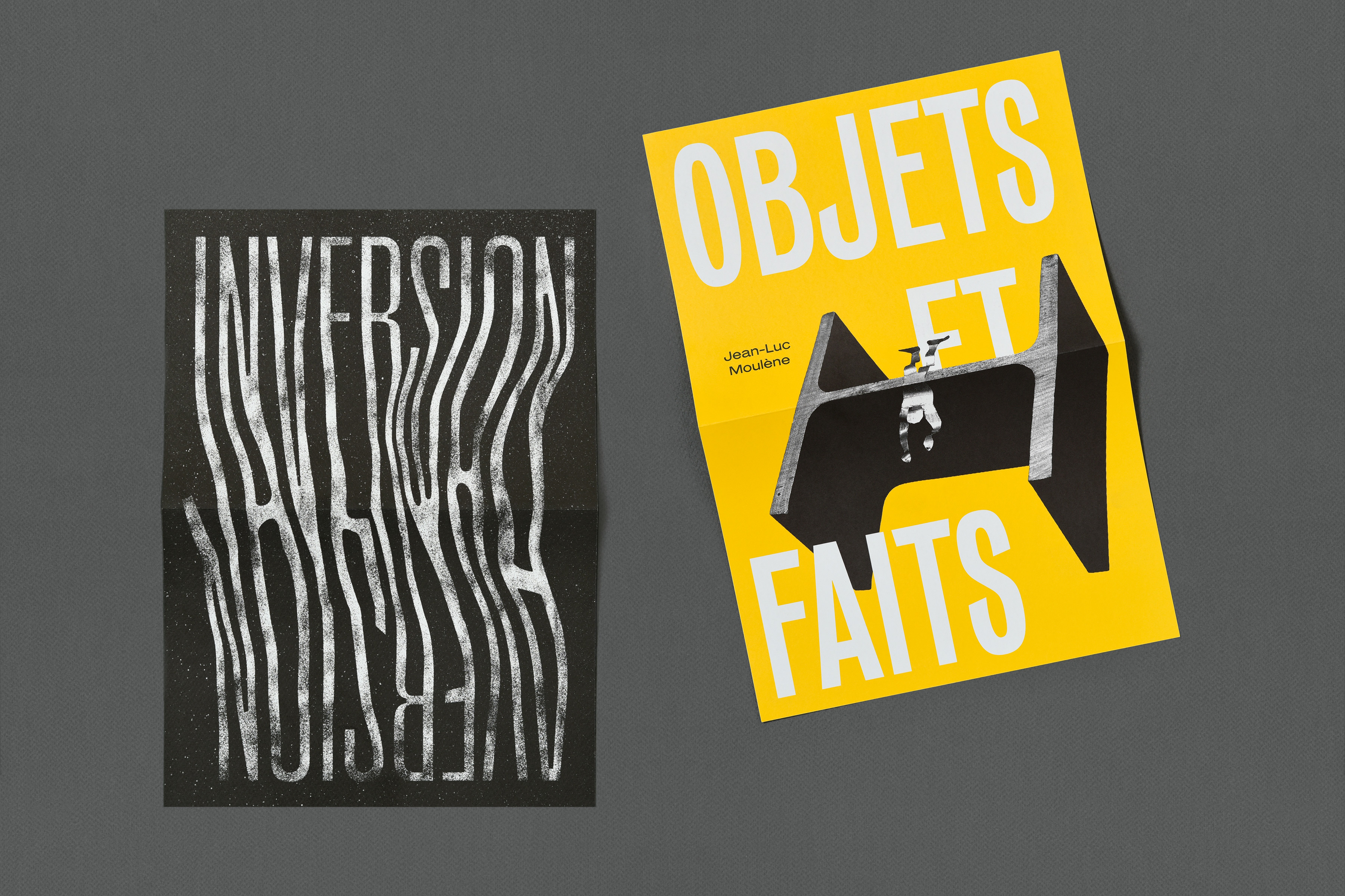
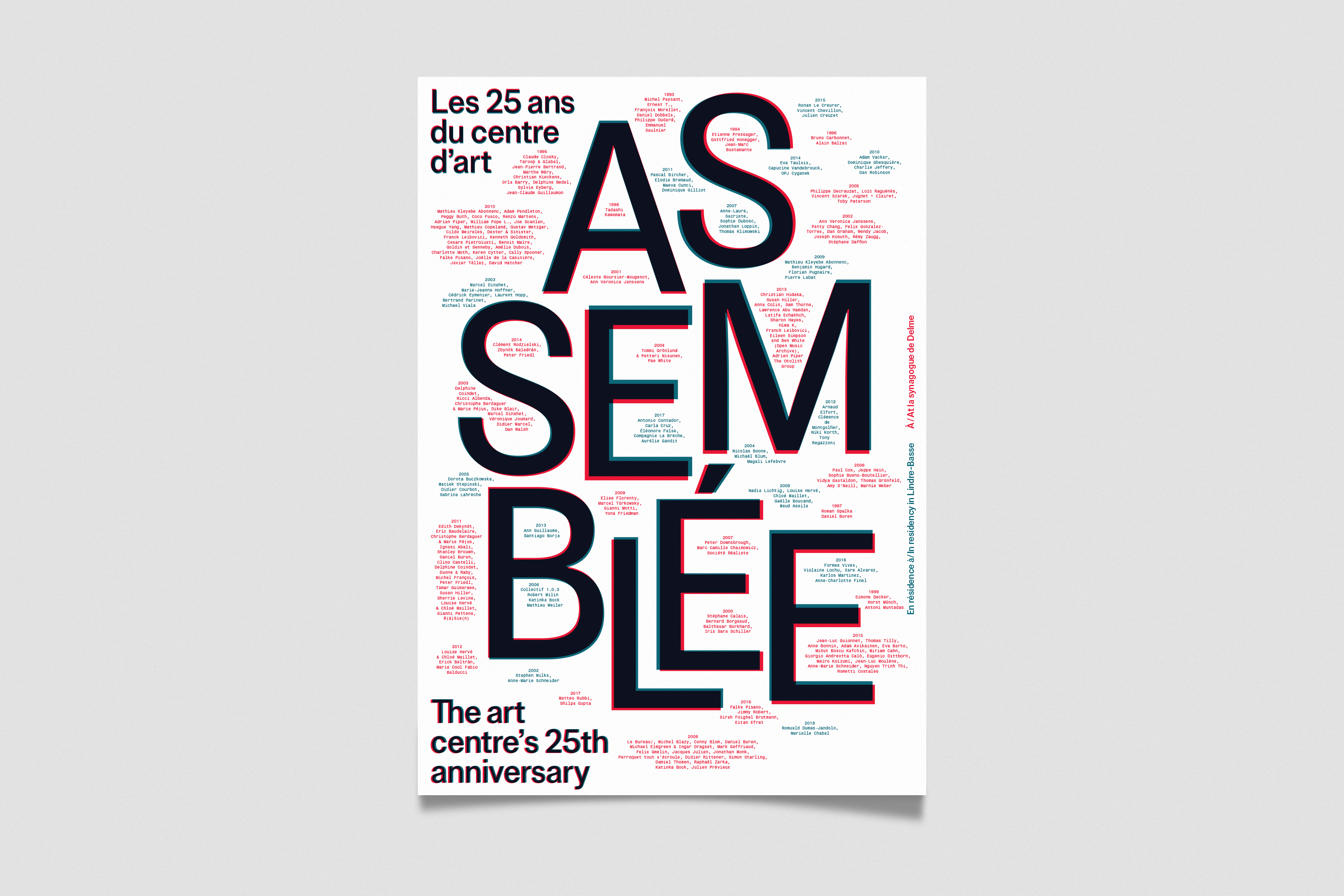
Synagogue de Delme – Invitations
Client: Synagogue de Delme | Years: 2015-2018 | invitations, posters | In collaboration with studio deValence
For several years, studio deValence has been in charge of the Synagogue de Delme’s communication. Under their art direction, I designed a few invitation cards which came as folded A4 sheets: a completely free visual proposition for each exhibition on the front and a fixed layout with all the informations on the back.
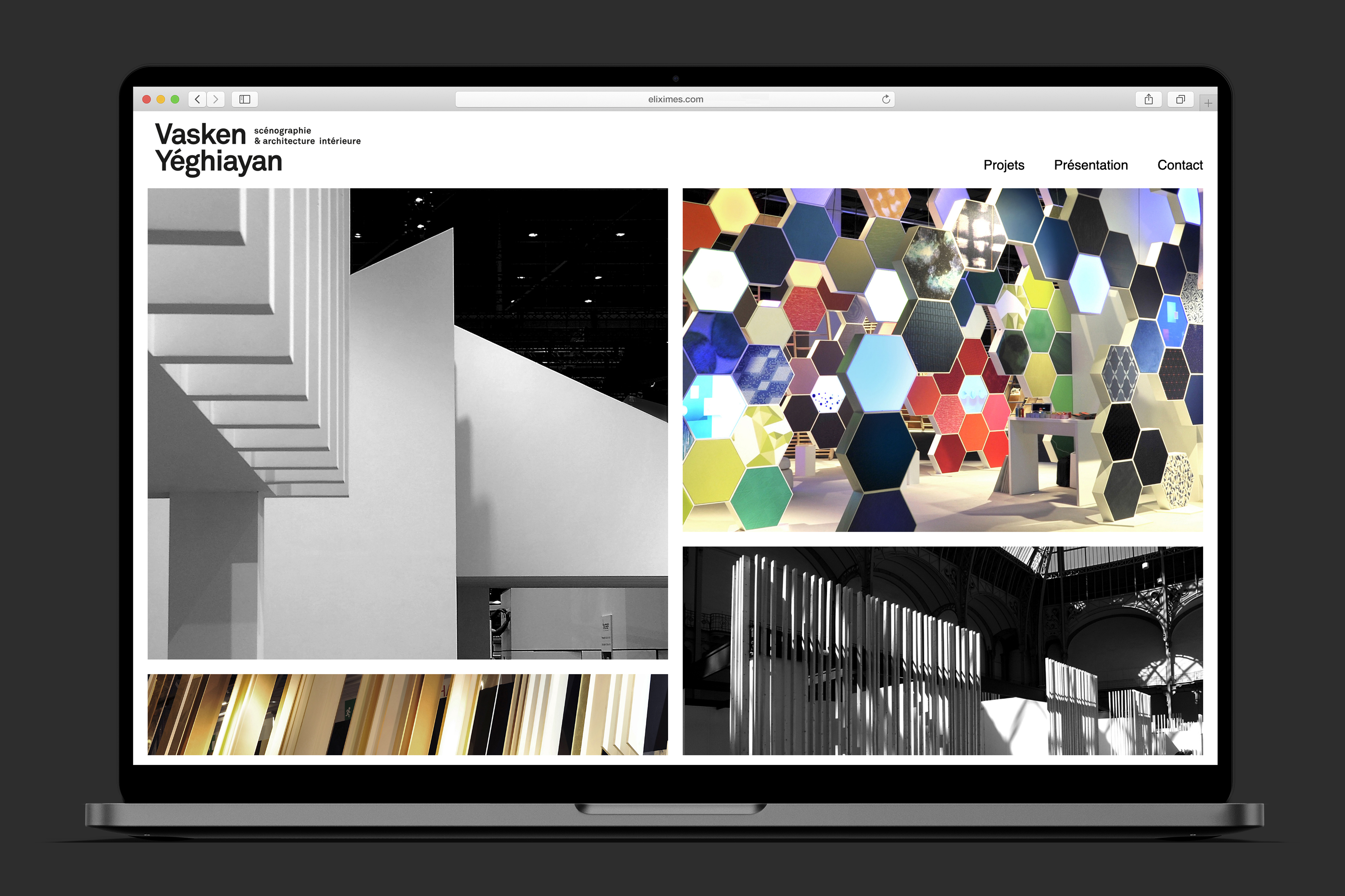
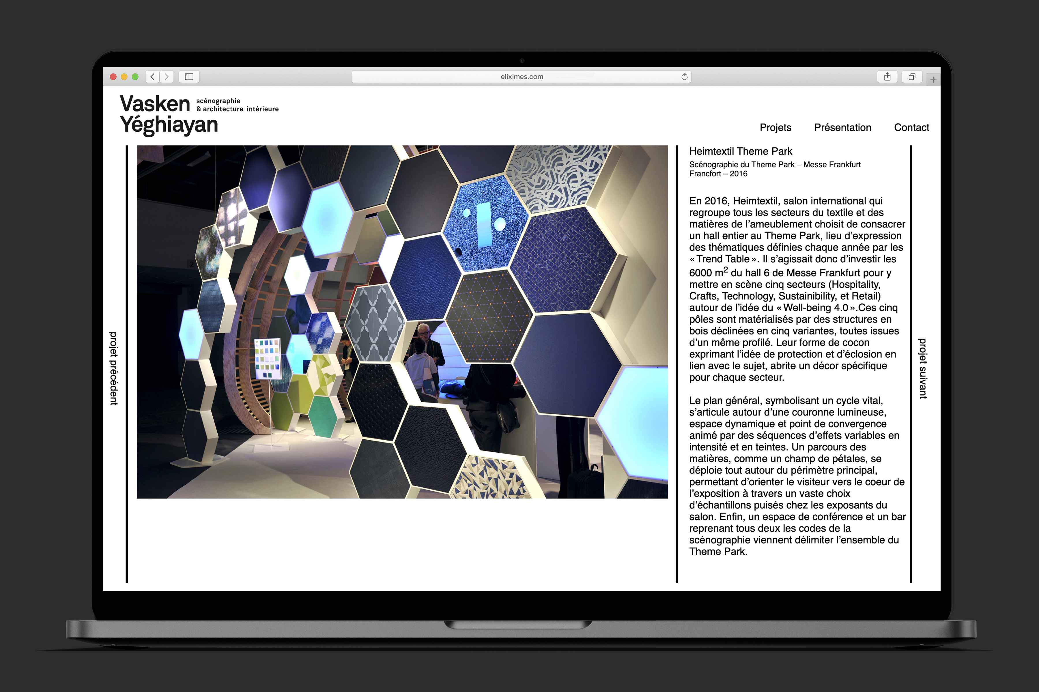
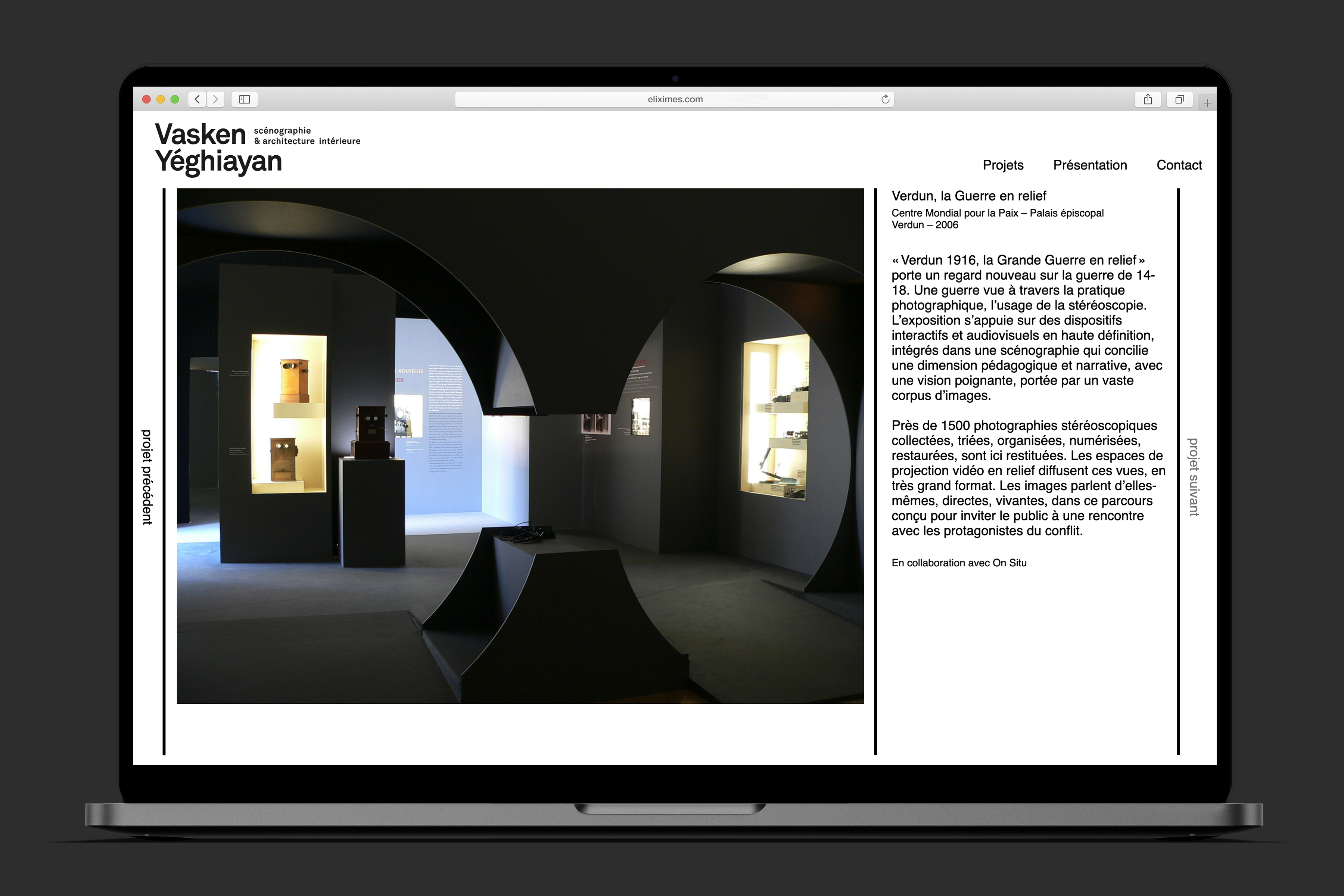
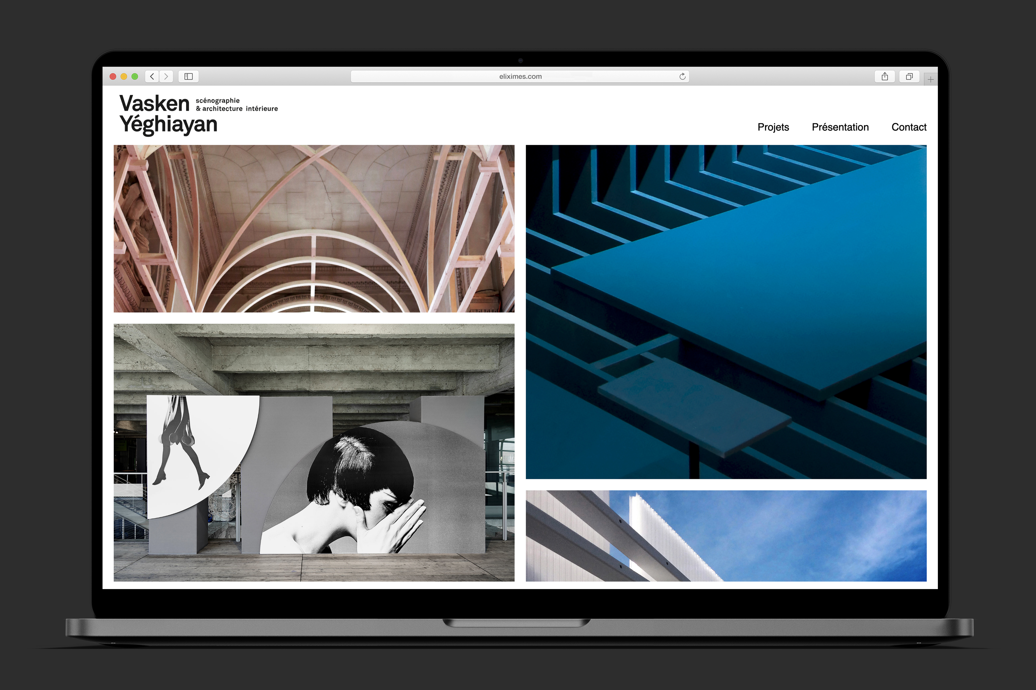
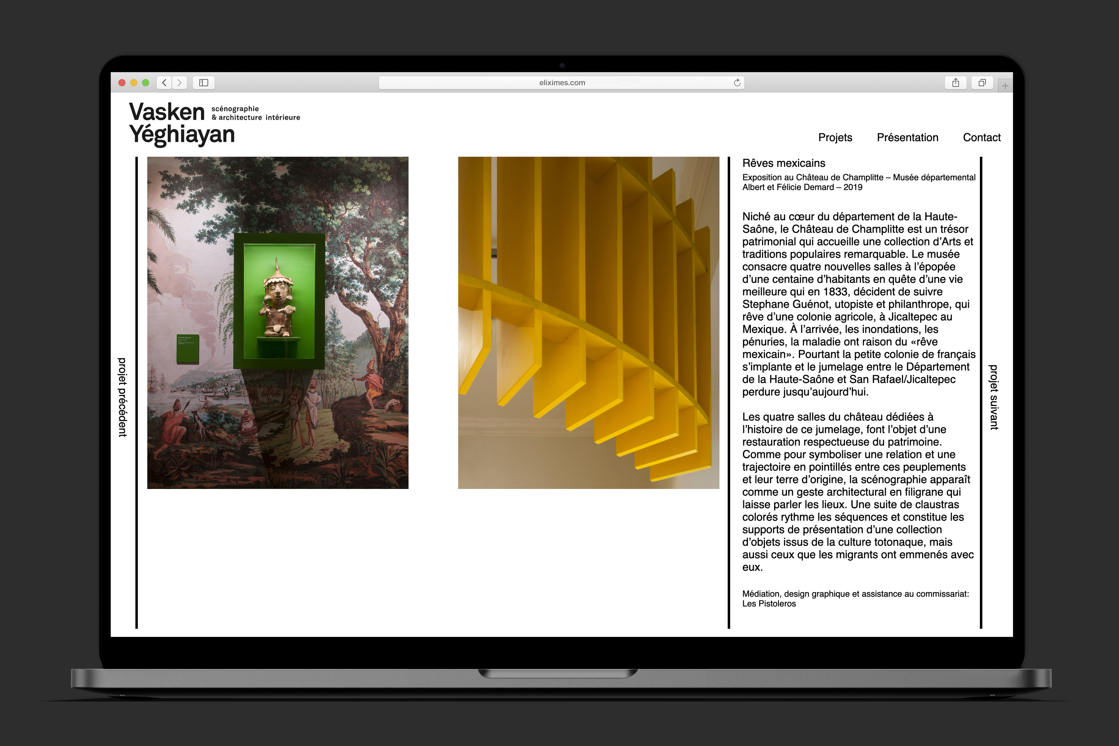
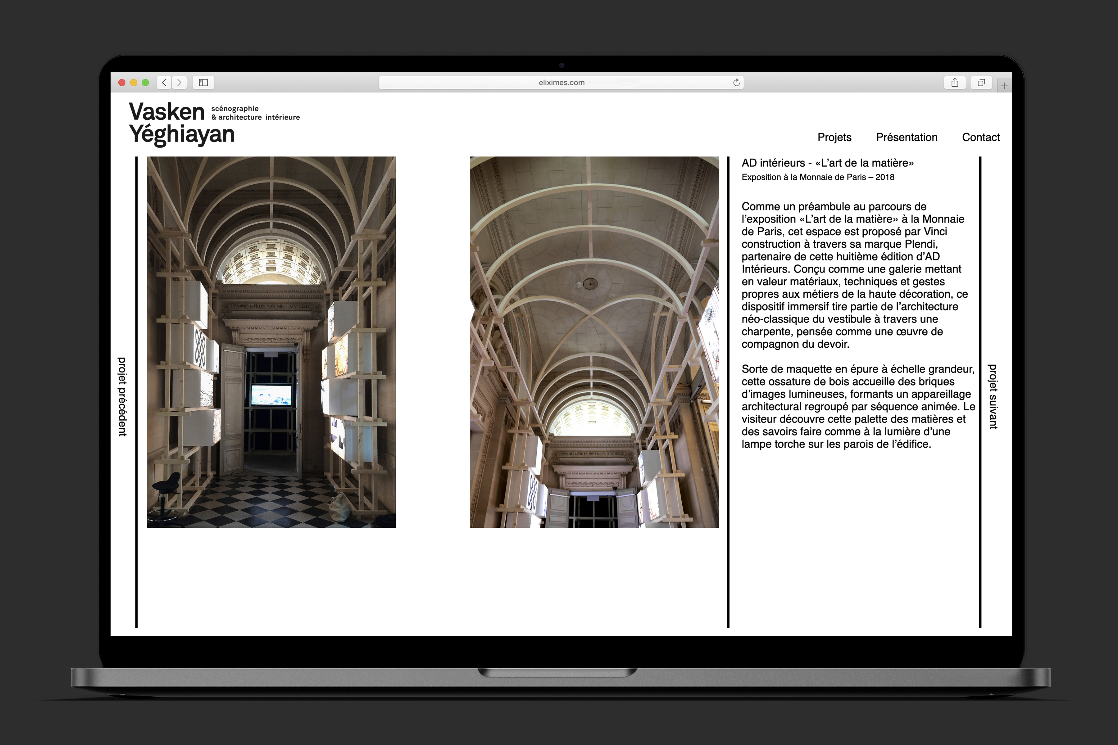
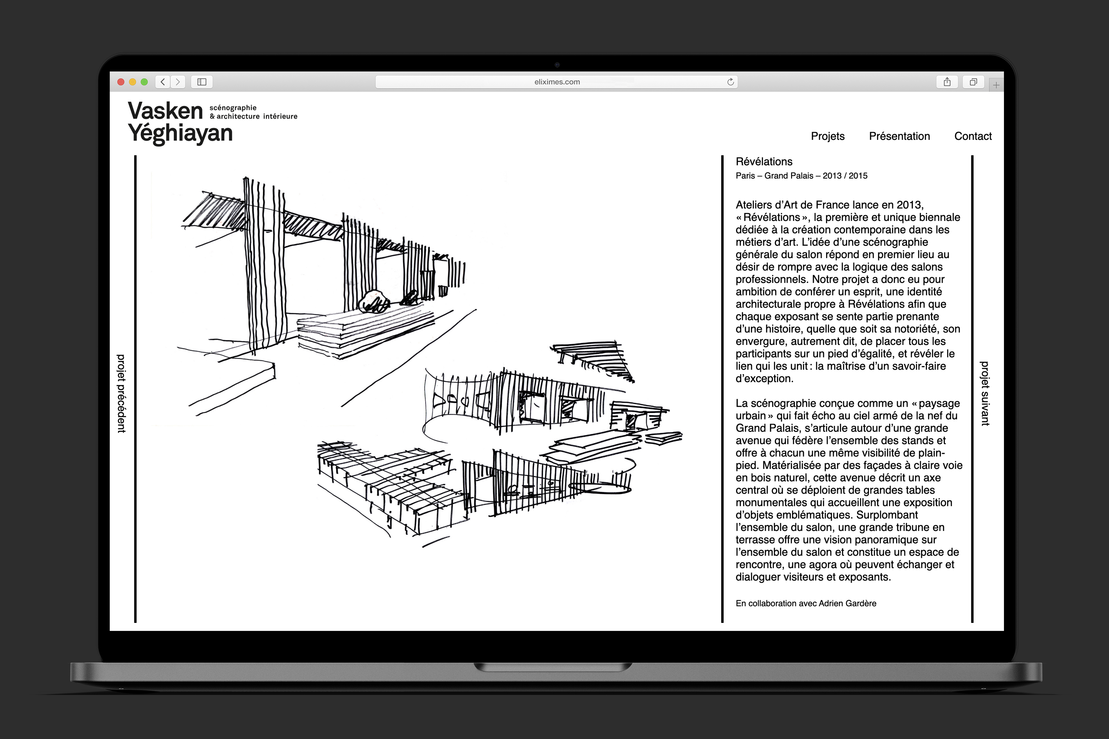
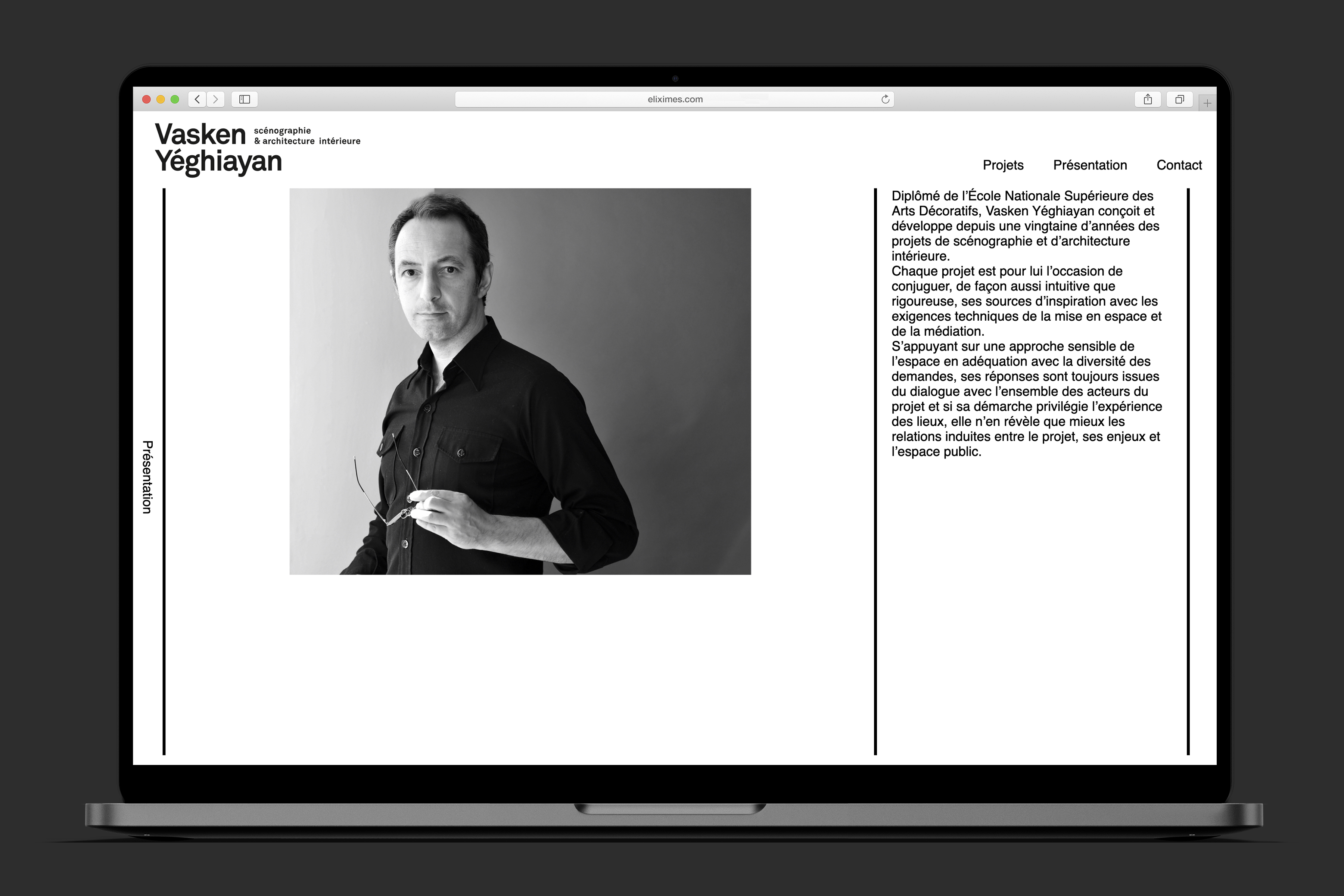
Vasken Yéghiayan
Client: Vasken Yéghiayan | Year: 2015 | web design
In 2015, set-designer Vasken Yéghiayan approached me to work on his personal website to showcase his practice. Since then, we’ve been closely working together to keep it up to date with his latest projects.

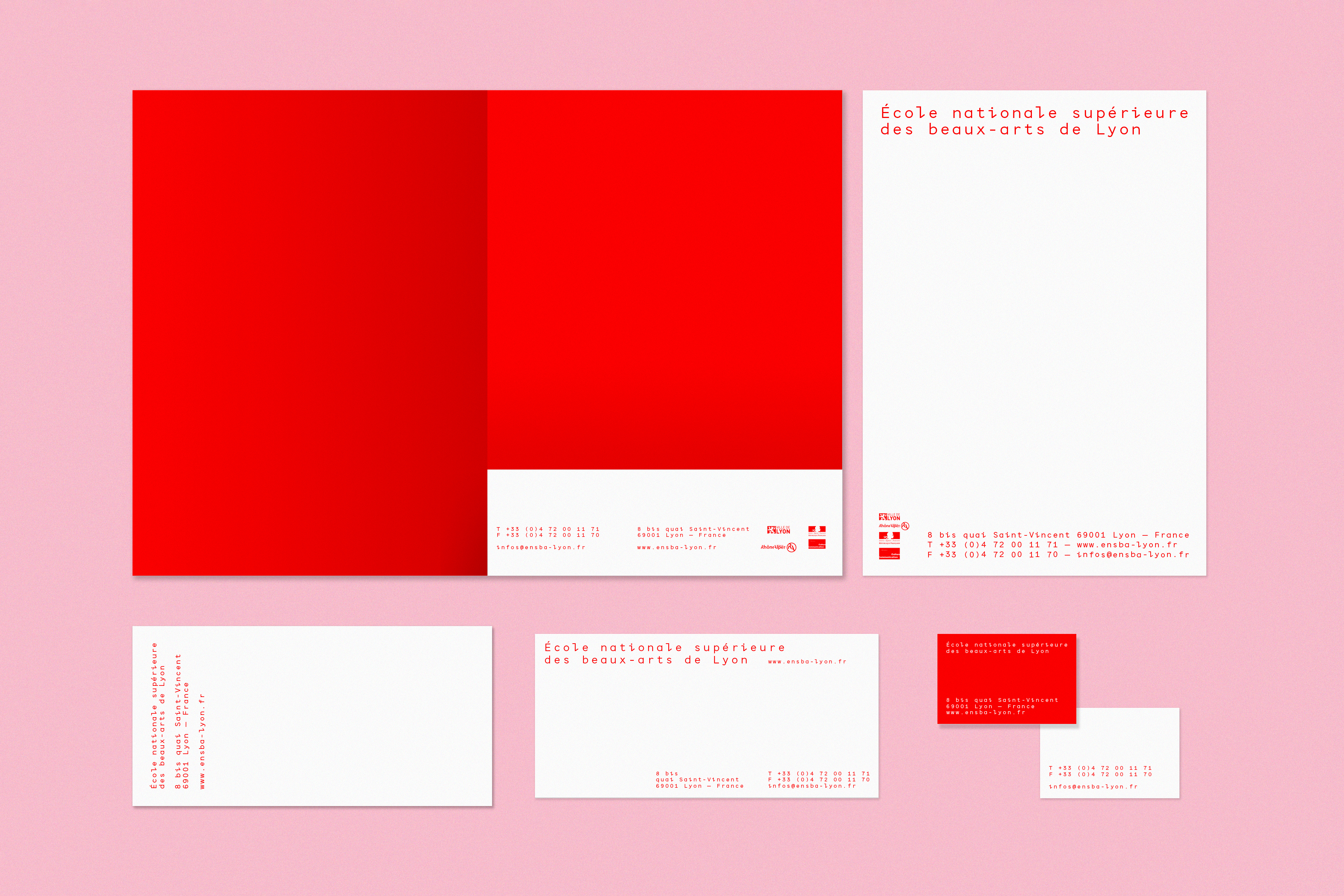
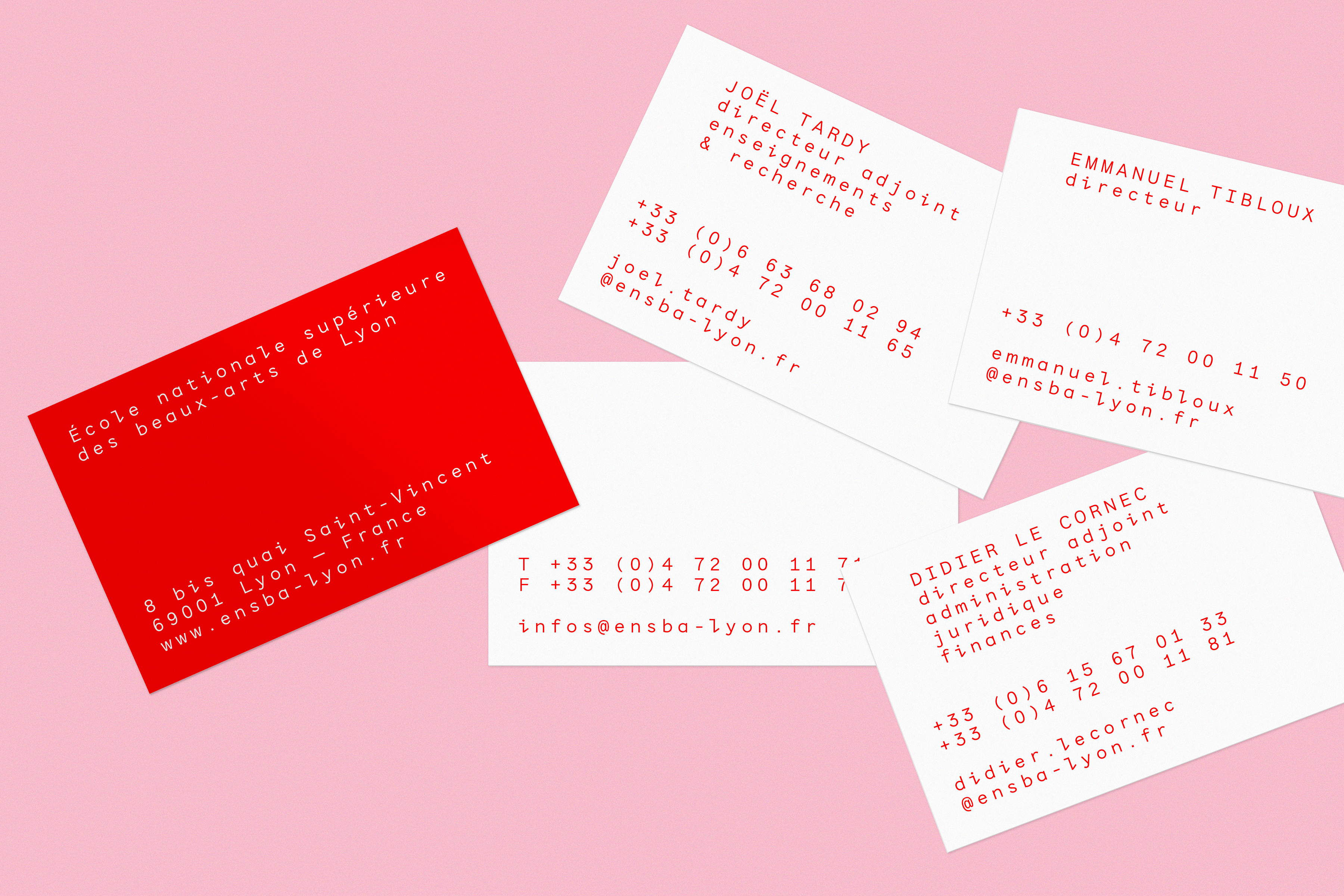
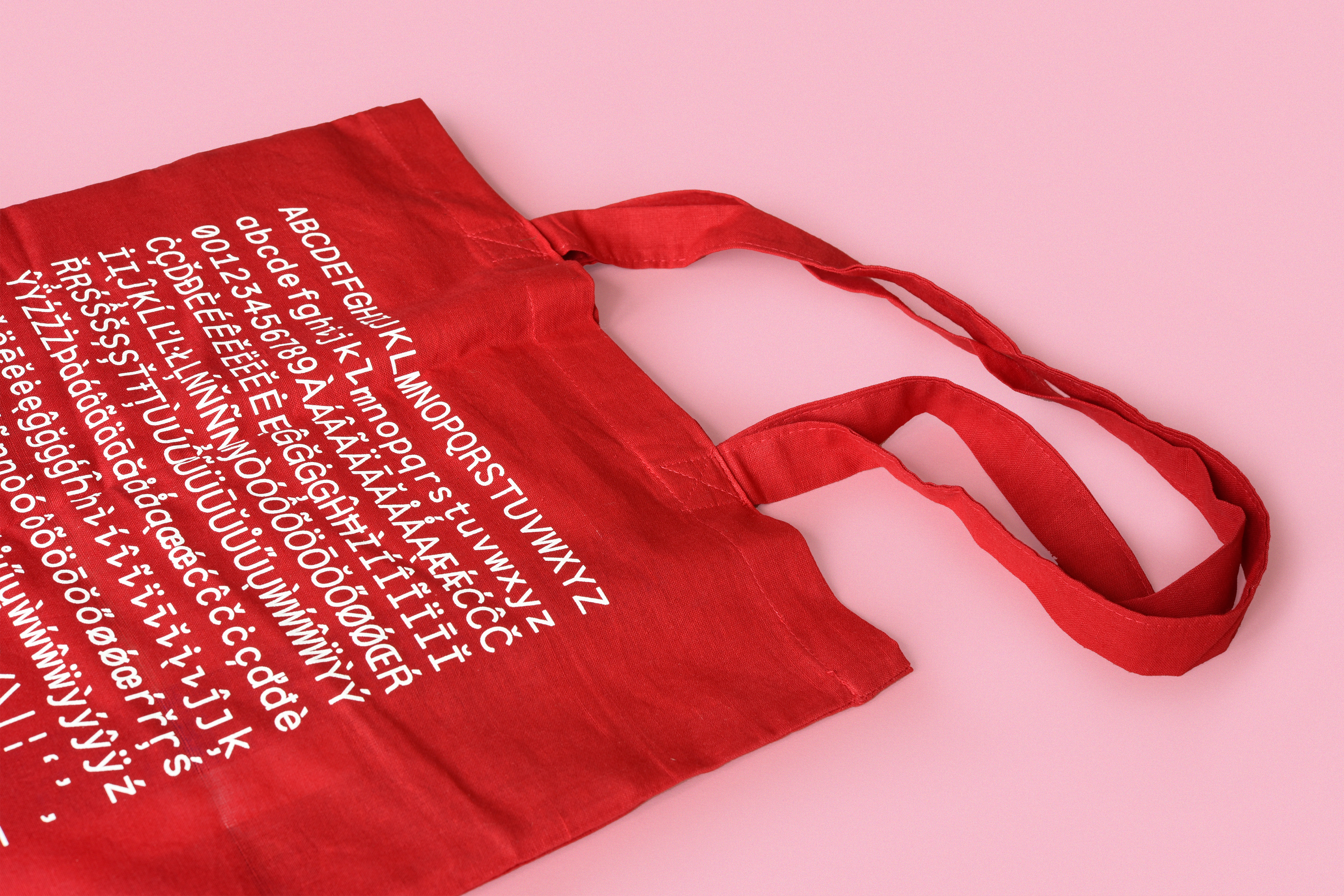
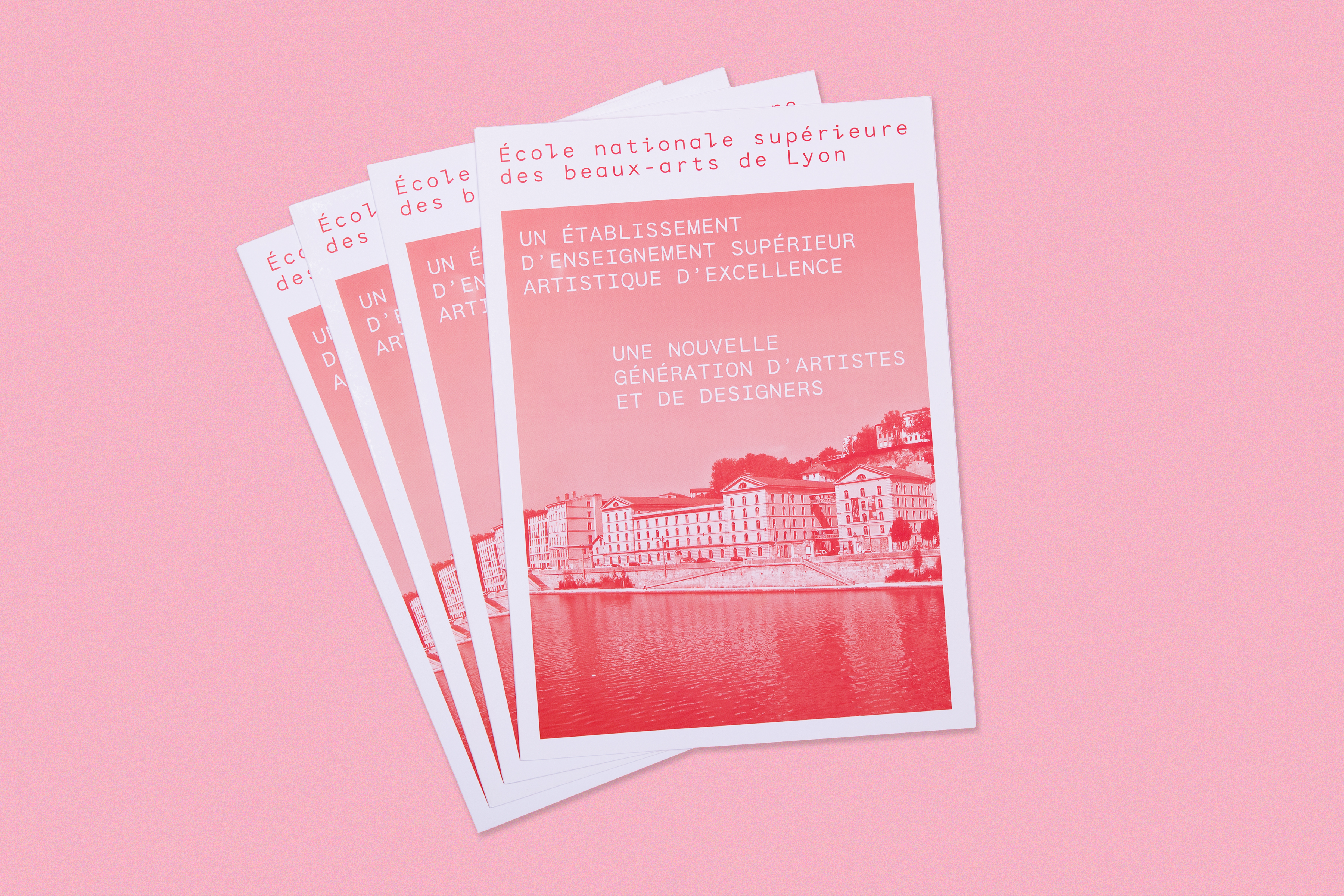
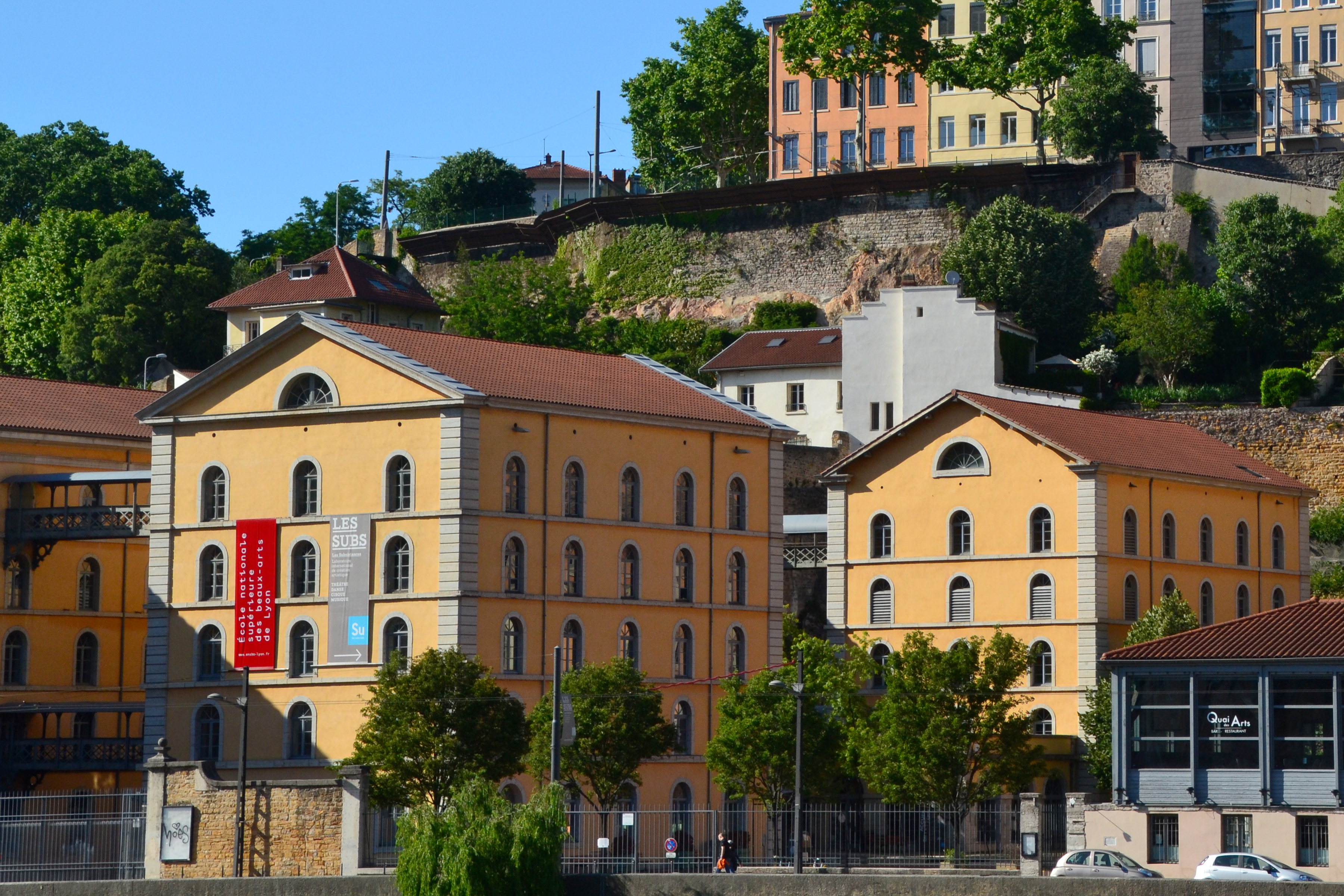
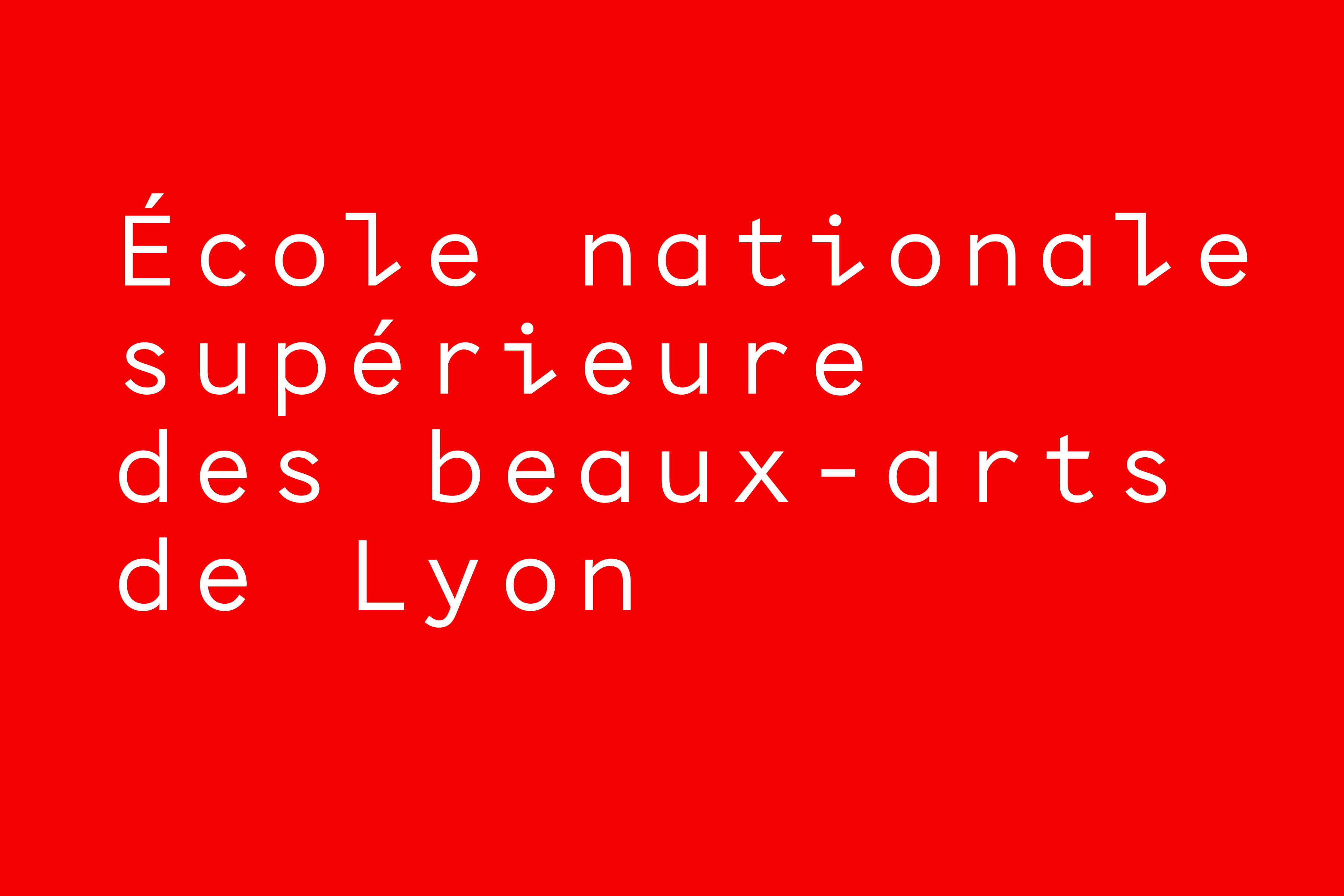
École nationale supérieure des beaux-arts de Lyon
Client: Ensba Lyon | Year: 2013–2015 | visual identity | In collaboration with Radim Peško and Fabrice Mabime
The redesign of the visual identity of Lyon’s national fine arts school rests on two axes of exploration: time/color and space/typography. These two axes are guided by a concept of ductibility resulting in a series of subtle variations, the basic principle of this identity. The color red and its infinite variations are the backbone of the identity, evolving with time, printing or display techniques and the seasons. The Ensba and Ensba Mono fonts, which were designed specifically for the school’s identity, emphasize the architectural dimension of the page and are an immediate signature, even when used in the simplest and most direct way.
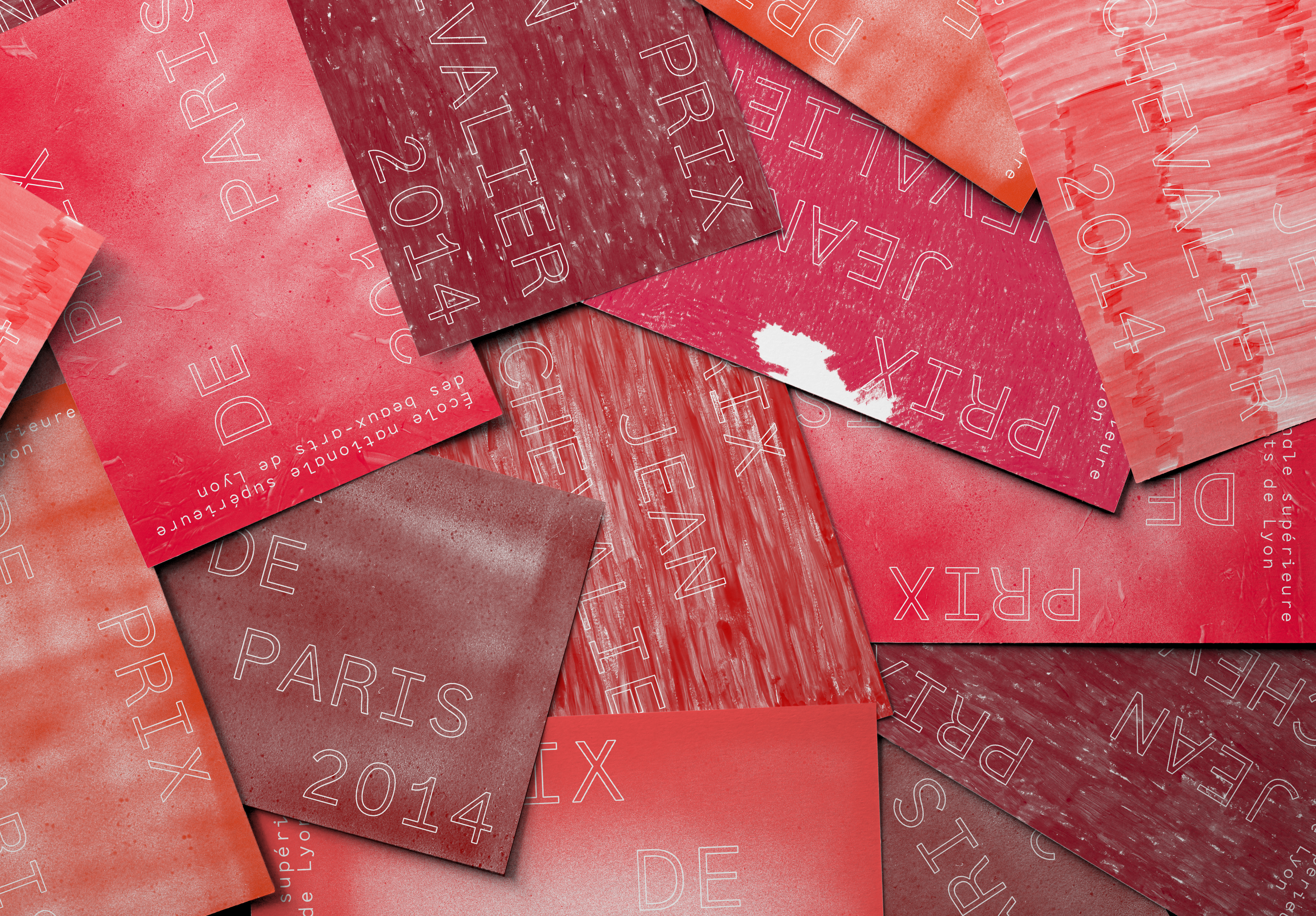
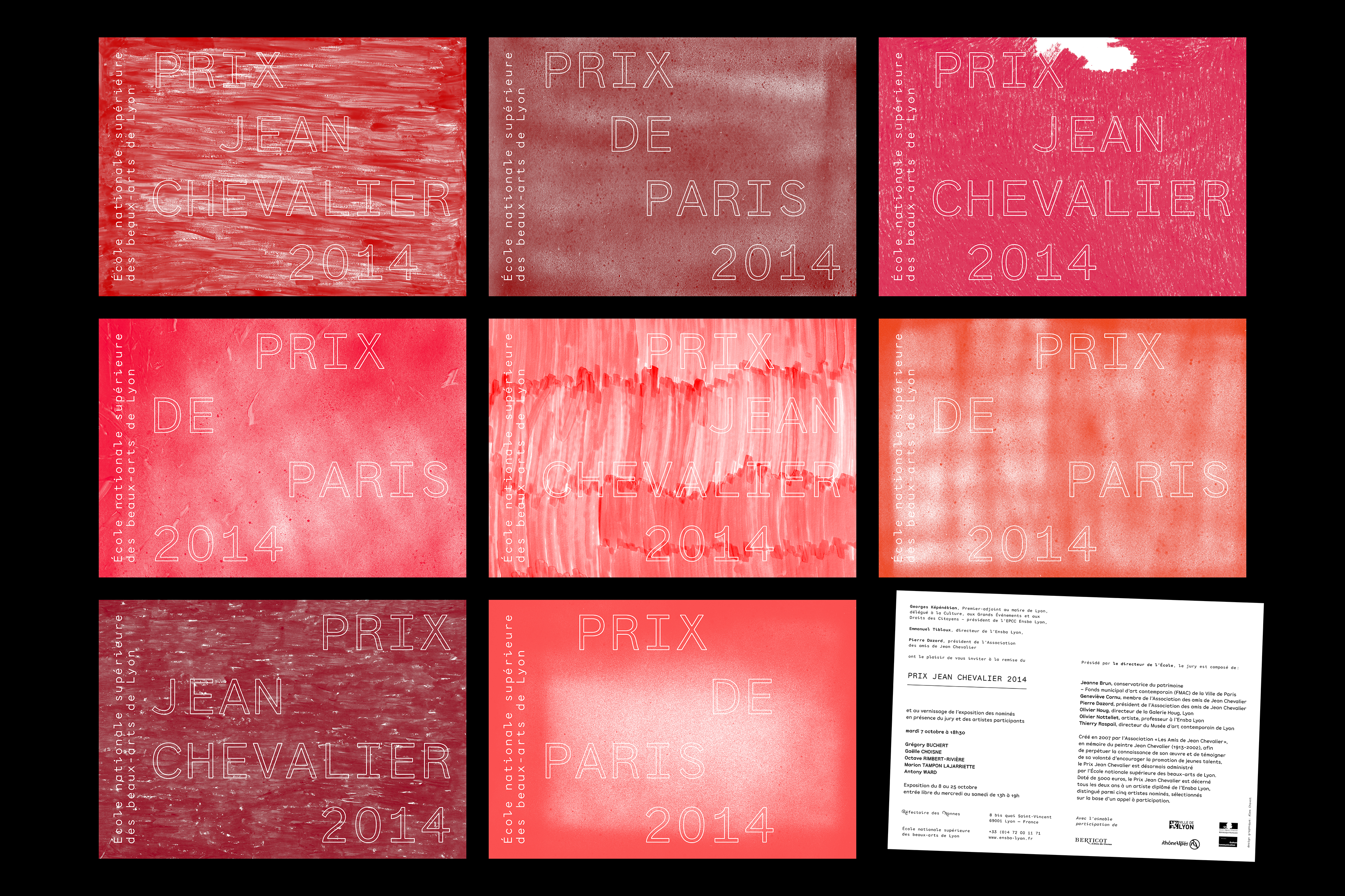
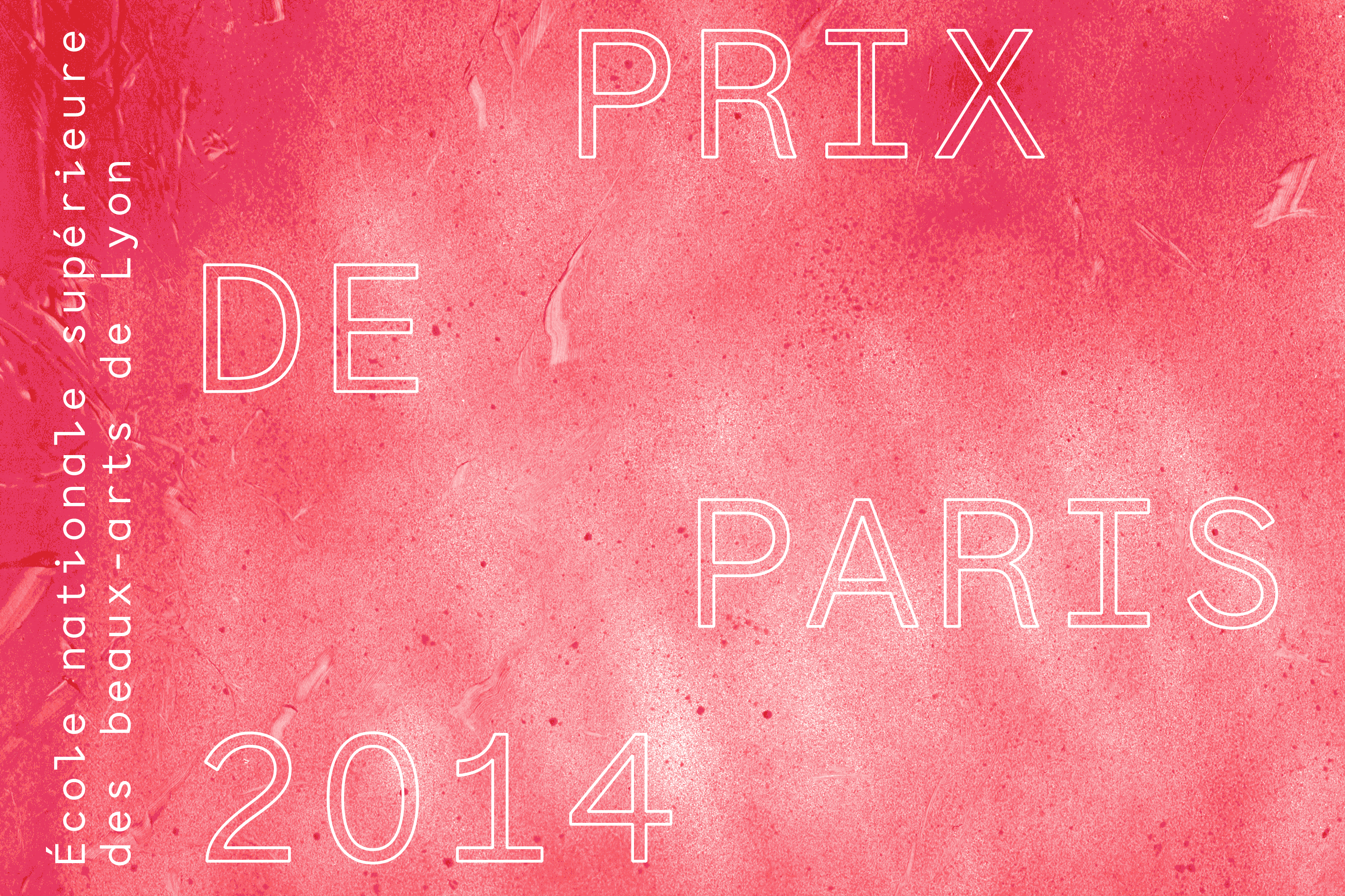
Prix de Paris / Prix Jean Chevalier
Client: ENSBA Lyon | Year: 2014 | invitation cards
Invitation cards for two Art prices taking place at the National Superior School of Fine Arts in Lyon in 2014. There were four different visuals for each event playing with the idea of variation, tools and textures. The identity’s red color was different on every single card as we changed the color and its intensity during the printing process.
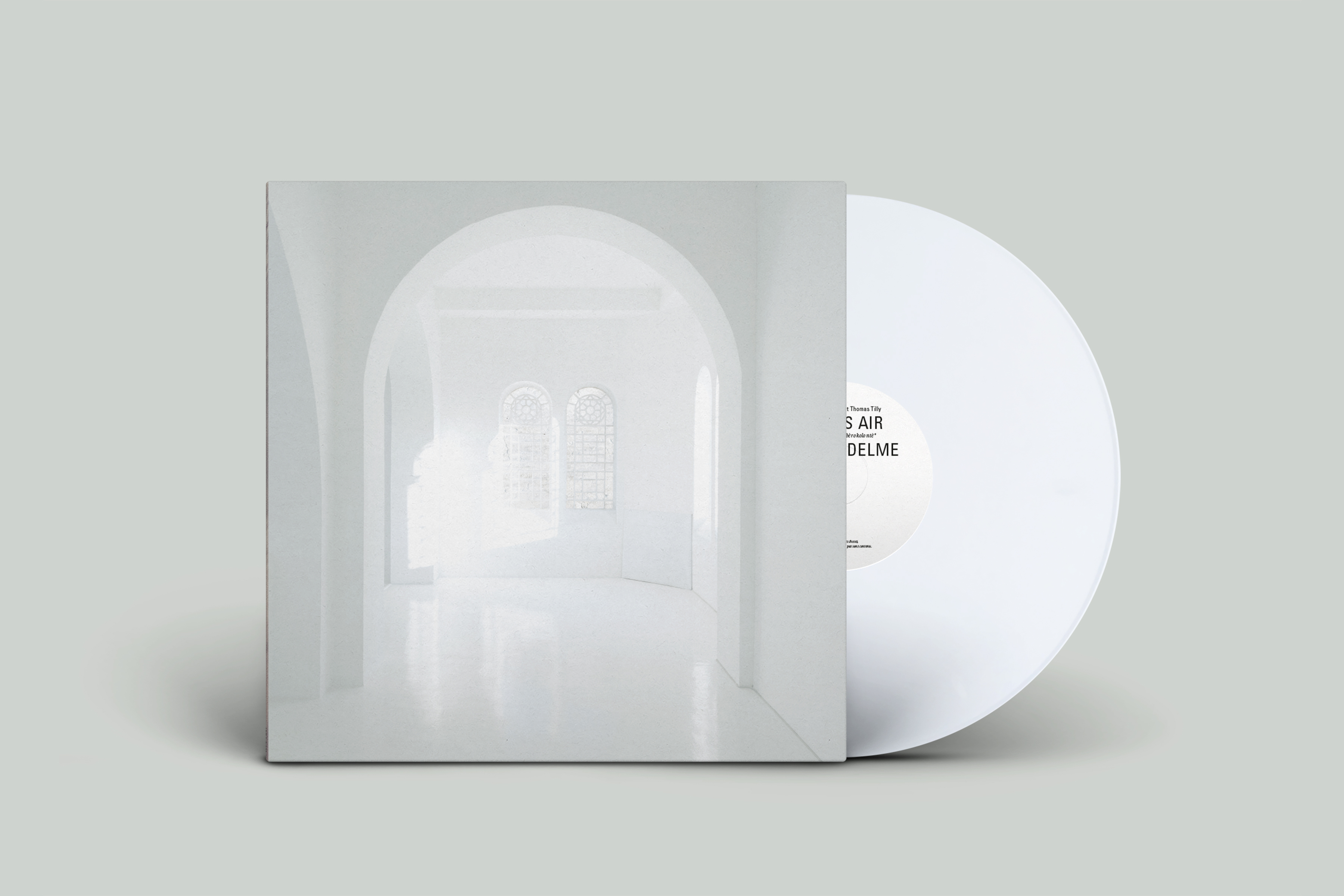
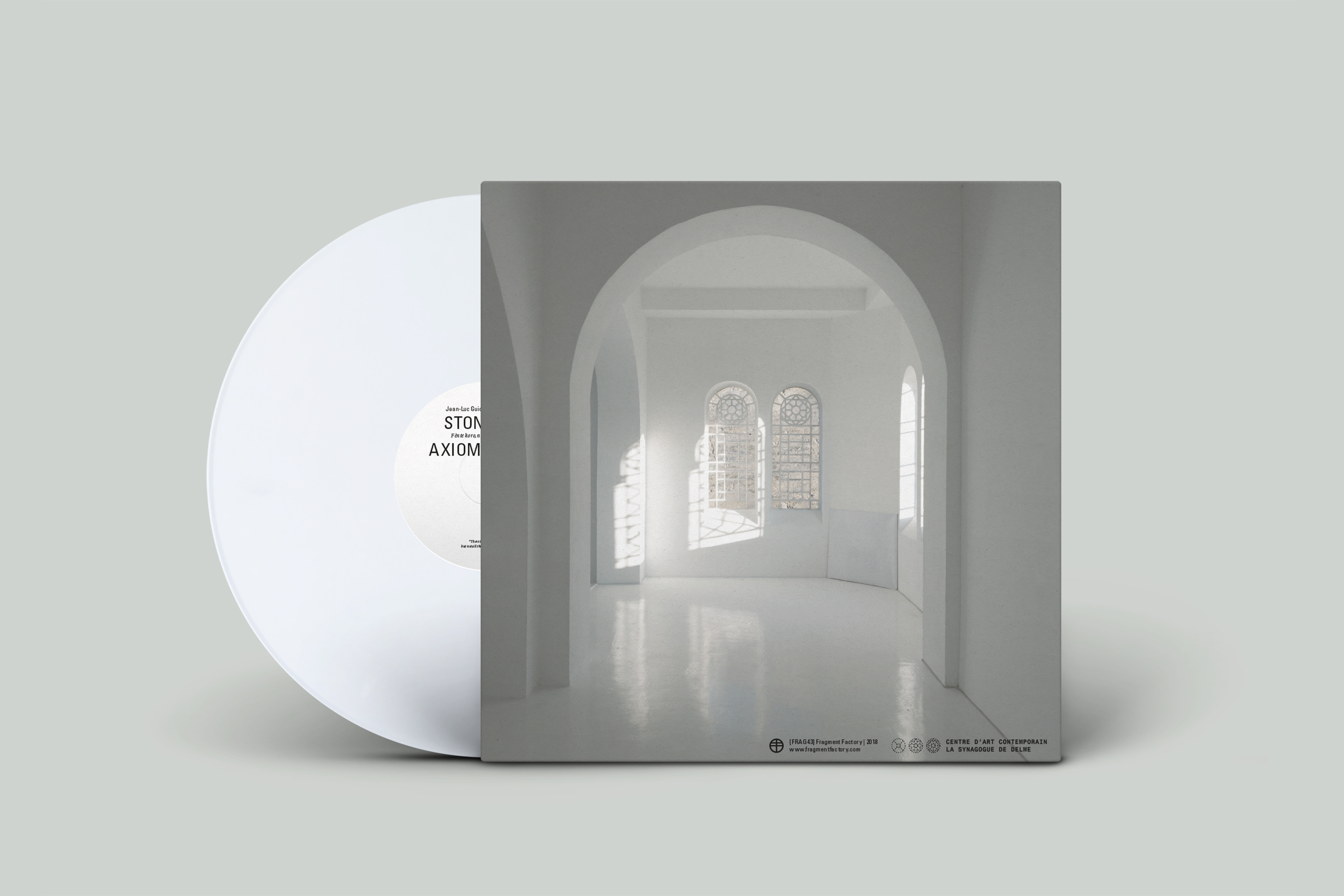
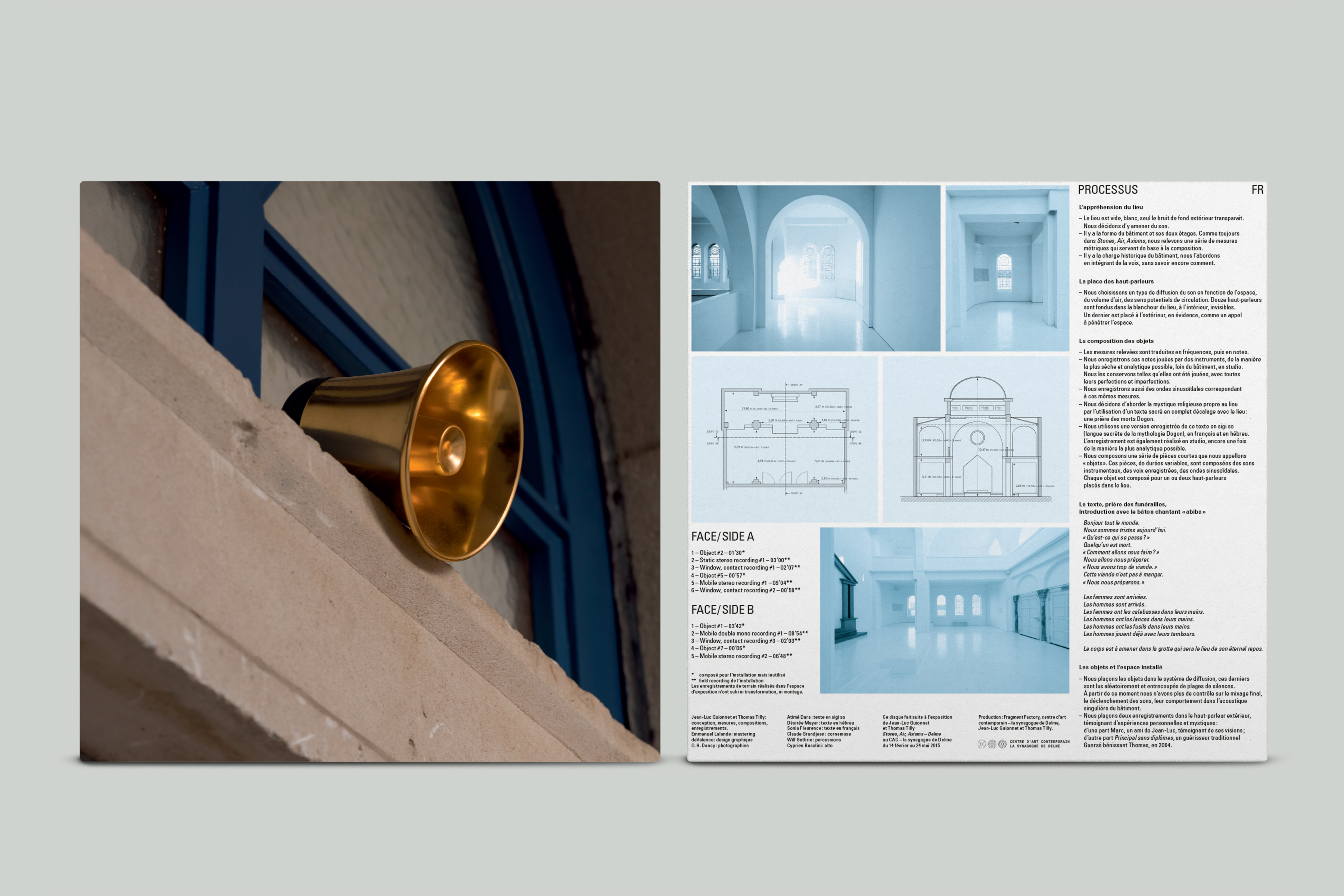
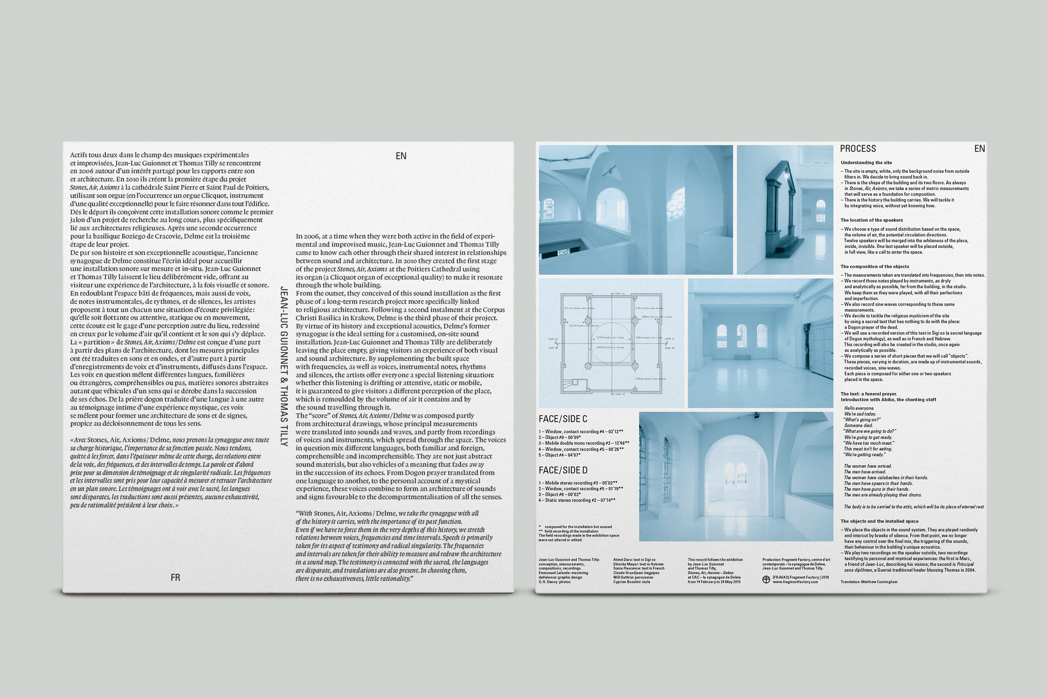
Synagogue de Delme – Stones, Air, Axioms
Client: Synagogue de Delme | Year: 2018 | vinyl sleeve | In collaboration with studio deValence
“Stones, Air, Axioms” is a research project by artists Jean-Luc Guionnet and Thomas Tilly, which addresses the complex relationship between sound and architecture. The art center La Synagogue de Delme was the third occurrence of this project, after Poitiers and Krakow. This edition follows the exhibition in Delme of Jean-Luc Guionnet and Thomas Tilly in 2015.
2× white vinyl LPs – 300 copies edited by Fragment Factory (Hamburg) and Synagogue de Delme.

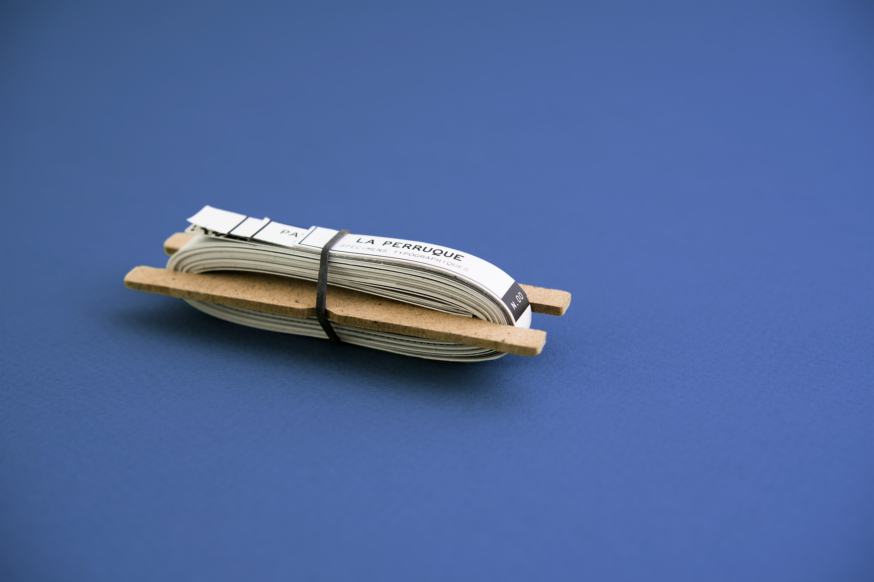
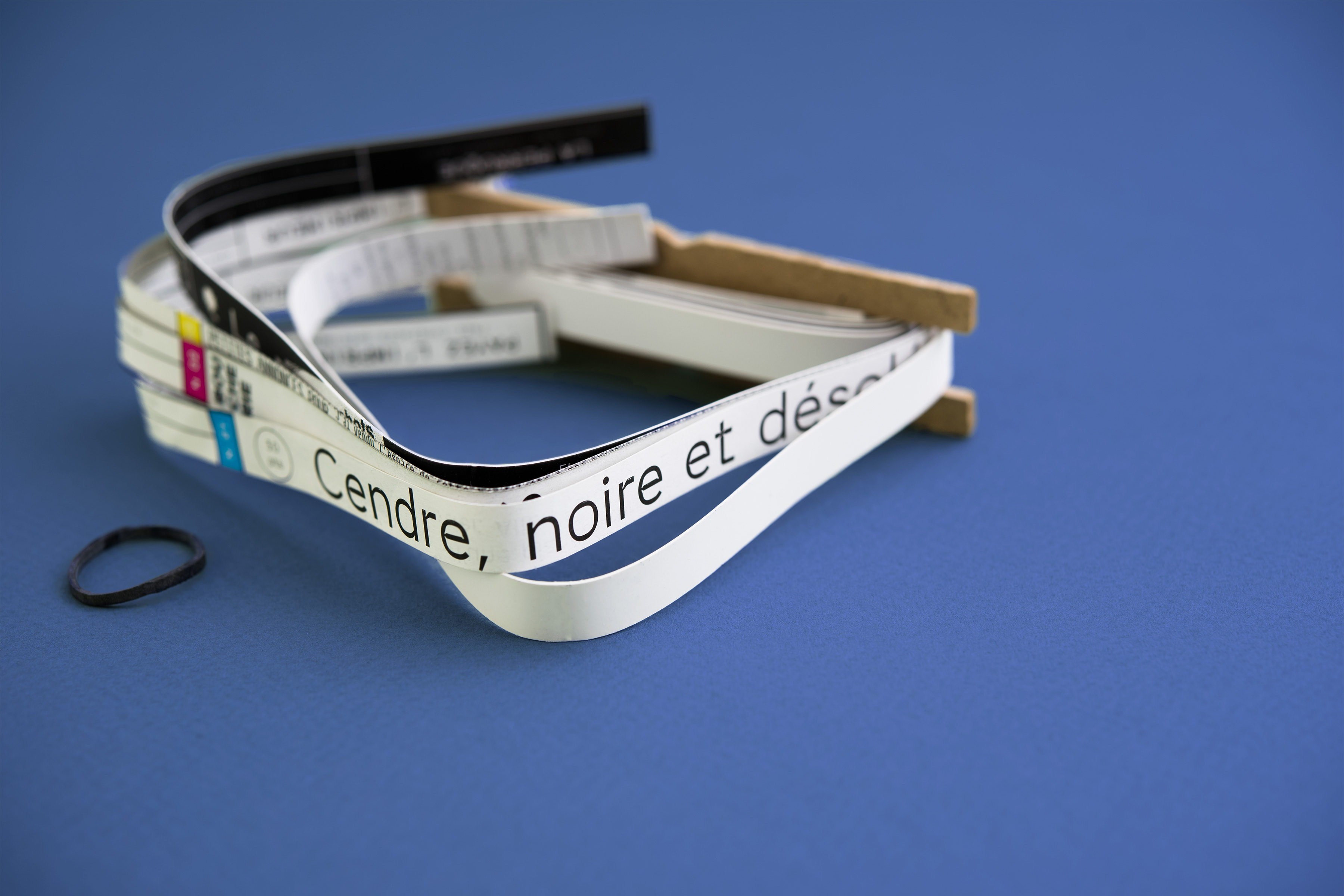
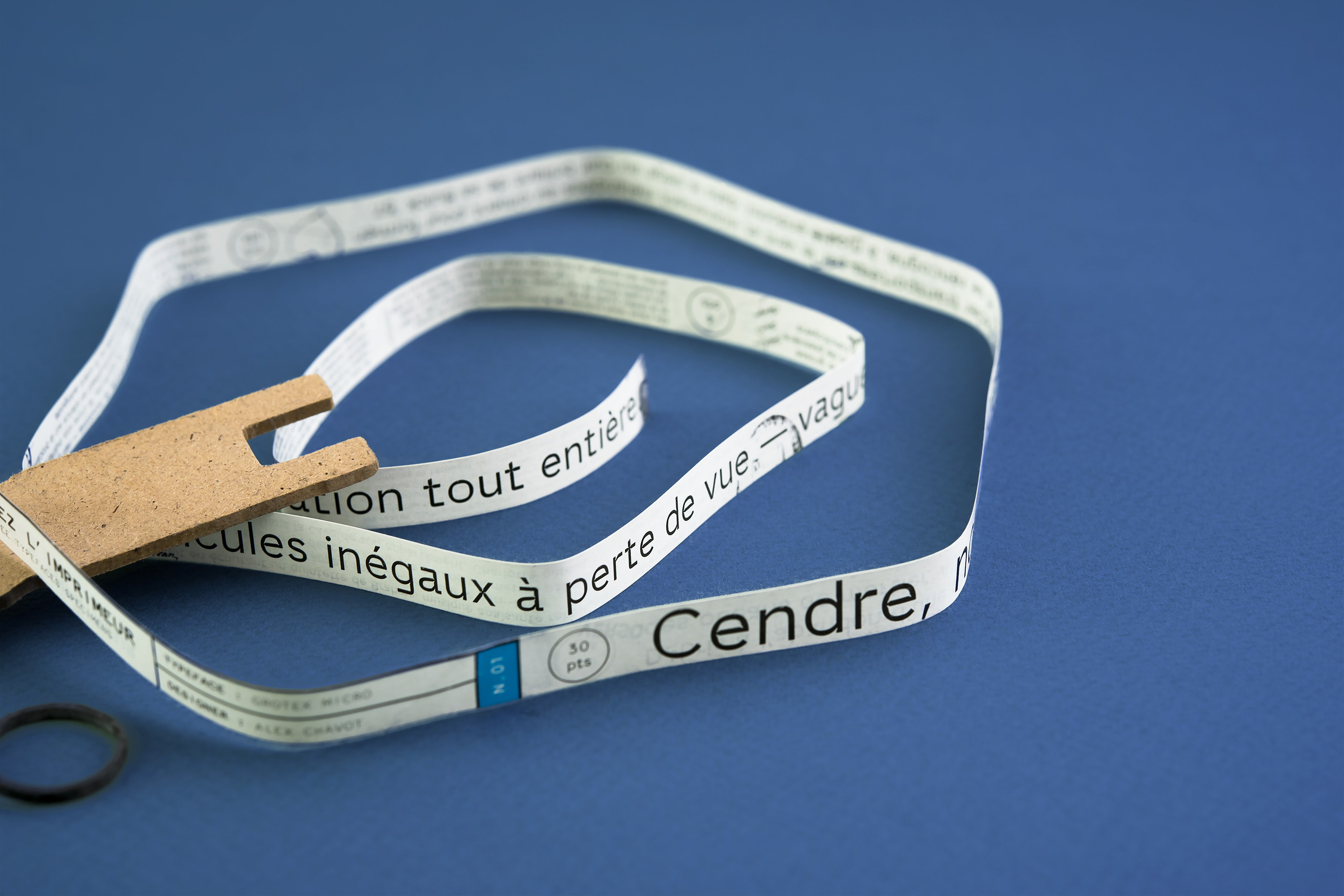
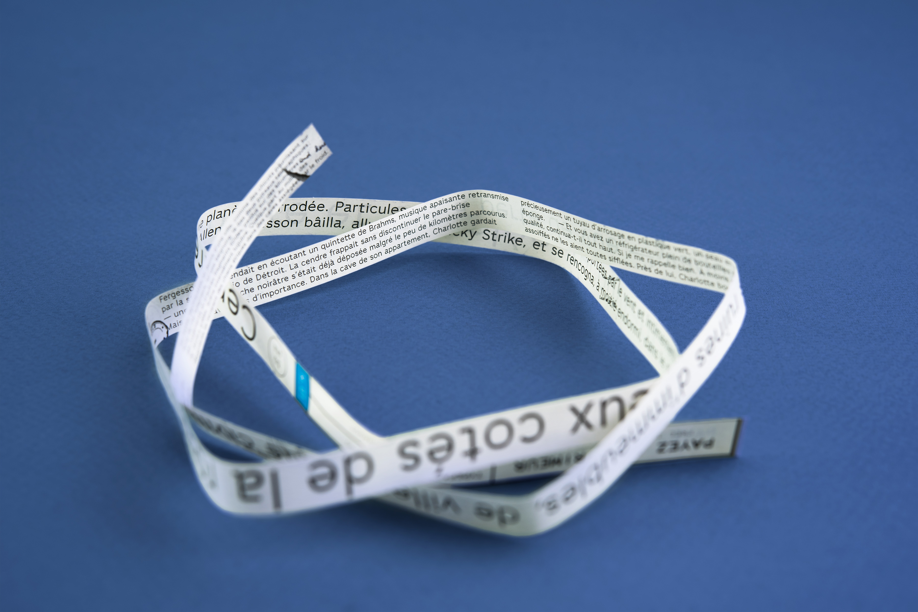
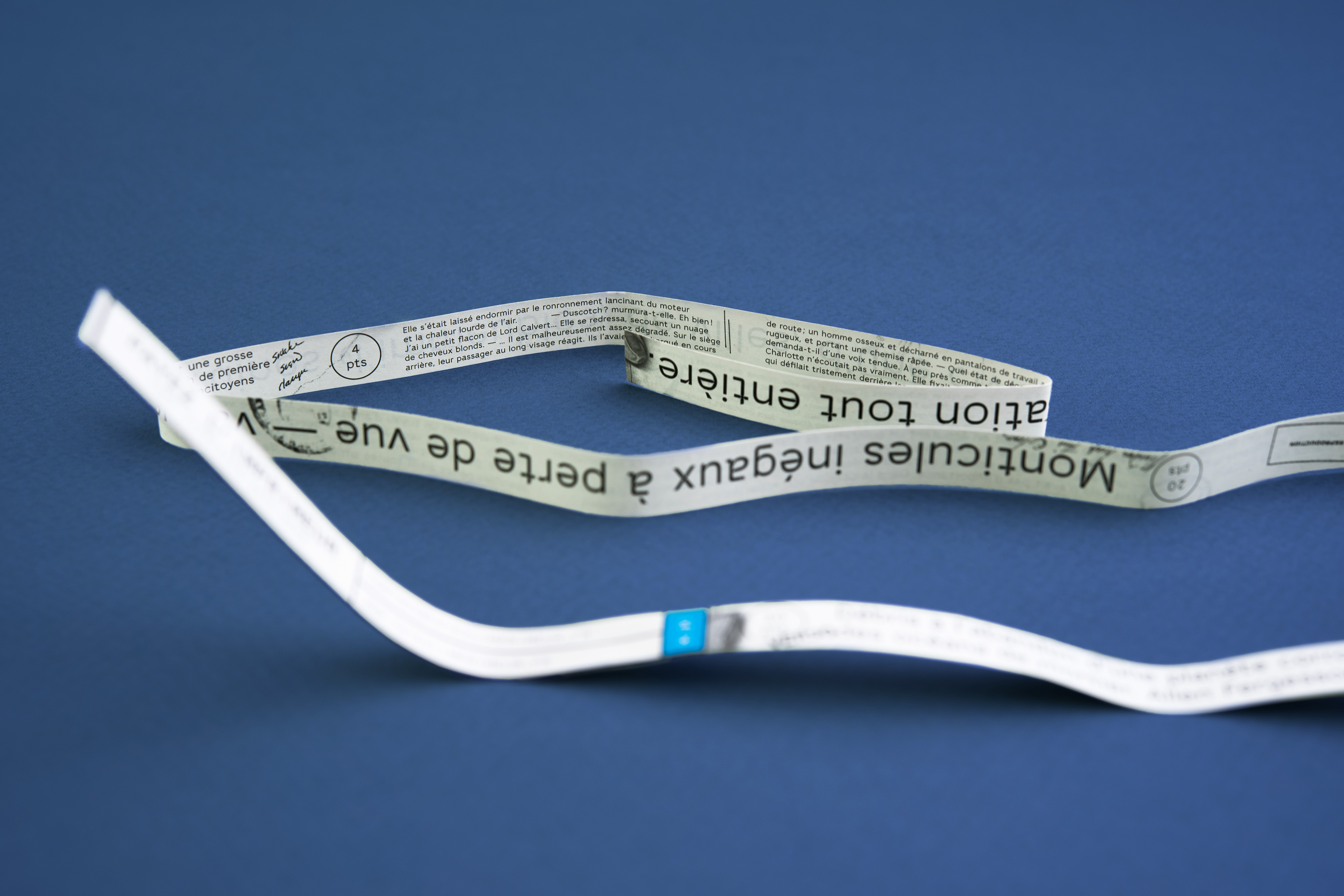
La Perruque – nº1
Client: Surfaces Utiles / La Perruque | Year: 2015 | specimen design
La Perruque publishes and distributes type specimens. Printed on the margins of offset prints, each issue of La Perruque presents a unique typeface. Altogether, the issues weave a thread between type designers and graphic designers’ contributions. Invited by Olivier Bertrand (Surfaces Utiles), I had the honour to kick it off by quoting the beginnings of Philip K. Dick’s short-novel “Pay for the printer” (the former name of La Perruque). Especially drawn for La Perruque, my Grotex Micro font is put to the test, from 4 to 30pt type-size. The text develops itself as the story unfolds, along strange marks and glitches extracted from pages scanned by Google Books.

Mamie Marie